With one for each end of the color spectrum, no one has to miss out on the trends.
Each year around this time, color-focused (read, paint brands and Pantone) release their “color of the year”, a carefully chosen shade in tune with fashion and pop culture trends. As interior designers, it’s one of our favorite trends to watch. What shades will our clients be asking for in their homes? Have we been ahead of the trends, incorporating these standout colors into our work already?
This year, the world seems collectively in need of deep, comforting colors. Sherwin Williams and Benjamin Moore picked up on that feeling, but chose wildly differing colors of the year. Luckily, they’re both gorgeous.
Benjamin Moore

Image via Architectural Digest
2018’s color of choice, according to Benjamin Moore, is the hot, peppery “Caliente”. It’s a bold dark red that brings to mind the dark body of Spanish wine or the delicious heat of red chilis. As a paint color, it will bring depth and drama to any space, injecting a bold, risk-taking sensibility to the most minimal of homes.
Painting a wall Caliente is a big commitment, though. Even if you aren’t quite ready to make that leap, it’s a great accent color to add into your space. Pillows, blankets, a bold set of chairs, or a rug can inject a little of its bold flavor into any room. It’s the perfect way to warm up any space for to combat those winter blues.
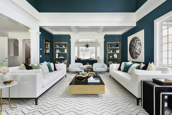
Sherwin Williams
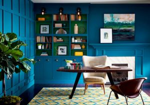
Image via Sherwin Williams
Speaking of winter blues, Sherwin Williams took the opposite tack from Benjamin Moore. Instead of fiery scarlet, their color of the year is the moody “Oceanside”—a dark jewel-toned blue that has notes of rich dark green. It feels folkloric and reminiscent of mysterious, iridescent deep sea creatures.
Oceanside is just as bold as Caliente, making huge impact on walls or trim. But again, if painting is too much of a commitment, there’s plenty of ways to work the gorgeous color into your space. A deep velvet sofa, a place setting that brings in the color, or even a funky filing cabinet can bring in just the right amount of the statement color.
While trends come and go, we can’t help but imagine that both of these great shades will be sticking around for a while. After all, who wouldn’t want their house to look like the inside of a (well-appointed) jewelry box. If you need help finding just the right piece to incorporate into your home, don’t hesitate to ask us. We can’t wait to see how these shades show up over the next year!