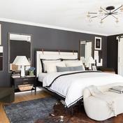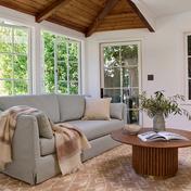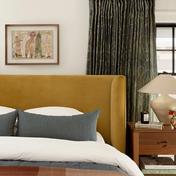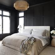
Design Story: A Fun, Functional & Contemporary Nursery

Time Several Hours

Budget $ $$$

Skill Level

WORDS BY The Havenly Team

Fill 1Created with Sketch.

Published on October 9, 2016

Back in the spring of 2015 we had the pleasure of decorating Nicole and Nate’s multi-purpose living area. You might remember the Design Story on our blog or the featured article about the space in Apartment Therapy.

We loved working with Nicole and Nate on their living space, and we were thrilled when they came back to Havenly and asked Shelby G. to help design their baby boy’s nursery.

Nicole: “I know what I like and what I don’t like, but I have a hard time visualizing a room coming together. That’s where Havenly comes in. I’ve had the pleasure of working with Shelby before on our office, and I know how immensely talented she is. Working with my style, likes and dislikes, I knew Shelby would be able to come up with a nursery room design that would be a haven (no pun intended) for both baby and I.”

Nicole & Nate’s Nursery Design Story

Nursery Concepts

[df_row][col-md-6][/col-md-6][col-md-6_last][/col-md-6_last][/df_row]

In addition to their well-articulated aesthetic tastes, Nicole and Nate have an exceptional eye for detail, so we weren’t surprised to find that they had collected some notes and inspiring photography prior to their design project.

The couple wanted to explore two broad themes. Theme one was cool, calm, white and traditional, while theme two was bold, contemporary and colorful. And then there were all of the important little details, like animal aesthetics:

Nicole: “With my Pinterest board, a phone call and some inspiration photos, Shelby knew what I wanted in a nursery before I knew what I wanted.  We had a couple of pieces that we already had purchased for the room, and Shelby was great at incorporating those into the design and finding other pieces to complement them. We wanted animals, but as accents. They’re ok for art, stuffed animals, etc, but not sheets. We don’t want the room to be ‘animal’ themed.”

Nursery Renderings

After discussing things like shelving functionality, wood tones and color palettes, wallpaper for accent walls and color choice for rugs, Shelby got to work on distilling the collaboration into a stunning room rendering.

This stage of the design process often results in valuable design insights. For Nicole, those insights informed her shopping decisions when it came to choosing between rockers and gliders –

Nicole: “As I mentioned to you, I heard that this is the single most important item you will purchase for the room as you’ll spend hours upon hours in it.  I took this very seriously, and Nate and I went to half a dozen stores to sit in rockers and gliders.  We found out very quickly we both preferred gliders to rockers.  (Who knew?)  They take less effort to rock, and they’re a smoother ride.  So that eliminated rockers entirely.”


The final rendering is a design-forward mix of calm whites and traditional lines with bold accents and contemporary decor.

Nicole: “Hey Shelby,Love, love, love. Thank you for sticking with me on this. The nursery design is a perfect mix of patterns, soft colors and animal accents. It is both fun and functional, calming and cool; it’s a space we love being in every day.”

The Completed Nursery

[foogallery id=”11265″]

Nicole: “The most memorable moment in the completed space (thus far) has been hearing our son laugh for the first time. And just the other day, he was trying to crawl.  I am sure there are many memorable moments ahead for us in his nursery.”

What do you love most about this nursery design project? Let us know in the comments below!

[df_divider el_width=”70″ style=”solid” accent_color=”#EEEEEE” border_t_width=”2px” padding=”20px 0″ position=”align_center” el_class=””]