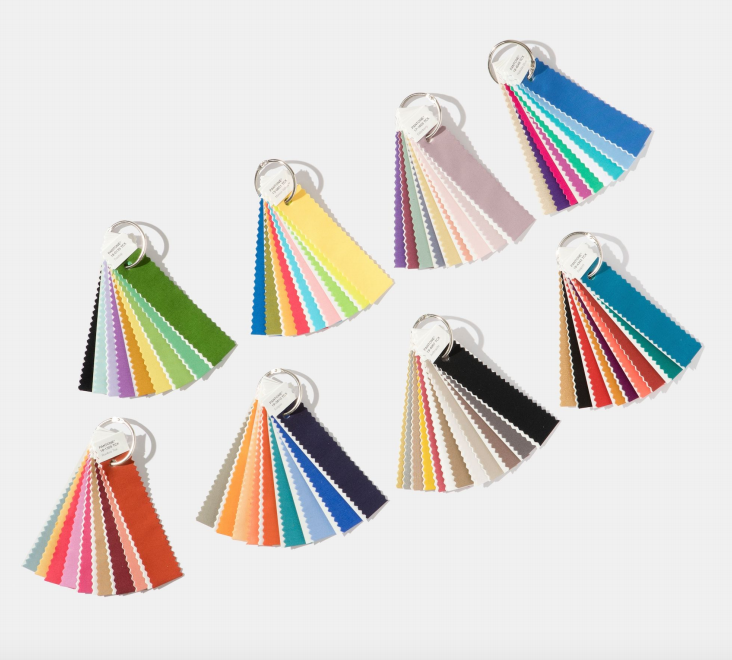
One of our Havenly designers, Kylie Williams, weighs in on what she seems coming around the corner for colors.
Always keeping up with the latest trends, I decided to do a little research on what the next color forecasts were for the interior design industry. I’m excited to say that although we’re not quite ½ way through 2017, the experts of color at the Pantone Color Institute have already revealed their color trend predictions for 2018, and from my experience, they’re usually pretty well right on the money!
Executive Director, Leatrice Eiseman, shared the predictions at the International Home & Housewares Show in Chicago recently, making note that these came from months of studying culture and consumer goods around the world.
According to Pantone, one of the new trends of 2018 is about embracing shiny, iridescent, pearlized, and translucent. We know metallics are classic but they are about to really move over into neutrals and I am super excited. All this loveliness will be something the eye can absolutely not avoid. Come on in glam, we welcome you with open arms.
Where else does Pantone believe we are headed? The thoughts are that we’ll be moving away from pastel shades like the pale pinks and blues of recent years for some much bolder and brighter shades. Backing this up Eiseman stated that “Intense colors seem to be a natural application of our intense lifestyles and thought processes these days,” … that’s a comment we can all relate to. Welcome brights, bring your energy…
These two trends are reflected in the eight 2018 Pantoneview Home + Interiors palettes described below. Although there is no official color of the year as yet these palettes are a great taste of the sorts of tones you can expect to see… P.S. Luckily, pink still isn’t going anywhere.
VERDURE
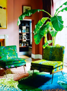
Photographed by Kate Martin
Vegetal colors like Celery and Foliage combine with berry-infused purples and an eggshell blue (also, loving the chairs).
RESOURCEFUL
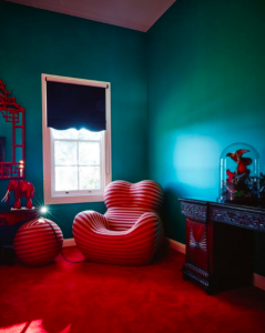
Photographed by Hugh Stewart
Complementary colors on the color wheel – oranges and blues – blend in a palette that is clever and “resourceful” in re-using and refurbishing what consumers may already own.
PLAYFUL
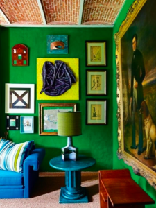
Photographed by Kasia Gatkowska
Speaking to our need for whimsy, the Playful palette is out-of-the-ordinary and quirky. The colors are “bright-hearted more than light-hearted” Yellow, Lime, Green and turquoise.
DISCRETION
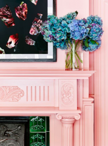
Image from Vogue Living
Low-key and subtle, Discretion is the opposite of Playful. Nostalgic hues like pink have developed more power than ever before (pink lovers woo hoo)
FAR-FETCHED
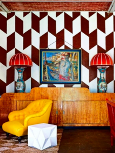
Photographed by Kasia Gatkowska
This palette reaches out and embraces many different cultures. It refreshingly mixes earthy, rosy and deep tones together.
INTRICACY
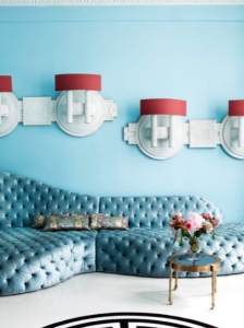
Photographed by Rei Moon
This palette reflects the popularity of intricate designs. It features the “new neutrals” – aka metallics – with pops of color mixed in for added add glamor.
INTENSITY
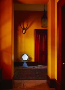
Photographed by Hugh Stewart
Providing an eclectic mix of colors in shades of plum, blue, and blue-green contrasting with oranges deep reds and olds.
TECH-NIQUE
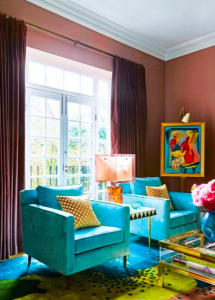
Photographed by Kate Martin
Featuring colors that “seem to shine from within” like iridescent vibrant blues, fuchsia and purple, plus turquoise and hot pink.
References
http://www.elledecor.com/design-decorate/color/a9178549/pantone-colors-2018/
https://www.pantone.com/pantoneview-home-interiors-2018

