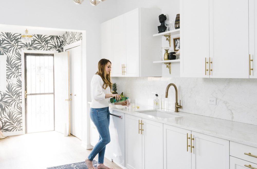
When we purchased our house, we knew that renovating the kitchen was going to be one of the first projects we tackled. Not only were the existing finishes dreadful (who wants a countertop with grouted tiles?), but the layout was less than optimal. The fridge was in an adjoining room and a large column sat right in the middle of the limited countertop space.
Starting from scratch meant reconfiguring the layout, moving a wall, choosing finishes from cabinets, to counters and flooring, and purchasing all new appliances. Naturally, I went straight to Pinterest and browsed favorite design blogs to find inspiration. I knew I wanted a mostly white kitchen, on a budget, but was torn on exactly what counter stone, cabinet type, and backsplash to use.
I’ve always loved clean, flat modern cabinet fronts. But considering the older character of the house, I was hesitant to go too modern in the kitchen or choose something that would become dated.
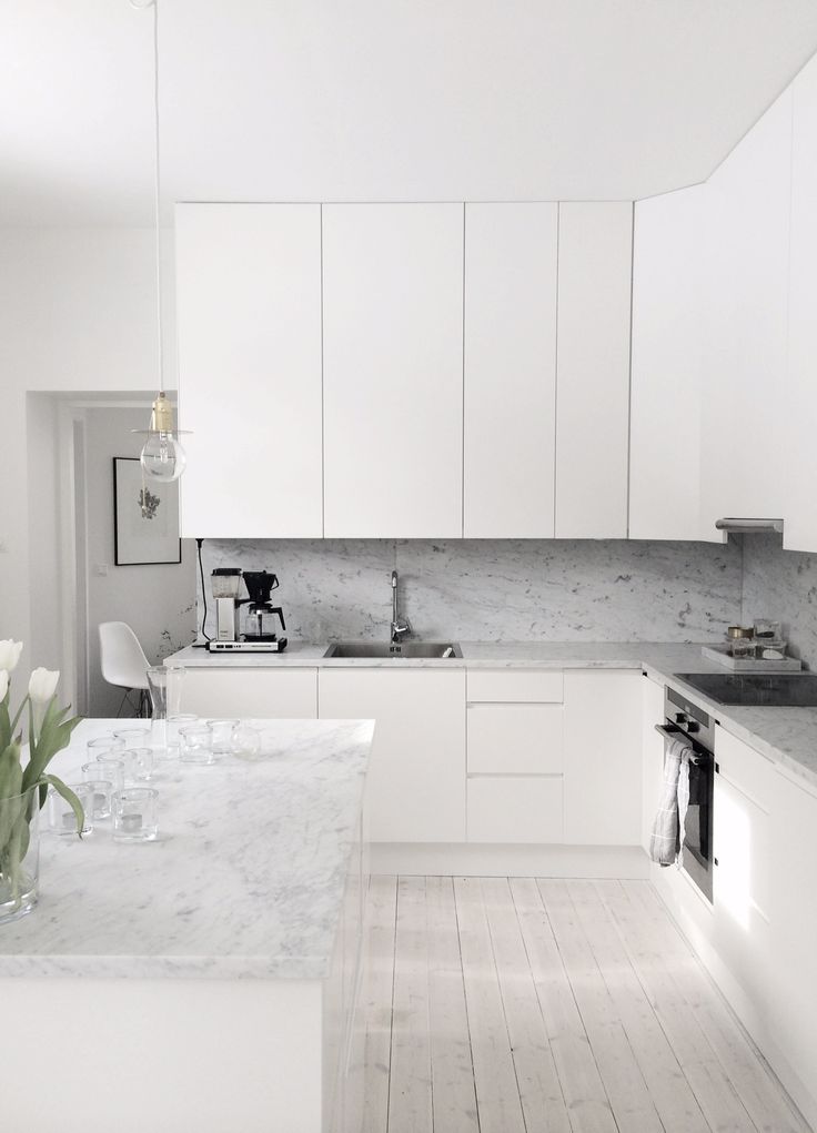
I love how sleek this all-white kitchen, however I was worried this look is too modern for the style of my home. (Image)
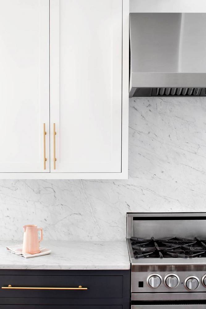
Simple cabinetry, gold hardware, and a marble backsplash were all on my wish list. (Image)
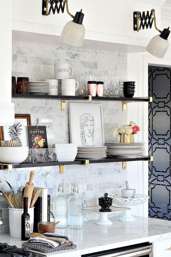
I loved the idea of open shelving to display my prettiest glassware, small bowls, art, and decor. (Image)
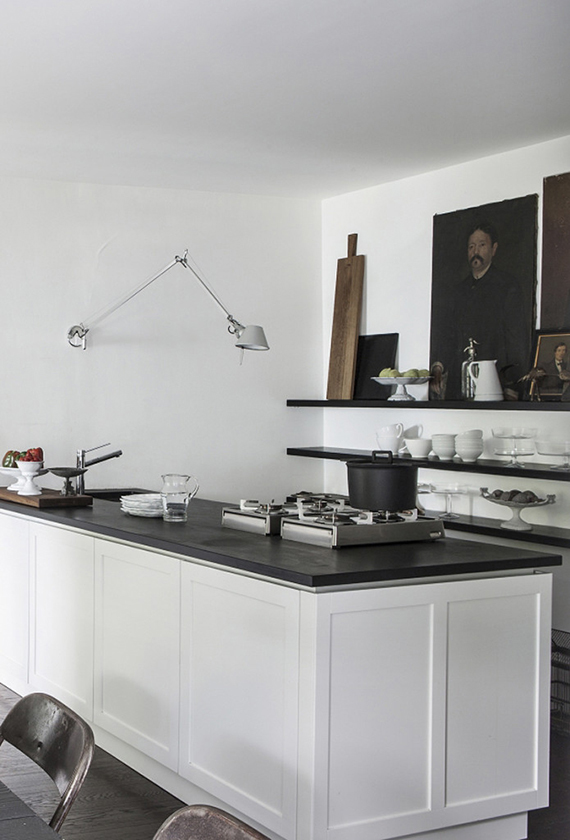
I’ve always loved artwork in the kitchen. The mix of old and new in this space, plus a touch of dark drama, felt right up my alley. (Image)
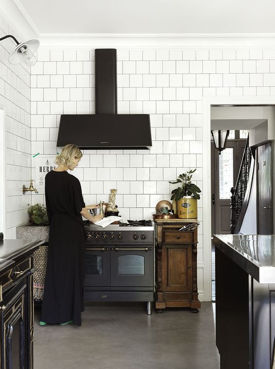
Initially, I considered doing black lower cabinets, however I wasn’t sold on the black stainless appliances. And, I knew deep down I wanted the kitchen to full of light tones. How dreamy is this range and hood? (Image)
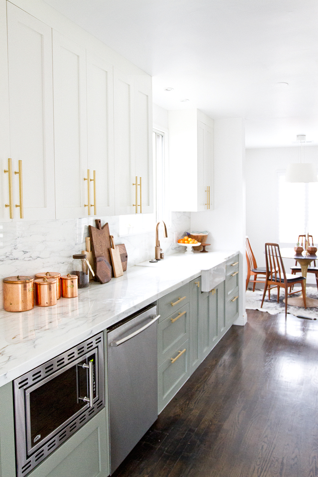
I ultimately decided on a streamlined shaker style cabinet from Semihandmade to blend a classic style with a modern finish. What I loved about these particular Shaker cabinets is that the shaker frame on the cabinet fronts were narrow and not too outdented, lending to a subtly modern take on the classic style. These cabinet fronts also happen to be made to work exclusively with IKEA cabinet frames! This means I could save money on the cabinets themselves without being limited by the cabinet front options (and quality) that IKEA provides. I initially saw them used in Sarah Sherman Samuel’s kitchen, and it felt like the perfect look for my space.
(Image)
After selecting the cabinets, we decided we were sold on the look of continuing the countertop material up the backsplash and behind the range. We scoured local stone yards and suppliers to find a marble-like stone (ideally without marble-like maintenance). After looking at a range of natural and composite materials, we went with a mostly white calcultta quartzite that blended gray and gold-toned veins.
Choosing appliances was, perhaps, the most controversial of my decisions, amongst my friends and colleagues at least. When I tell people I went with white appliances, I usually get a look that implies “why on earth wouldn’t you choose stainless steel?” Well, the truth is, I’ve never been a fan of stainless steel. I think it’s going to look dated any day now. I love the look of built-in appliances, but didn’t have the budget to customize millwork for this purpose. While my dream would be to own a black La Cornue range, sometimes budget gets in the way of our dreams… The modern white appliances blended with the cabinetry as well, so felt like the most seamless choice to have a close-to-built-in look.
After months of renovating and decorating, I’m extremely happy with how the kitchen turned out!
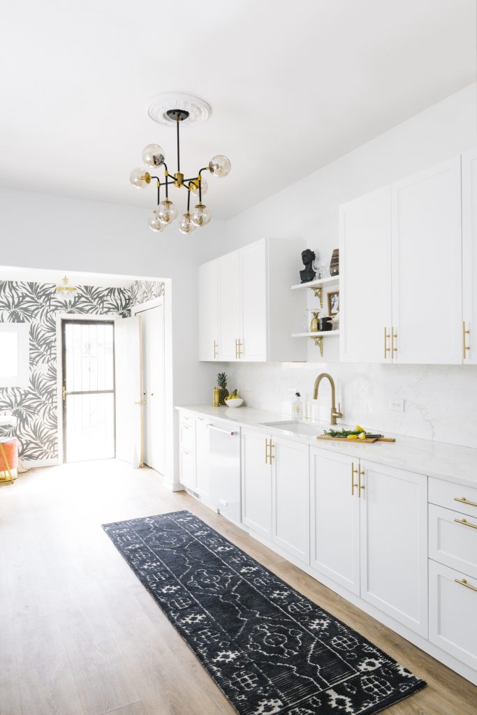
The cabinet fronts ended up being beautiful in person, easy to install, and sturdy. I’m so happy we went with the shaker style in the long-run as I think they’ll age with the house well. The appliances blend into the cabinets pretty seamlessly, and we love the dramatic and modern look of the seamless countertop to backsplash material. We complimented the gold tones in the quartzite with a champagne bronze modern faucet, brushed brass cabinet hardware and accents.
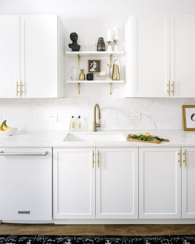
We opted for two open shelves with vintage brackets to hold serving pieces and decor above the sink so that area, where we stand most often, felt more open. It also gave us the opportunity to add a bit more personality to the room. A vintage inspired runner and statement chandelier completed the look.
Let us know your thoughts on the kitchen reveal, and stay tuned for more room reveals coming soon!

