Havenly Head Designer Shelby Girard is decorating her new home in her favorite style: Black and white glam! In part 2, watch Shelby’s black and white home design process unfold with her first step in any design: Concepts.
We’re finally somewhat settled in the new house, with major renovations (and mental breakdowns) behind us. Now it’s on to the fun part: black and white home design!
Having already selected the major finishes around the house (flooring, paint, cabinets and tile), I’m now in my comfort zone, which means spending long hours online furniture shopping with wine in hand. I can safely say that I am now familiar with about 99% of all black, white or gold furniture and decor items that exist on the internet. Seriously, if you’re looking for something in this palette, I probably know exactly where you can find it.
While I’ll be using as much furniture as possible from my previous apartment, we’re nearly doubling the size of our space in the new home so there’s a lot to buy! Keeping my original black and white home inspiration in hand, I’ve developed concepts for each room in the house to help me get started with the design process. I want to make sure each of the rooms are cohesive and flow together (which isn’t hard with a limited color palette), but all uniquely their own at the same time.
One of the features that sold me on the home is the flow of the main floor, which included the entry and 3 open, but distinct, rooms, along with the kitchen and bathroom. While most would probably be sold on the 2 car garage or extra bedroom, I was ecstatic at the thought of having a living room AND a sitting room (I’ll take any chance I can get to buy more throw pillows)!
The Entryway
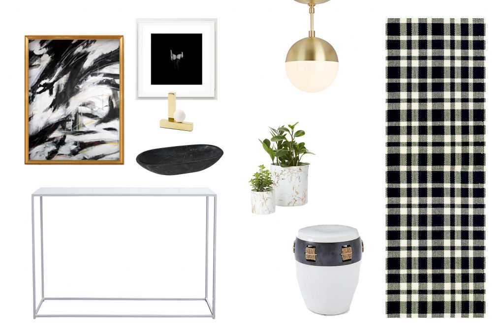
The entryway is small and narrow, but I still wanted to have a console table to throw keys on, as well as some art (this is our guests first impression, after all) and, most importantly, a bold rug to run up the white staircase.
The Living Areas
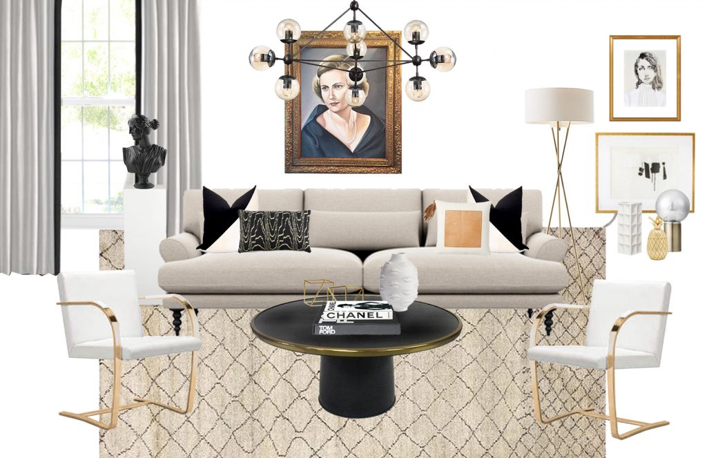
My idea for the two living spaces was to have one area where we could watch tv, without it feeling like a “tv room”, and another that could be a true sitting room.
The main living room is the first you see as you walk in, so making this beautiful, refreshing and pulled together were key. The sofa happens to be super deep and soft for tv watching, but the spindle legs and rolled arms make it feel like it belongs in a formal living room as well.
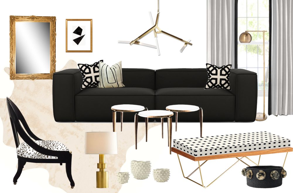
For the sitting room, I used a dark sofa to contrast the lighter one in the adjacent living room, and a faux hide rug to break up the straight lines of the chandelier and boxy sofa. The modern, sculptural chandelier is my favorite in the house, and will definitely be a conversation piece. I love the way the straight lines contrast against the antique gilded mirror and curved, spoon-back accent chair.
The Dining Room
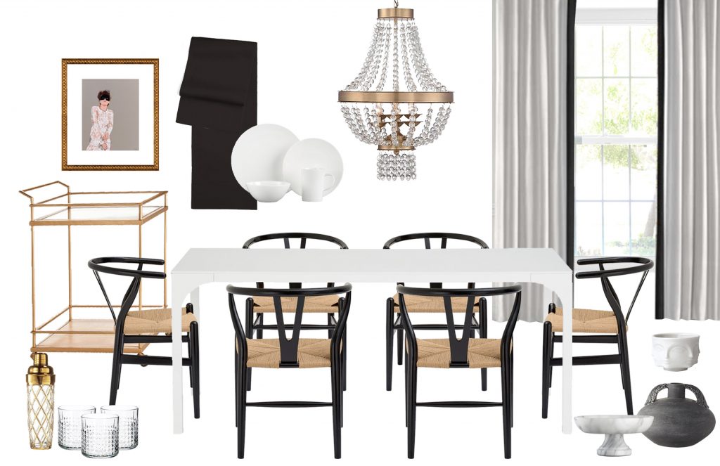
Adjacent to the sitting room is our dining room, smaller in size but able to fit a 6 person table. I promised my husband that I’d try to keep the designs pared down and somewhat minimal, so really only wanted to include the essentials in this room (a bar cart is an essential right?). We’ll see how long I survive without a rug, which I’m already secretly shopping for.
The Bedrooms
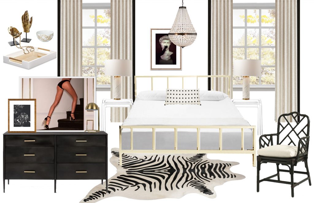
For the master, we were able to reuse most of the furniture from our apartment, while adding some drama with black accents found in artwork, curtains and a new dresser.
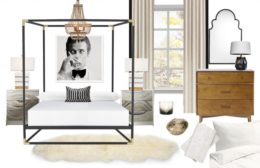
In the guest room, I wanted to create a comfortable and clean, yet inspiring space, using crisp white bedding, a romantic chandelier, and a modern canopy bed.
The Bathroom
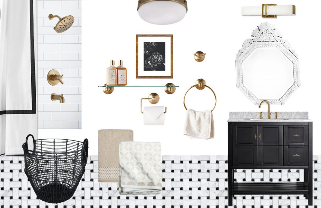
Lastly, for the upstairs bath, we started from scratch. We completely gutted it, so we were able to choose tile, a bathtub, vanity and faucets. I chose to fill out the room with hammered brass accents, a venetian mirror to add some antique charm, and a mix of neutral towels, which we’ll store in a large floor basket.
If you haven’t noticed yet, I really love a good light fixture. I’m probably most excited to see the various fixtures installed and how they’ll play off of each other from room to room (the 1990s ceiling fans just aren’t cutting it right now).
In the next few posts, I’ll walk you through my decision making process for some of the pieces that can be the most difficult to pull the trigger on. That’s honestly my favorite thing about the Havenly design process – It lets you work one-on-one with your very own designer, who’s there to help you start the ball rolling with concepts, then help you make decisions on some of the harder pieces in your space.
Stay tuned for more black and white home design tips and tricks, and let me know what you think so far in the comments below!

