18 Bold Color Palettes Designers Love To Make A Space More Dynamic

Color can seem a bit like magic. It has the power to change your mood, transform the look of your home, and create a sense of cohesion among discordant elements. So when you opt for a bold color palette in your home, it’s bound to pay off, stylistically, in dividends.
Bold color palettes are not just for the maximalists amongst us; all you really need is one or two dynamic colors to create a striking impression in a space. So if you prefer to err on the side of the simple, pairing a more dramatic color with a neutral complement can have as eye-catching an impact as going all-out with multiple vibrant tones. What’s most important, in any space, is achieving a sense of harmony, and the right hues can help you to do just that.
There are so many bold color palettes our designers are loving right now, but here are a selection of their current favorites to inspire your next design decision. You might just find that it’s time to switch things up in your home.
1. Bold Color Palettes: Deep Chocolate

A dark wall color can have a dramatic effect on a largely neutral space; deep, chocolate-brown walls make this living room, which features earthy tones such as terracotta and olive green, feel even more intense and intimate.
2. Bold Color Palettes: All Bright

Turquoise, bright pink, and tan give this living space a sense of all-caps energy, but the bright hues are anything but discordant. A multi-colored area rug and an abstract piece of art do the heavy lifting of tying them all together.
3. Bold Color Palettes: Muted Blue

Not quite navy and not quite cornflower, this stormy blue wall color brings depth to a modern living room, without making it look altogether moody. Lighter accents, like a camel-colored sofa and a beige rug, strike the right balance.
4. Bold Color Palettes: Royal Blue and Cream

Sometimes, all you need is one standout hue to create a bold color palette. In this living room, a vivid blue sofa stands out when surrounded by a relaxed, cream-colored rug and and two blue pinstripe benches.
5. Bold Color Palettes: Modern Luxe
You can hardly ever go wrong with a neutral color palette, but a few small changes can give it a bigger impact. A golden, ochre-colored sofa adds a touch more luminosity than a tan alternative might, and charcoal-grey armchairs add a more thoughtful contrast than lighter-toned options. In between, cream-colored walls and area rug make the space look bright and refined.
6. Bold Color Palettes: Blue and Yellow

When you’re pairing two colors that don’t seem like they should have anything to do with one another outside of, say, a high school sports team uniform, it’s best to give them plenty of breathing room. The punchy yellow drapes and light blue throws in this bedroom play nicely thanks to their cream-colored surroundings.
7. Bold Color Palettes: Black and Cream

Black and white spaces can sometimes deal too deeply in contrasts — which is why a black and cream color palette is often a more welcome option. Some rust accents, in a patterned area rug and a throw pillow, make this living space even more inviting with their added warmth.
8. Bold Color Palettes: Contemporary Garden
While the color palette of this bedroom includes a mix of hues — mist green, ochre, cornflower blue, and bright color — they pair wonderfully thanks to the balance of their saturation and intensity. A golden bed frame stands out as the focal point of this room, and light-toned bedding and drapes, while colorful, don’t compete with its deeper hue.
9. Bold Color Palettes: Sky Blue and Tans

For a more dramatic look, up the saturation of one color and opt for a brighter hue of the other; here, a bright sky blue brings energy to a living room when applied to walls and ceiling, and a sumptuous, caramel-toned sectional stands out against that vivid foundation.
10. Bold Color Palettes: Calm Eclectic

A clash of disparate prints creates a space that is decidedly eclectic — but in a range of earth tones and found-in-nature hues, they can have an ironically calming effect. The light blues, deep greens, burgundies, and tans of this space are surprising, yet natural, complements.
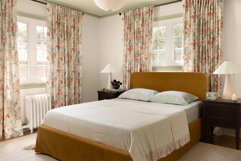
11. Bold Color Palettes: Gold and Green

The lush, vivid green of this floral bedspread is not an obvious pair with golden-yellow walls, but they make a rich contrast. The deep ochre headboard eases the transition to the buttery walls and helps amplify the jade bedding.
12. Bold Color Palettes: Pale Peach

A barely-there pink wall color gives this bedroom a warm, romantic atmosphere — spring-like hues, like sage green, pale brown, and a deeper pink, look even more charming with that peachy foundation.
13. Bold Color Palettes: Teal and Tan

Blue and orange are direct complements on the color wheel, so naturally, any variation on that combination is bound to pair well. In this room, a vibrant teal covers floor-to-ceiling bookshelves, to impressive effect; a tan leather armchair, with matching ottoman, offers a place to rest in the electrifying space.
14. Bold Color Palettes: Soft Metals

A black accent wall ups the drama in this moody, romantic bedroom, while the color palette of its bedspread is a touch more nuanced; nearly-blue slate gray and orange-toned copper might seem like they’d diverge, but together, they create a dynamic contrast of warm and cool.
15. Bold Color Palettes: Forest Green

The right mix of light and dark makes a space look striking. A velvet sofa practically blends into the dark green walls of this living room, while light wood and beige elements — a coffee table, a rattan dresser — pop. A lush green plant adds to the sumptuous look.
16. Bold Color Palettes: Shades of Cool

Charcoal gray walls set the tone for a moody, bold color palette in this dining room, while tonal blue and high-contrast cream add both drama and balance. The end result is eye-catching, yet calming and classic.
17. Bold Color Palettes: Think Pink

Yes, a room color-drenched in pink furniture and textiles can still feel mature and elevated with the right eye. The soft pink sofa functions as a neutral, while the berry accent seating and two-toned pink rug add a little drama. With white walls as a backdrop, the look leans chic Parisian modern.
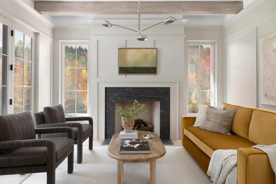
18. Bold Color Palettes: Golden Hour
Warm and cool tones blend beautifully in this nature-inspired space. The golden velvet sofa adds a touch of sunny warmth, while the deep green wallpaper and painted trim offers cool balance and contrast.
Want expert advice on your own space, straight from an interior designer? Get started today with ourstyle quiz.
