All White Everything Is *So* 2017 — Embrace These 9 Subtle Hues For Warmth & Personality

It’s an interesting time to be an interior design minimalist. In light of the slow but steady comeback of traditional design influences (and the color, pattern, and hints of maximalism that comes with it), the all-white minimalist look that ruled the 2010s is starting to feel a bit dated.
Coupled with a renewed emphasis on warmth, coziness, and character at home post-pandemic, our inner minimalist is admittedly a bit color and pattern-curious. While we’ll never embrace full-on neon or even pastels, we’re down to test the waters with a little olive green (maybe).
With that particular design dilemma in mind, we present nine subtle gateway colors that bode well with neutrals, and don’t stray too far from the white-on-beige-on-tan look. Havenly designers share their top picks:
1. Warm Earth Tones

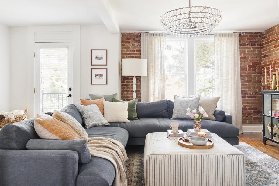
Warm nature-inspired earth tones like ochre, terra cotta, sienna, and tan are natural complements to the all-white look. Start with a warm walnut coffee table, and play off that hue with brick accent chairs and earth-toned throw pillows. Best of all? You can always swap out the pillows when you’re ready for a new look.
2. High-Contrast Black
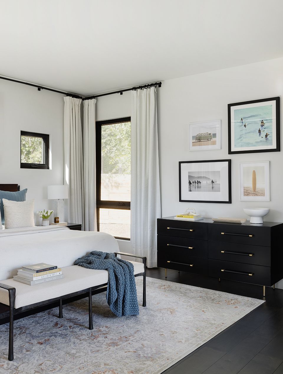
Black is technically more of a neutral than an actual color, it does add a certain punch of drama to a space that some minimalist interiors lack. For a hint of modern edge without straying too far from your comfort zone, consider black picture frames or a statement dresser. Paired with a little rich blue, the look feels intentional and varied.
3. Sandy Hues
When in doubt, warm up a cool white-on-white color palette with subtle warm neutrals like sand, tan, beige, and cream. This is a natural extension of the cool Scandinavian look fit for 2023. Add in natural plum foliage and wicker accents for texture!
4. Sea of Blues
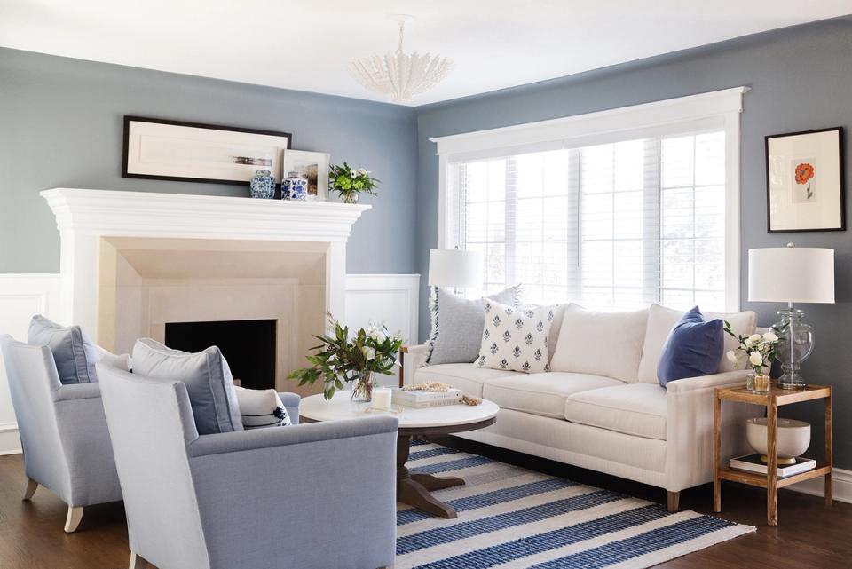
Blue is a neutral in our book, and it always has been a foolproof complement to white and ivory. If your minimalist style leans coastal or even preppy, consider adding in a pop of cornflower, sky, or navy blue for a hint of dimension and color. The look is just as serene as white-on-white (if not moreso!).
5. Shades of Gray
While cool charcoal paint or a dark gray area rug may feel too bold, this pop of edgy color will add depth and visual interest to any minimalist interior. Warm up the look with hints of tan and brass, plus natural textures like jute and wicker. Finished with fresh blooms and a houseplant or two, the look feels layered and inviting.
6. Cool Earth Tones
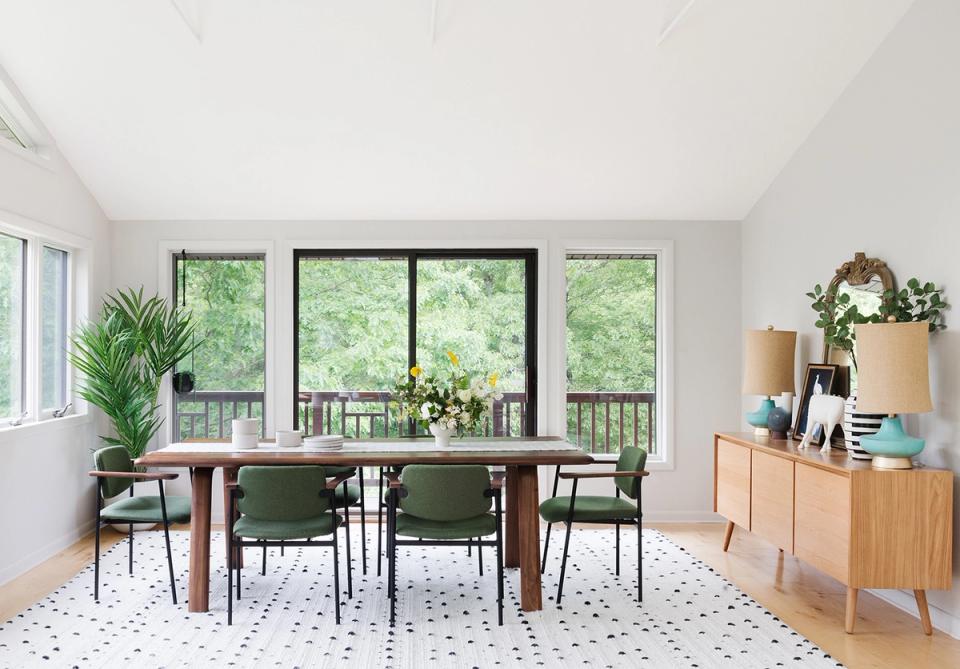
Prefer the cooler side of the color spectrum? Earth tones like olive, evergreen, sea blue, and even bold navy are perfect complements to a neutral color palette. Add eye-catching dimension with olive upholstered dining chairs, or simply test the waters with houseplants and fresh greenery for a commitment-free trial.
7. Rich Pastels
While pastels recall the kitschy spring decor of the 1990s, saturated pastels like sorbet, olive green, and soft gray-blue feel rich and elevated. Plus, these subtle colors lean neutral while adding depth and character to a space. Consider a classic ticking stripe or a soft chinoiserie print to play up the whimsy.
8. Desert Tones
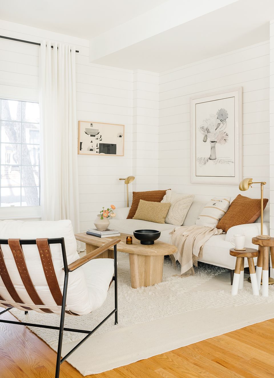
We absolutely love a desert sunset color palette comprised of cognac brown, natural ochre, terra cotta, and saturated tan. Add warm accents to an otherwise all-white space with leather furniture, light oak tables, and tonal throw pillows for an effortless warm minimalist aesthetic.
9. Pop of Print
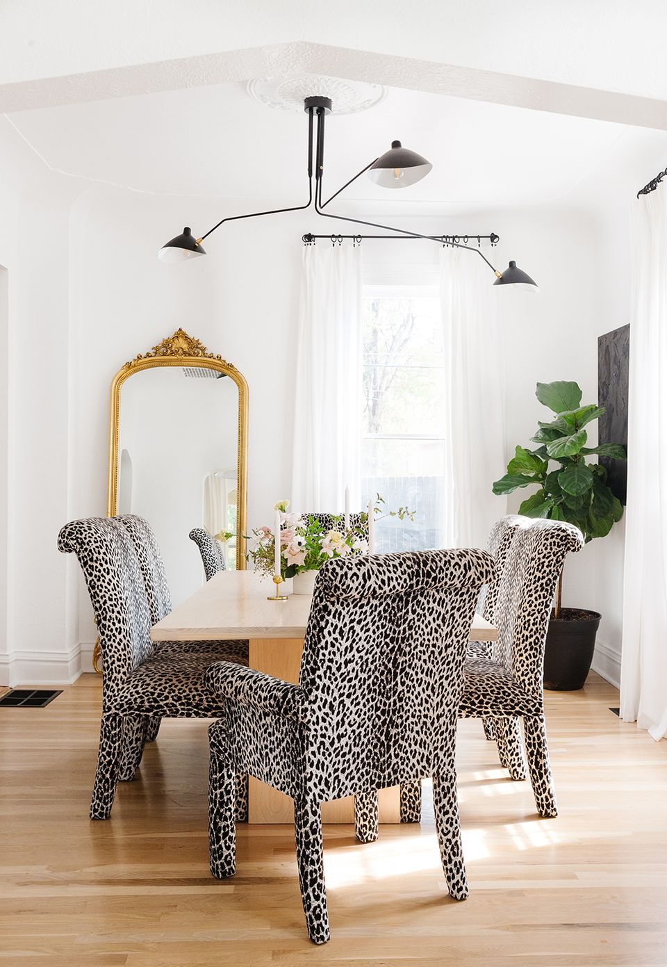
Hear us out: animal print is a perfect pattern to consider if you subscribe to a minimalist aesthetic. It’s pulled from nature, comprised of neutral hues, and will add a pop of personality in one fell swoop. Consider a leopard, cheetah, or antelope print (used sparingly, of course) to lend personality to a white-on-white space.
Want help finding your own version of a warmer neutral palette?
Knowing which of these nine hues works with your light, floors, and furniture is a lot easier with a second opinion on your actual room. A Havenly designer can build that palette specifically for your space.
Take the Havenly style quiz — it takes 10 minutes and matches you with a designer who'll build a full neutral palette that fits your home.
Not ready to commit? Try Havenly AI — snap a photo of your room and see it reimagined with a warmer neutral palette.
Frequently Asked Questions
What counts as a neutral color in interior design?
Traditionally white, beige, and gray. But designers also treat black, navy, and even olive green as neutrals because they pair easily with almost anything, including bold accent colors.
How do I add color to an all-white room without overdoing it?
Start small. Try a stack of throw pillows, one accent chair, or a set of picture frames. You can always swap them out later if the color doesn't stick.
What's the difference between a warm and cool neutral?
Warm neutrals, like tan, cream, and terracotta, have yellow or red undertones. Cool neutrals, like gray and charcoal, lean blue. Mixing both keeps a room from feeling flat.
Is animal print considered a neutral?
Yes. Because it's drawn from nature's own palette, animal print reads as neutral even though it's technically a pattern, which is why it pairs so easily with other colors.
What's the easiest neutral to start with if I'm coming from an all-white room?
A warm sandy or greige tone. It reads as barely-there compared to a bright white, so it feels like a safe first step before moving into deeper earth tones.
Can I mix multiple neutral undertones in one room?
Yes, but pick a dominant undertone, warm or cool, and let the other show up only as an accent. A 50/50 split between warm and cool neutrals can read as slightly off rather than intentional.
Related reading
- 10 Timeless Neutral Color Palettes That Interior Designers Call “Perfect”
- 4 Reasons Why Gray Is Out And Warm Neutrals Are In
- 10 Designer-Approved Colors That Go With Gray — Because Neutrals Aren't the Only Option
This story was originally published on August 5, 2024. It was updated on July 10, 2026.
