This Designer’s Chic Townhouse Doesn’t *Look* Budget-Friendly — But It Is

As a Havenly lead designer, Kelsey Fischer knows all the tips and tricks for crafting a chic home on a budget. She’s helped countless clients upgrade their spaces without breaking the bank, so she was well prepared to apply the same economical strategy to furnishing her own Denver, Colorado townhouse.
From sourcing secondhand treasures to clever DIY projects, Fischer was equipped with cost-saving techniques to use while decorating, but surprisingly, she didn’t have a specific look in mind. “It just evolved based on elements I knew I wanted to keep and new pieces I discovered along the way. I made the various selections work by tying together a complementary palette and silhouettes,” she explains. “I wanted our home to feel cohesive, but I like that the overall combination was unplanned.”Fischer also had to consider the existing features of her contemporary prefab building. She highlighted the high ceilings and fresh finishes, while adding character to the overly gray palette and indistinct architecture. She also embraced the natural sunshine, which is rare with a long and narrow floor plan. “Do all the windows also look directly into my neighbors windows? Yes, but I love the added light,” she shares.
With a keen eye for pre-owned pieces, clever handiwork, and a spontaneous mentality, Fischer curated the home of her dreams for a pretty low price. Here’s how she made it happen.
Achieving a Lived-In Living Room
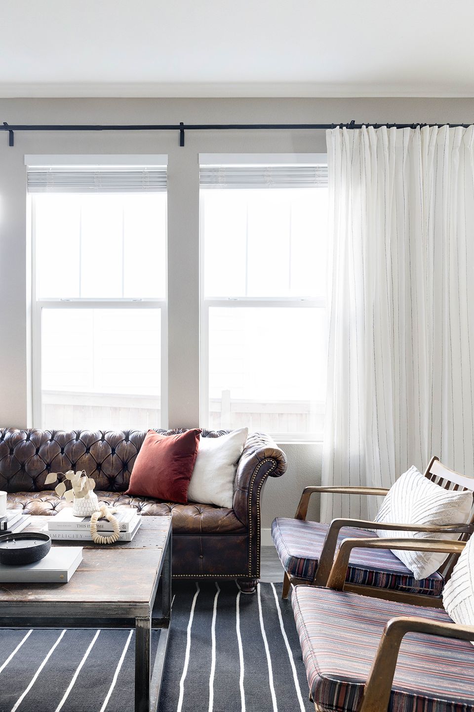
The first decision Fischer made was easy: The living room would revolve around the coffee table she built with her husband as newlyweds. “We didn’t have the budget for the one I really wanted, so we made it with the wood from a garage work table and a scrap metal frame,” she reveals. “Is it the most polished and designer piece? No, but it is part of our history now 10 years on, and I love it.”
Fischer’s next choice was practical, rather than nostalgic. She situated a consignment shop leather Chesterfield sofa against the wall and paired it with a set of spindle-back accent chairs to maximize seating without crowding the tight area. “I didn’t want the room to feel closed in,” she reasons. “I also chose an open style console to keep it from seeming too bulky.”
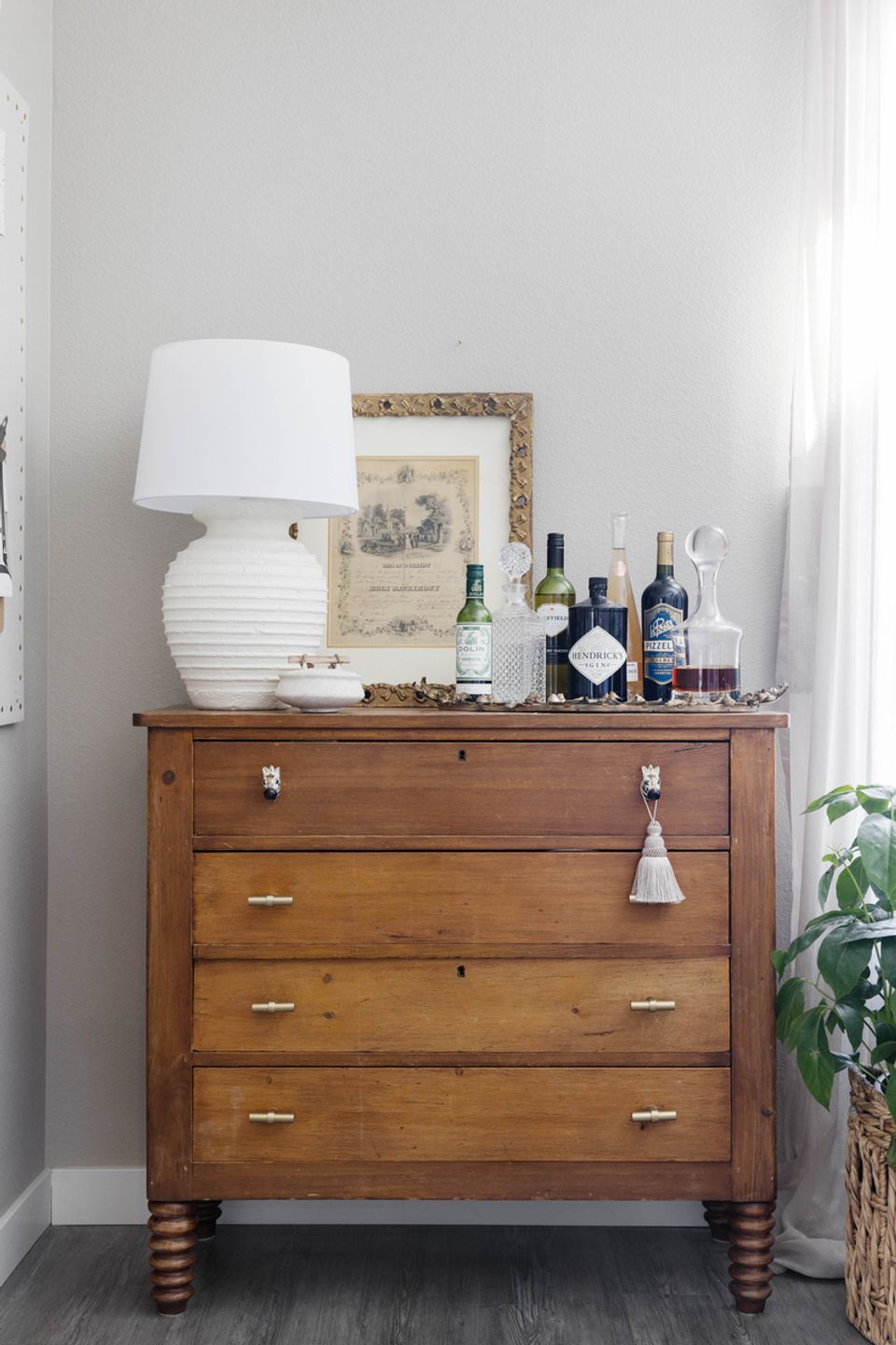
In both the living room and the adjacent office, Fischer opted for a high-contrast look that provides continuity between the two places. “Linking the black striped rug with the bold art in the office, and the more traditional sofa with a traditional desk, creates a story,” she says. “That’s super important to me, especially in spaces that are connected.”

Prioritizing Function in the Office
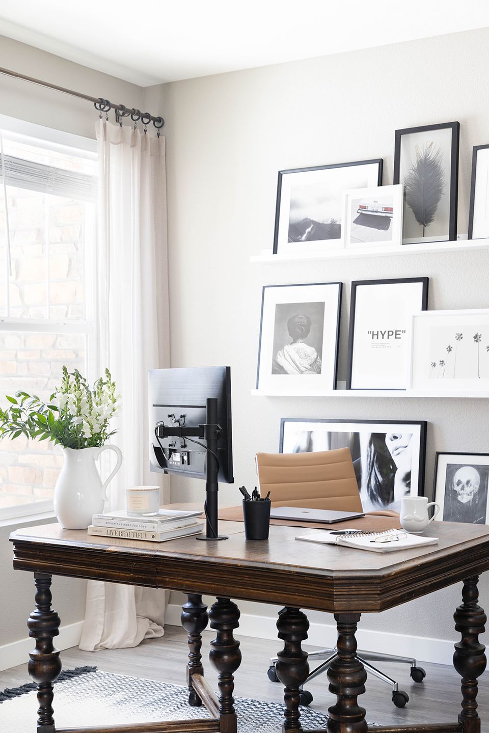
Due to the pandemic, Fischer had to design her office quickly — and during a supply chain crisis. She couldn’t wait six months for a desk to arrive, so she found a walnut dining table on Facebook Marketplace to use instead. “This was originally our dining space, so the size of the table worked great,” she admits. “I repurposed our gallery wall to be my Zoom background and it has been a great swap!”
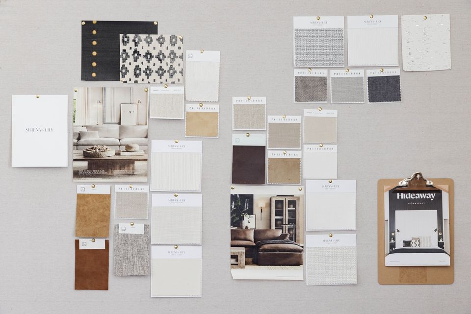
Fischer also constructed a DIY pinboard for visualizing and strategizing new work. “That was a pandemic special while I needed something to keep my mind occupied,” she says. “DIY can really save you money. I am a big fan of sustainable design, and taking on a few easy DIY projects is a great way to stretch your dollar and create something truly unique in your space.” Pro tip: layer swatches and inspiration images in an organized yet asymmetrical layout for an artful moment.
Making Peace in the Bedroom
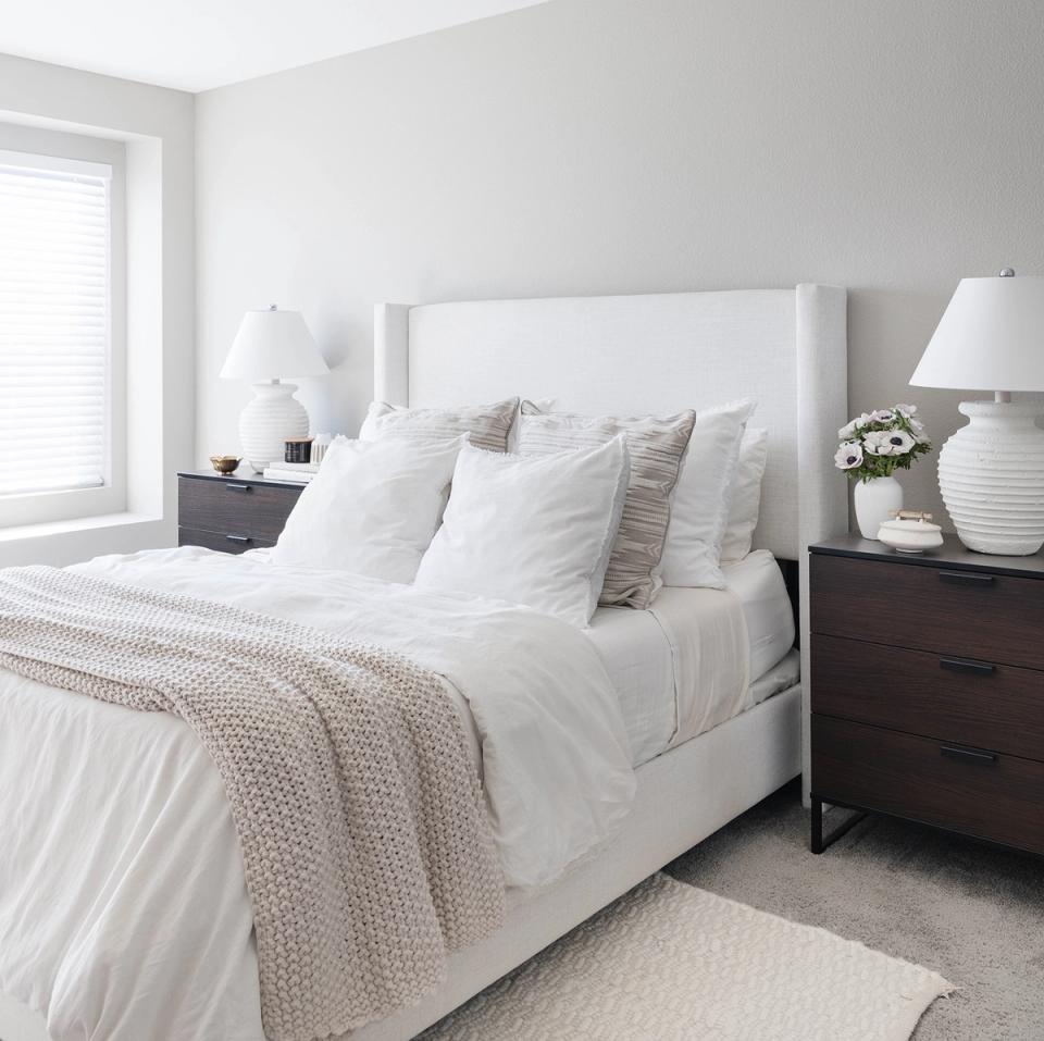
If the office is dedicated to productivity, then the bedroom is intended to be the polar opposite. Fischer fashioned a tranquil, monochromatic ivory oasis with a variety of soft textures that welcome sleep and relaxation. “I wanted to keep it peaceful,” she insists. “I don’t like a lot of color, but I wanted it to feel layered and fresh. The bedroom is a place to unwind, and I definitely prefer that minimalist look.”
Nesting for the Baby
The nursery is equally serene, but with an added whimsical flare inspired by children’s books like Peter Rabbit and Wind in the Willows. With gender-neutral pastel hues, a flowy crib canopy, and a cozy McGee & Co. bouclé swivel chair, the aesthetic is entirely magical rather than trendy.
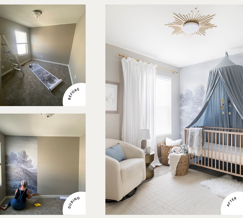
Fischer and her mom installed a non-toxic, peel-and-stick wallpaper mural of a watercolor countryside landscape. The dreamy backdrop is enhanced by celestial accents like a star and moon mobile, a sunburst medallion light fixture that Fischer’s husband made with laser-cut, spray-painted plywood, and matching drawer pulls on the dresser. The result is out of this world.
Fast Five with Havenly Designer Kelsey Fischer
Three things you can’t live without?Something to make the house smell good (candles, flowers, diffusers), cute coffee mugs, and plants — they bring me so much joy!
Best budget-friendly design tip?Be strategic! Hunt for cool and unique pieces in less mainstream locations, like estate sales, consignment shops, and secondhand stores. That’s where you’ll find treasures no one else has.
How might we find you lounging? Probably in sweats with a cup of coffee that has been reheated 100 times. Home is where I can relax and where everyone is allowed to be comfortable and themselves!
Weirdest thing we might find hidden in your sofa cushions?Baby socks and hair ties, for sure.
One thing everyone should have?Ambient lighting. It goes such a long way to create a cozy feel for whatever space you’re in!
From budget hacks toperfecting room flow, our designers are chock-full of expert tips. Start with our style quiz to work with a design pro one-on-one.