Design Project
Bachelor Star Katie Thurston’s NYC Apartment Is Just As Warm & Down-To-Earth As She Is
See how Bachelor star Katie Thurston transformed her NYC apartment with designer Neha Kaimal, blending mid-century modern with playful touches.
See how Bachelor star Katie Thurston transformed her NYC apartment with designer Neha Kaimal, blending mid-century modern with playful touches.


Expert guides on styles, layouts, and color

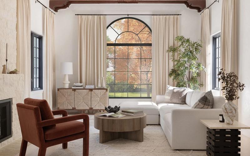
Hanging curtains the right way comes down to five steps: measure twice, choose the right fabric for the light you want, pick a curtain style, match your hardware, and install high and wide. The cardinal rule? Mount the rod close to the ceiling and well past the window on each side, then let the panels just kiss the floor. Havenly designer Brady Burke walks through each step below.

Brainstorming ways to hide cords without rewiring your house? We’ve got you: Clip them along furniture legs, run them under rugs, paint them the same color as your wall, or obscure them entirely with a strategic plant. The trick isn't making cords invisible—it's making them blend in so well your eye stops registering them. Below, Havenly designer Brady Burke walks through seven low-effort fixes.

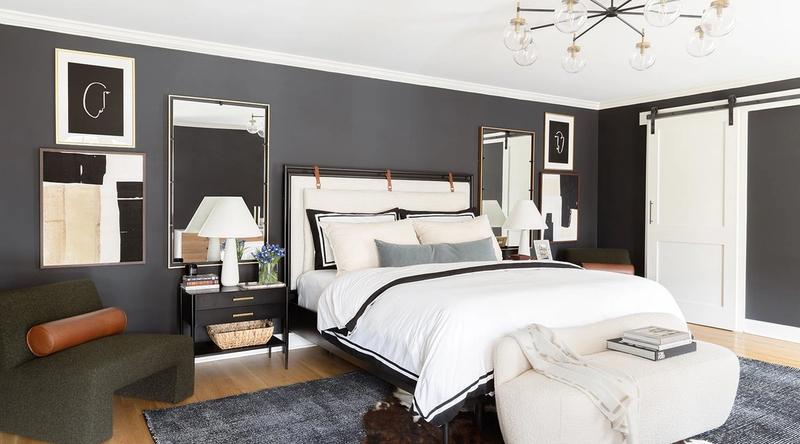
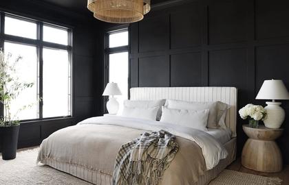
Arranging pillows on a bed comes down to one thing: balance. Whether you want clean and simple or layered and luxe, pick a pillow count, commit to it, and let everything else follow. Below, 20 designer-approved arrangements—plus how to copy each one in your own bedroom.
The people behind our design advice and inspiration
Work one-on-one with a Havenly designer to bring your dream room to life.
Get Started