This Artist’s Bay Area Boho Home Is Filled With Story, Color, & Creativity

Anjelika Temple knows a thing or two about maximalist, bohemian design. The co-founder of Brit & Co and Havenly’s very own editor-in-residence considers herself an artist first and foremost, and has been slowly designing her Bay Area abode with husband David and their two young daughters, Anokhi and Indira.
But, when stumped by the flex playroom-slash-living-space at the heart of their home, Anjelika tapped Havenly designer Melissa Wagner for some assistance. “Our living room has felt like a furniture store for awhile now,” notes Anj. “I really wanted to create a cohesive seating area that would fit in with our colorful, bohemian aesthetic.”

Inspired by the Temple family’s love of art, color, and plants, Melissa got to work on carving out a designated “adult” seating area in the open-concept space. “We were able to arrange the sofas to create a subtle division between the two spaces, while maximizing seating in the main living area,” explains Wagner.
Ahead, step inside the Temple family’s brand-new living space, and tour the rest of their art-filled, bohemian oasis. (Be prepared to pin.)
Making Space for Zen


Thanks to the revised layout and new area rug, the finished living space “feels like a real room now,” says Anjelika. “It flows seamlessly into the dining and play areas, while doubling as a place of comfort and zen once the kids go to sleep.” Wagner nailed down the larger pieces first, and then brought in decorative elements to cozy up the space, like the woven pendant lights, colorful throw pillows, and complementary rug. “We were able to maintain the youthful kid’s area while seamlessly integrating seating that’s just as colorful and vibrant, but clearly more sophisticated,” she adds.
Putting the "Play" in Playroom

As a creative herself, Anjelika wanted to leave plenty of space for free play in the main living area. “This is where we have daily dance parties and create a lot of art as a family,” she explains. In addition to a cozy rug, floor pillows, and a do-it-all arts and crafts table, the space is brimming with colorful books, plants, and artwork. “I love combining everyday kid art with prints we’ve collected over the years,” she adds. “That juxtaposition feels like an accurate visual portrayal of who we are: one part chaotic, one part design-oriented, and all parts color.”

Dining in Style


The open-concept living and dining areas are the epitome of boho maximalism, with one unifying design element: color palette. “I intentionally chose a few hero colors and visual motifs to repeat throughout our home,” explains Anj. “You’ll find deep teal, marigold, and a variety of warm pinks throughout, which creates balance and harmony.”
Designing a Sanctuary


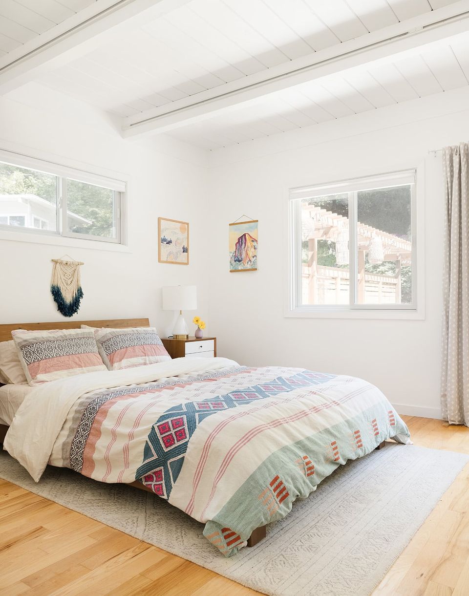
Anjelika’s maximalist aesthetic takes a slight backseat in the bedroom — a very intentional design choice on her part. “In order for maximalism to work, you have to have a few spaces that lean minimalist to balance out all that color and pattern,” she explains. “That’s exactly what I did in our bedroom — while the bedspread is still colorful, it’s pretty much a blank canvas compared to the rest of the house. I feel so at rest in here!”
Inspiration Everywhere

Anjelika’s home office is every bit as playful as you’d expect. She went with a clean, minimalist desk and office chair surrounded by colorful artwork and fresh blooms. But for her, the most important design element is the front-row window seat. “If I’m ever short on inspiration, I go for a hike,” she explains. “I find nature so inspiring — breathing the fresh air and ogling all the plants at various stages of life really it fills me up!”
A Proper Art Party


Even the girls’ shared bedroom stays true to the overarching design aesthetic, down to the vibrant color palette and personalized artwork. “Art is obviously a theme here, but I really do love how much of the art on our walls was made by us or someone we know,” notes Anj. “To me, it’s the ultimate DIY hack!”
Lounging In Paradise


True to form, the patio is every bit as colorful and vibrant as the home itself (thanks to a little help from The Inside, of course). Anjelika went with a clean, minimalist canvas with pops of color, pattern, and texture throughout. “The outdoor space here really won us over,” she explains. “We spend so much time out here painting, crafting, eating, and just hanging out.”
Looking for a way to overcome your unique home dilemmas? Work one-on-one with our expert interior designers for just $129 per room. Get started today with ourstyle quiz.