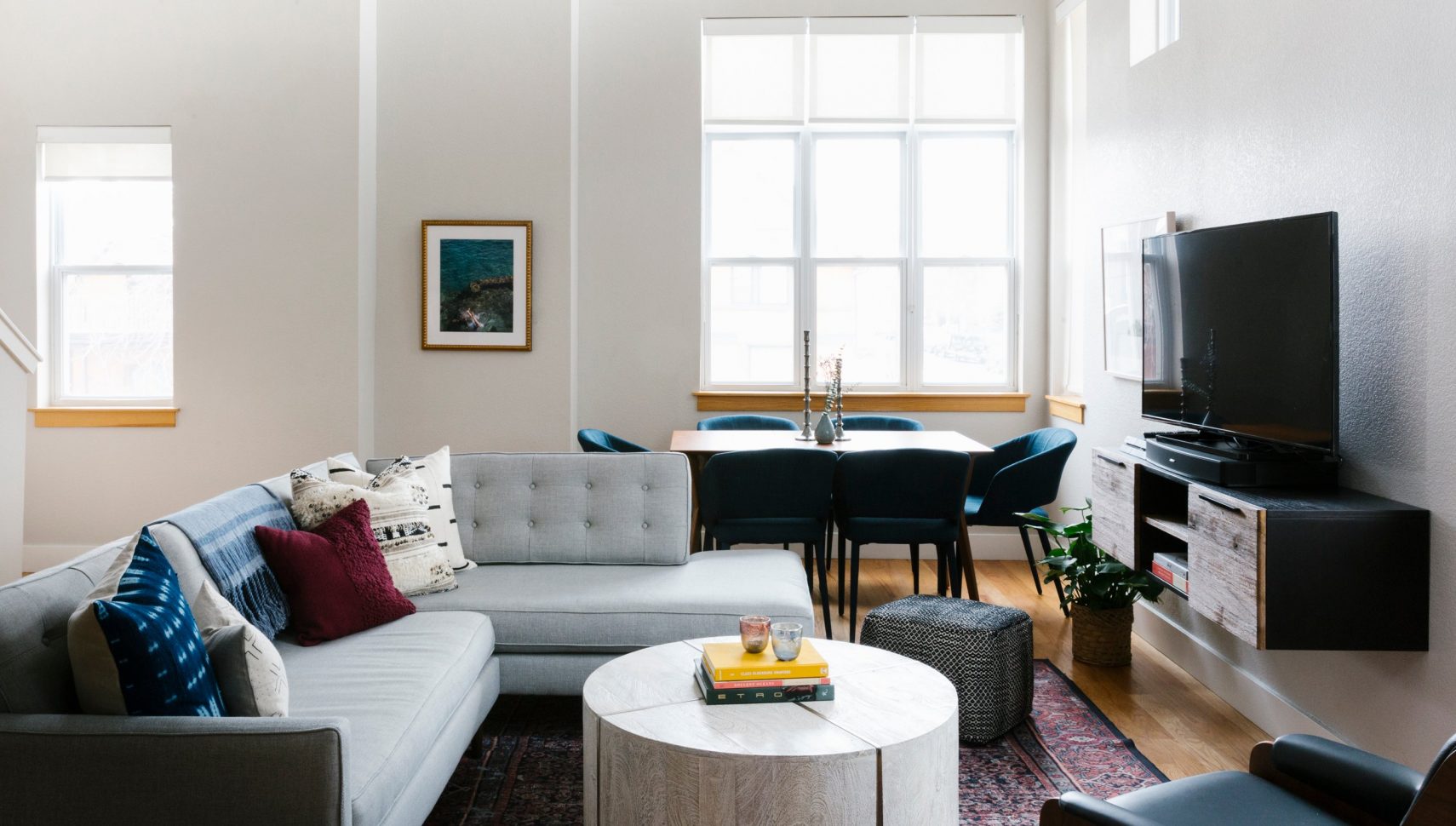
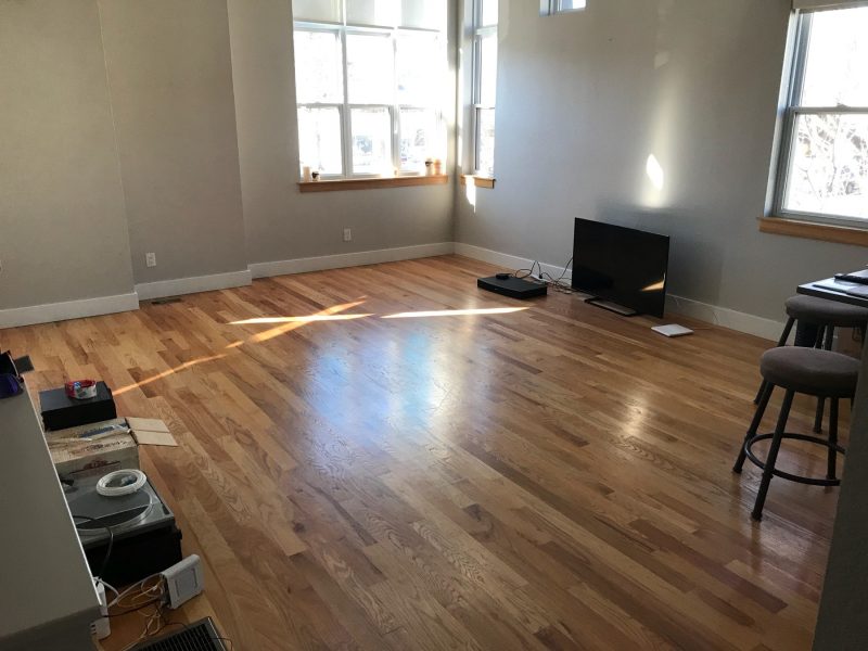
When Kurt moved into his new Denver house, a beautiful blank slate with tall windows and even taller ceilings, he “really wanted to make the space [his] own.” While he was excited to create the perfect look for his new home from scratch, Kurt had no furniture to fill the expansive space. Really, none. His before photos of the space showcase a TV and not much else.
Kurt’s house also presented some architectural challenges. It’s hard to create distinct areas in an open-concept space, and Kurt wanted both a living area and a dining room. Double height ceilings meant the walls were a huge blank slate. And, while the room felt spacious and light, it was a typical urban space in its square footage—small.
Kurt felt overwhelmed at the prospect of furnishing his new place, realizing that on his own “the task could take months.” So, he turned to Havenly for help, and was matched with his designer Heather. He liked her modern, comfortable style, and wanted to bring that feel into his new home. Luckily, she was able to “dial in” on his style immediately.
Kurt is a young, hip, and busy sales executive, so he wanted his home to be a comfortable place to come home to that would also be a great spot for entertaining his many friends. Heather started the process of creating the space by figuring out what pieces Kurt would need to use the living area functionally. They agreed upon comfortable seating for plenty of guests, a console to store his collection of records, and a coffee table substantial enough to use as a footrest (obviously a lounging necessity).
Heather presented Kurt with several design directions, each focused around a slightly different color scheme. Kurt initially liked the thought of a neutral palette, and Heather gave him an idea board built around that idea, with plenty of subtle textures. She also created a design centered around shades of blue, which featured some great Shibori textures. But, Kurt had some reservations: “I feel like my whole life has been about blue and everything associated with blue, so I’m trying to avoid doing a heavy blue room.”
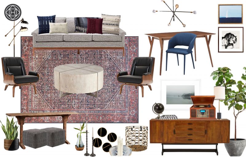
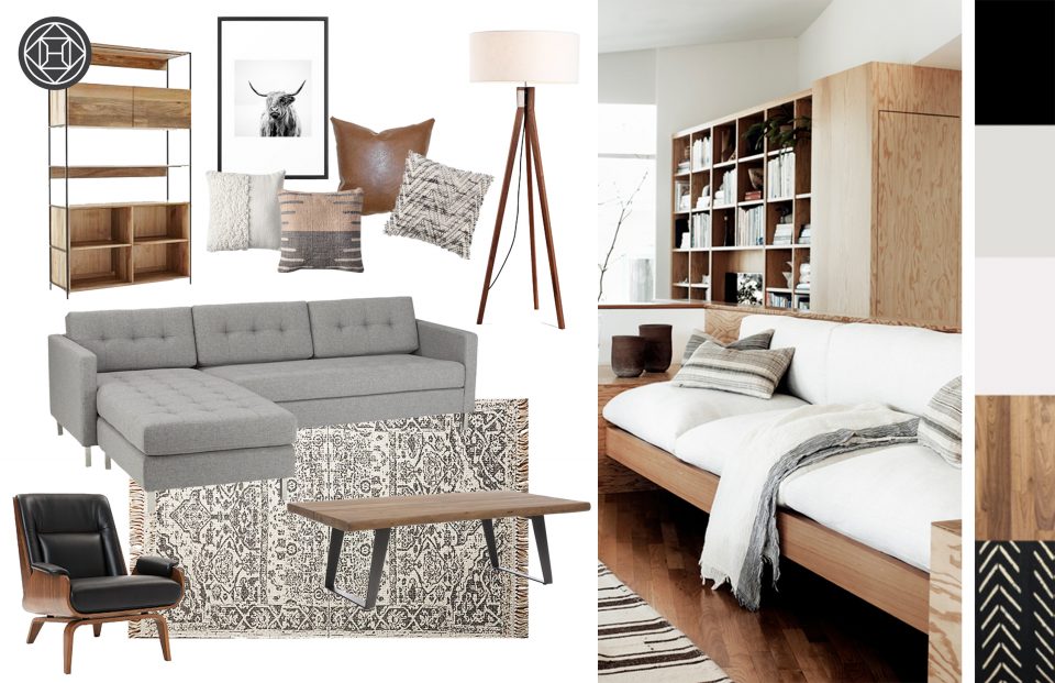
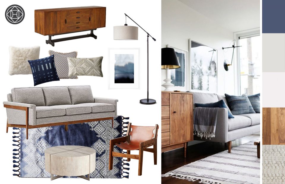
With that in mind, Heather’s third idea pulled together the lighter furniture pieces Kurt loved with a warmer color palette—a great burgundy rug that blended nicely with only a hint of blue. Kurt loved the direction, so when Heather developed her detailed design concept for the space, she used it as guidance. She created two concepts that perfectly balanced “mid-century style and classic comforts”, but each played around with slightly different lighting combinations and accessories.
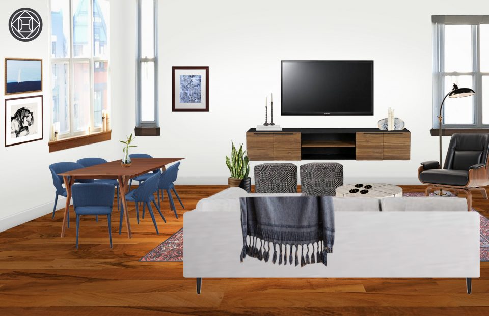
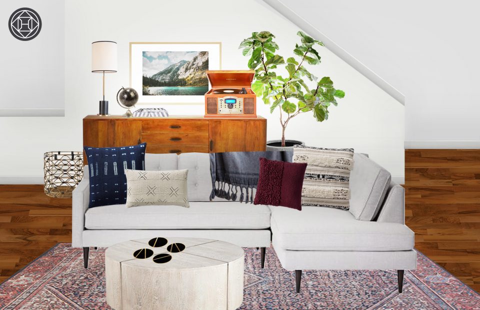
After consulting with Heather, Kurt decided to forego a bulky chandelier, since his space already had so much light. He chose a lighter sectional sofa and a substantial coffee table that brought some curves into the space. Together, the pair chose some modern, sculptural dining chairs, but brought plenty of warm wood into the space with a floating media stand and a gorgeous console. Kurt’s favorite piece, a midcentury style lounge chair, fit perfectly, even with all the other furniture.
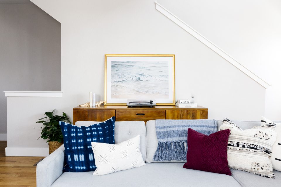
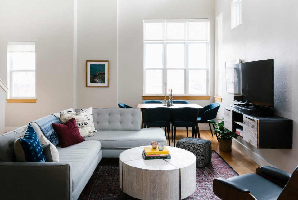
With Heather’s design help, Kurt’s new home feels finished and polished. The space is perfect for working from home or hosting a crowd. And, in the best test of a design’s staying power, the client is happy. Kurt can’t get enough of his new home—a good thing, since he spends “most of his time” in the new room. He “can’t believe how much Heather transformed this place”, and honestly, we can’t either. Fingers crossed we get the invite for Kurt’s next shindig.

