The Do’s and Don’ts of Gallery Walls
Ask any Havenly designer: Gallery walls are a definite “do.”
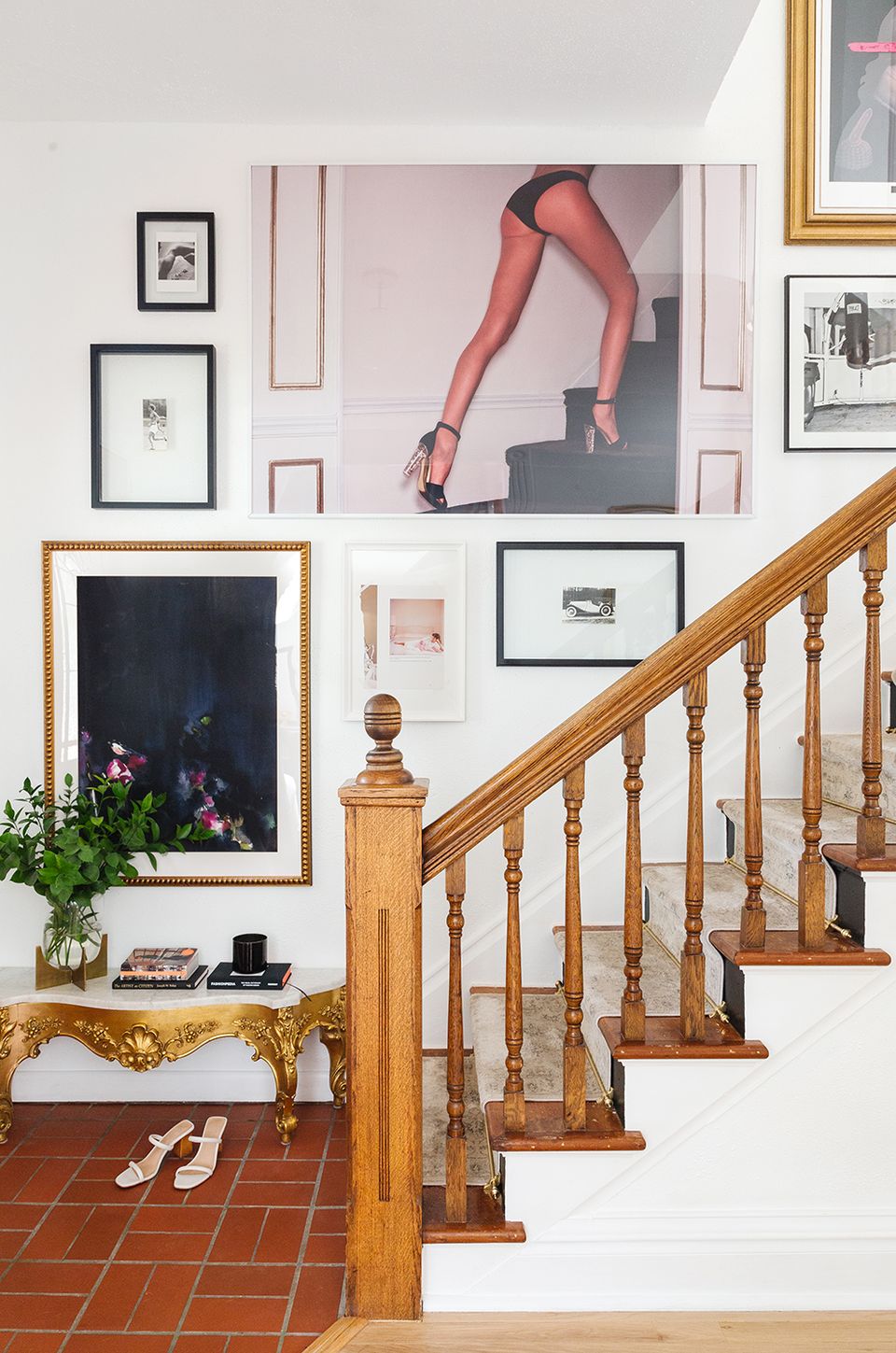
The works of art and the photos you display on a gallery wall tell the world who you are and what you love. Collected over time or curated over a weekend, they become the centerpiece of your own personal museum exhibit.
The result is meaningful and impactful—and easily achieved. Use these do’s and don’ts of gallery wall as your guide (or get inspired by these gallery walls):
The Dos
Do make it personal.
Showcase pieces that feel meaningful to you or are a curation of artwork that you adore.
Do keep it cohesive.
Work within a color palette that not only ties the pieces together but also complements your room design. The goal is achieving balance and cohesion.
Do frame it.
Opt for the power of repetition with frames that have a consistent look and feel. Or create visual contrast with a variety of colors and styles.
Do plan ahead.
Measure your wall space and tape off those dimensions on the ground first. This allows you to map out your layout before putting nails into the wall. If you’re really a perfectionist, you can cut out poster boards the same size as your frames to allow you to experiment directly on the wall. (Head here for more hanging advice.)
Do keep ‘em separated.
Hang pieces two to three inches apart so they feel connected to one another. Always use a level and tape measure to keep you on track.
Do start big.
Hang the largest piece first, typically in a central location, then balance with smaller pieces to the right and left, mixing up the visual weights so the final display doesn’t feel lopsided.
Do consider picture ledges.
If you’ve got commitment issues when it comes to your walls, opt for picture ledges. They’re easy to hang (don’t forget to use your level) and let you swap out art and photos in seconds.
The Don'ts
Don’t go for the obvious.
Avoid word art and cliche pieces of art.
Don’t hang them too high.
We typically suggest hanging artwork about five to eight inches above a key piece like a sofa, console or sideboard.
Don’t go too small.
The beauty of a gallery wall is it can easily adapt to fill a large wall and create a statement impact.
Don’t force symmetry.
Matchy-matchy is out if you’re going for an organic gallery wall. Play around with scale and placement for that effortlessly styled effect.
Don’t forget to curate.
Again, gallery walls are beautiful and dynamic when the individual pieces have been collected over time and artfully work together.
Don’t limit yourself to framed pieces.
You can always incorporate sculptural pieces alongside your artwork. Think of how a mirror, a flat basket or even sculptural art will add texture, dimension and personality to your gallery wall. Just like your framed art or works on canvas, these pieces should be curated to complement one another. Consider the overall palette, scale and texture. If you’re adding sculptural pieces, for example, include at least two or three so it doesn’t feel like your gallery wall contains a single offhand or unrelated piece.
Map them out just like you would the art itself, carefully staggering more dimensional items so they feel artfully scattered throughout your gallery, rather than weighted to one side.
Take ourdecorating style quiz, select the spaces that make your heart race, and we’ll point you toward your perfect interior design style.
