These 9 Designer Bedroom Color Palettes Feel Both Calming & Chic
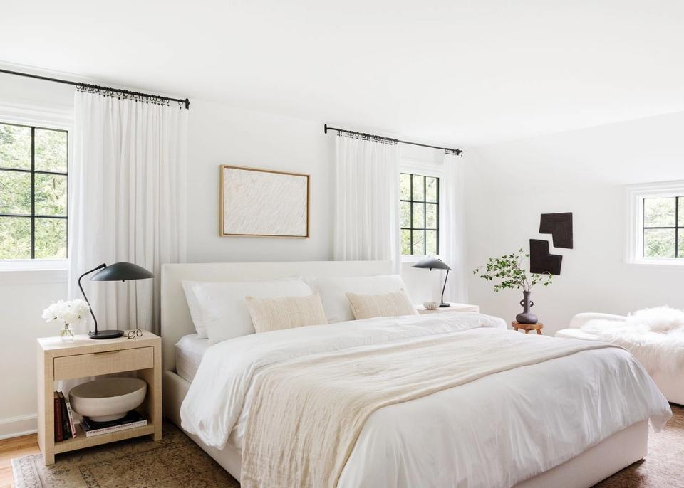
You may take the occasional nap in your living room, practice self-care in your main bathroom, or even unwind after work in your sunroom with a glass of wine. But of all the rooms in a standard home, the bedroom is where relaxation is paramount.
While we love a bold accent wall or eye-catching pop of color, we’d argue that all of your design choices, from the bedding to the color palette, should work towards the end goal of rest and rejuvenation. Save the stimulating patterns and awe-inspiring wall art for your home office or living space.
When curating a soothing space, color palette is a logical place to start. We’ll spare you the lecture on color psychology, but your chosen scheme in any given room will set the atmospheric tone. Ahead, Havenly designer Kelsey Fischer shares the soothing bedroom color palette ideas she has bookmarked for design projects:
1. High-Contrast Neutrals
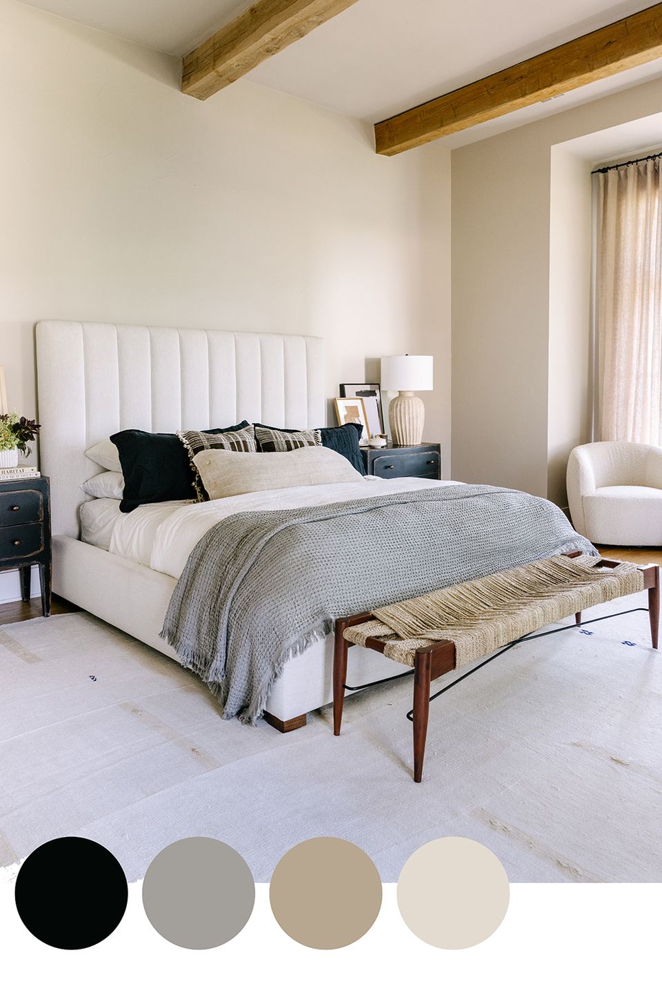
Doze off in a sea of calming neutrals like taupe, beige, and gray, with a hint of bold black for good measure. While the overall palette leans serene and neutral, the high-contrast black adds just enough drama.
2. Coastal Blues & Grays
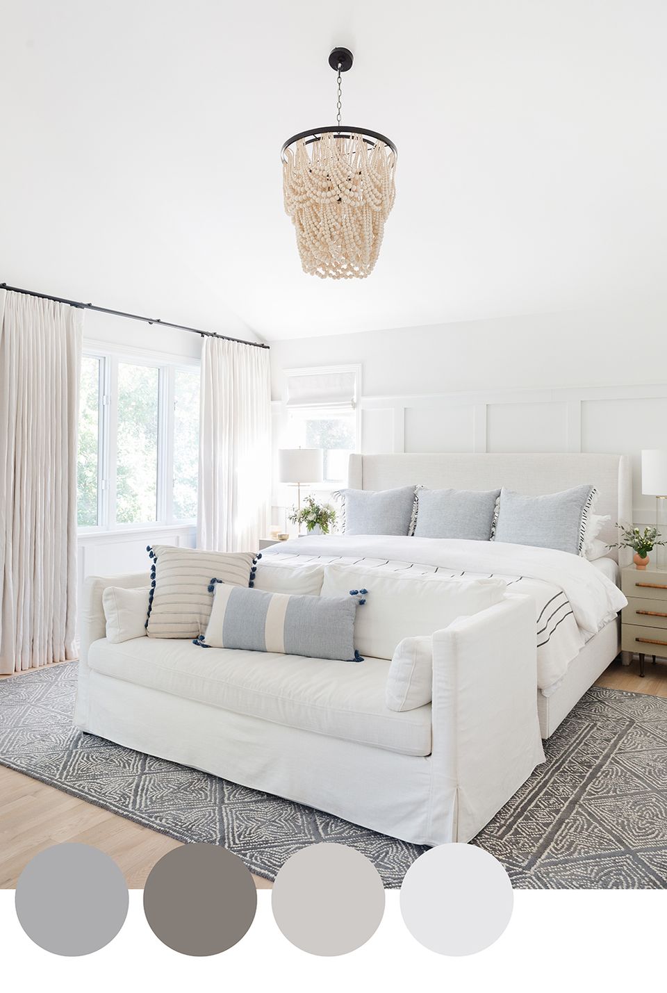
Soft blues and wispy grays could be considered the quintessential calming color palette (not to mention a Coastal Grandmother favorite). For a truly serene bedroom that is basically a design lullaby when you walk through the door, opt for soft gray, warm cream, and barely-there blues.
3. Boho Natural
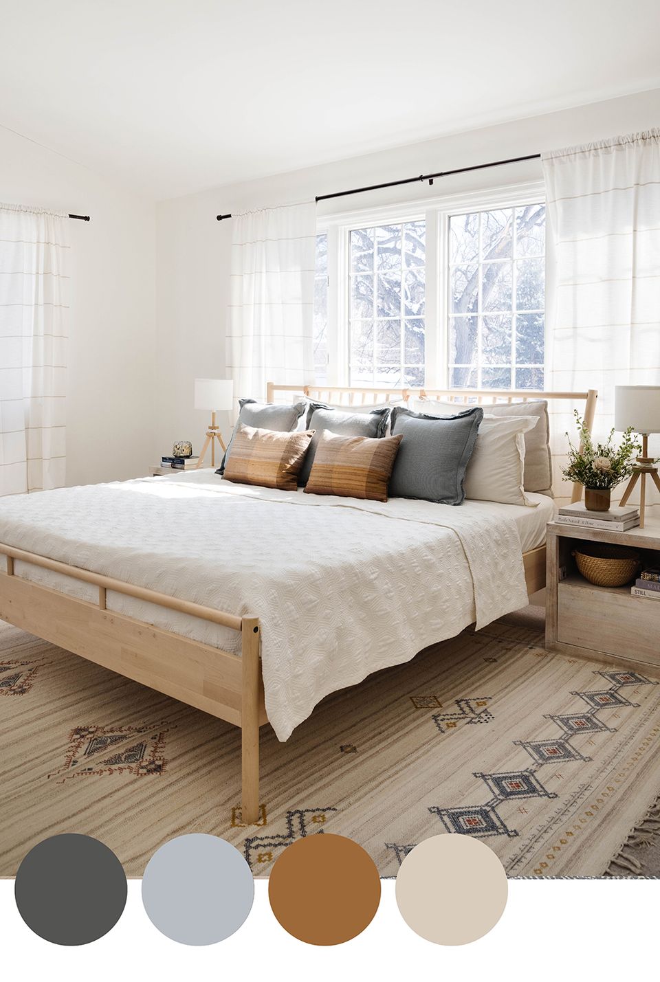
Earth tones take inspiration from — you guessed it — mother nature, and will therefore always lean relaxing. From soothing stone gray and warm white to soft ochre and a hint of blue, this bedroom color palette is just as timeless as it is relaxing.
4. Warm Neutrals
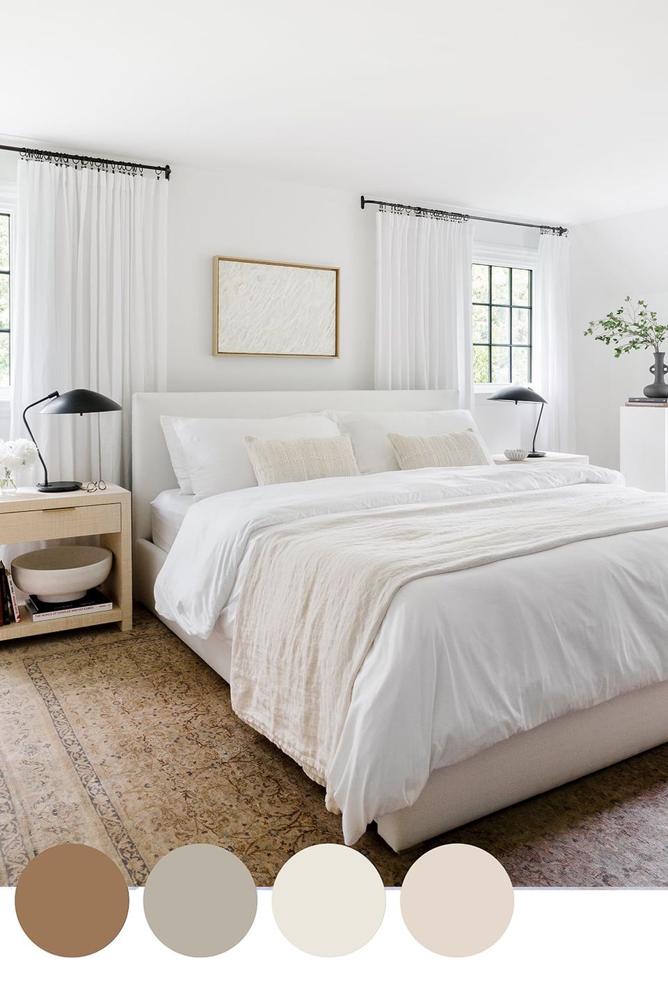
Not only is this timeless color palette incredibly soothing, it’s completely on-trend (ICYMI: warm neutrals are the new gray). If you love the organic modern look, opt for layers of ivory, beige, taupe, mushroom, and a hint of rich brown (preferably from a vintage rug). Does it get any cozier?!
5. Moody Organic
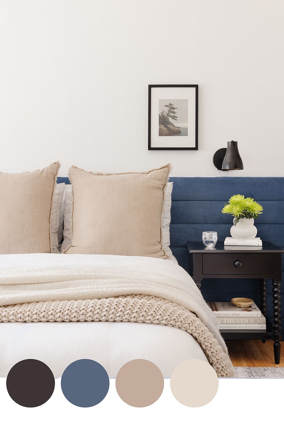
Thanks to the neutral earth tones and the hints of moody blue and black, this palette is perfectly balanced, sophisticated, and a touch bold. It’s design-forward and visually arresting, while still offering an air of calm.
6. Calming Pastels
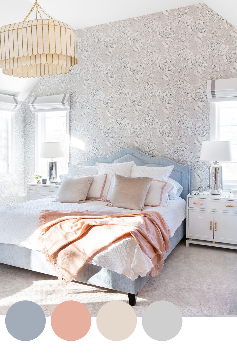
There’s something soothing about baby-soft pastels — there’s a reason they’re commonly used in nurseries. This palette of barely-there blues, warm blush, and soft ivory will have you counting sheep in no time.
7. Periwinkle Pop
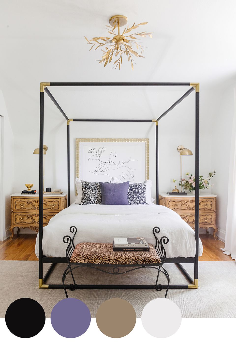
The smell of fresh lavender is known to relax the nervous system, and we’d argue that the same can be said for lavender decor. While this palette leans a touch glam with black and brass finishes, the layered beige and ivory bedding, plus a soft periwinkle pop, feels perfectly calming.
8. Country Blues
Nothing says serene quite like layers of calming blue, from rich navy to subtle gray-blue. Paired with the rich brick and warm wood flooring, the effect is tranquil and a touch country-inspired (down to the fresh wildflowers).
9. Dark & Moody
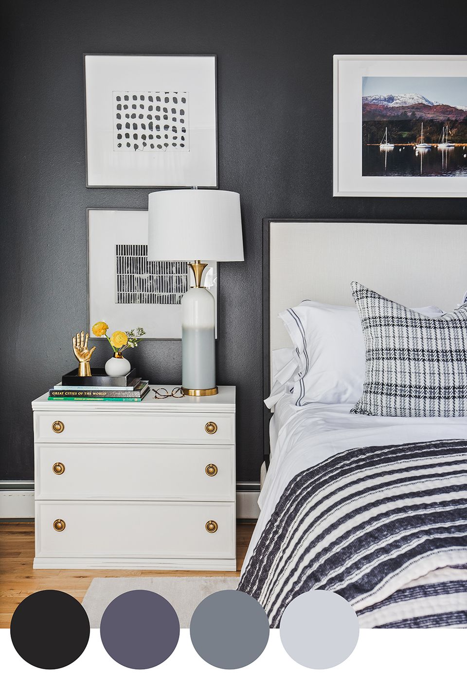
One could argue that a dark, moody color palette is just as relaxing as a soft one, especially in a bedroom. Wall-to-wall shades of deep navy, denim blue, and soft slate gray create an all-encompassing mood that’s absolutely perfect for an afternoon nap.
Want help finding the right calming palette for your bedroom?
Picking a palette from a list is one thing. Knowing which of these nine actually works with your light, your existing furniture, and how you sleep is another. That's the kind of call a Havenly designer can make in about 10 minutes.
Take the Havenly style quiz — it takes 10 minutes and matches you with a designer who'll build a full bedroom palette that's tailored to your space.
Not ready to commit? Try Havenly AI — snap a photo of your bedroom and see it reimagined with a calming palette that actually fits.
Frequently Asked Questions
What's the best color palette for a relaxing bedroom?
Soft neutrals, blues, and grays tend to feel the calmest, but a well-balanced moody palette can be just as restful. The key is keeping contrast low and skipping busy patterns near the bed.
Should I avoid bright colors in a bedroom?
Not entirely, but save bold, high-energy colors for accents rather than the whole room. A bedroom works best when the palette supports rest instead of competing for attention as soon as you walk in.
What's a good accent color for a neutral bedroom?
A touch of black, navy, or soft periwinkle adds depth without disrupting the calm. Keep it to one or two spots, like a nightstand or a throw pillow, rather than spreading it around the room.
Do warm or cool tones make a bedroom feel cozier?
Warm neutrals, like taupe and mushroom, tend to feel cozier than cool grays. If you want a serene but not sterile bedroom, lean warm and add texture through bedding and rugs.
What's the easiest palette to start with if I'm nervous about color?
High-contrast neutrals: a warm white wall with a deep espresso or charcoal bed frame. It reads as intentional and calm without asking you to commit to an actual color.
Do I need to match my walls, bedding, and curtains to the same palette?
No, matching everything exactly usually reads as flat. Pick one dominant tone for the walls, then let bedding and curtains riff on it a shade lighter or darker for depth.
Related reading
- 8 Designer-Loved Bedroom Paint Colors for a Stunning Sleep Sanctuary
- 11 Unexpected Bedroom Color Ideas Designers Turn to Again and Again
- 10 Timeless Neutral Color Palettes That Interior Designers Call “Perfect”
This story was originally published on October 17, 2024. It was updated on July 10, 2026.
