Benjamin Moore Alabaster Is The Perfect Soft White Designers Love — Here’s Why

Finding the right white paint color for your home is a lot like finding the perfect white t-shirt: It can take some searching high and low before you find the one that’s just right. But with a bit of expert guidance, that search becomes instantly easier. That’s why we’re here to share one of our designer go-tos: Benjamin Moore Alabaster is a tried-and-true white paint color can work in just about every part of your home.
Of course, the right white paint for your needs will depend on the lighting in your space and the colors you’re planning to pair it with. But Benjamin Moore Alabaster is a versatile hue worth considering for your next paint job.
Why designers love Benjamin Moore Alabaster
If you’re searching for a bright, crisp white that easily reflects light off its surfaces, Benjamin Moore Alabaster is a great option. Designers love this hue because of its clean, creamy tone. It skews more warm than cool, which makes it a lovely complement to warmer woods — but it also works well against more stark blacks and grays.
What are the undertones of Benjamin Moore Alabaster?
Benjamin Moore Alabaster is technically an off-white, as it has a touch of pink in it that gives it a warmer tone, without leaning too heavily towards beige.
Does Benjamin Moore Alabaster look yellow?
Nope! Thanks to its pink undertones, Benjamin Moore Alabaster is warm white that doesn’t look yellow, even in warm-toned lighting. Instead, it has a faint rosy glow that leans a bit closer to gray.
What Benjamin Moore color is similar to Alabaster?
Benjamin Moore White Dove is another white paint color we love — it’s equally warm and cool, so it’s versatile and classic, great for a wide range of design tastes. It is ever-so-slightly less light-reflective than Benjamin Moore Alabaster, if you’re going for a more intimate feeling.
Need inspiration on how to bring Benjamin Moore Alabaster into your space? Here are a few of our favorite spaces using this shade.
Benjamin Moore Alabaster with mixed gray tones

The warmth of Benjamin Moore Alabaster accentuates the taupe hues in this living room’s stone fireplace and its brown leather accent chairs. But because the wall color doesn’t skew yellow, it still pairs well with cooler gray elements.
Benjamin Moore Alabaster with beige accents

Effortless — that’s the vibe that this home office space gives off, thanks to its warm white walls and calming beige accents. Consider it the perfect workstation to help you keep your cool, even when chaos arises.
Benjamin Moore Alabaster with warm woods

Benjamin Moore Alabaster plays just as nicely with darker tones. A dark wood table and black chairs stand out in this dining space and help to bring out the subtle gray tones in the walls.
Benjamin Moore Alabaster with neutrals

This open-concept living space is bright and sunny thanks to its large windows and sheer drapes — but Benjamin Moore Alabaster carries the natural light even further. With light neutral furnishings, the space feels even more open and airy.
Benjamin Moore Alabaster with black

Worried that a black-and-white space will look too high contrast? It’s all about choosing the right white paint. The softness of Benjamin Moore Alabaster gives this bedroom a calm and sophisticated look.
Benjamin Moore Alabaster with rust tones

Thanks to its pink undertones, Benjamin Moore Alabaster is the perfect white to use in a space rich with earth tones. The white walls amplify the terra cotta and rust details in this space — as well as its warm wood ceiling beams.
Benjamin Moore Alabaster with all-over white decor

Consider this the case for an all-white living room that doesn’t look sterile or severe. Benjamin Moore Alabaster walls look perfectly cozy when paired with a pillow-covered white sectional.
Benjamin Moore Alabaster with warm and cool details

Although this dining room is designed entirely in neutrals, it features some pretty strong contrasts — namely, cool gray furnishings and a warm wood ceiling. But thanks to its warm gray undertones, Benjamin Moore Alabaster pulls it all together.
Benjamin Moore Alabaster with cool neutrals

This organic modern bedroom is all about harmony — and Benjamin Moore Alabaster plays a key role in that. A cool gray sofa plays nicely with natural tan textures, while crisp white walls make the space look airy and bright.
Benjamin Moore Alabaster with colorful accents

While neutral colors like gray and charcoal ground this living room, Benjamin Moore provides the perfect foundation for more colorful accents on its walls. The warm white helps framed artwork and some natural foliage to pop.
Benjamin Moore Alabaster with cool gray tones
In a space rife with cooler grays and blacks, Benjamin Moore Alabaster brings a feeling of balance with its pink undertones. The subtle tint complements the tan accents in this modern bedroom.
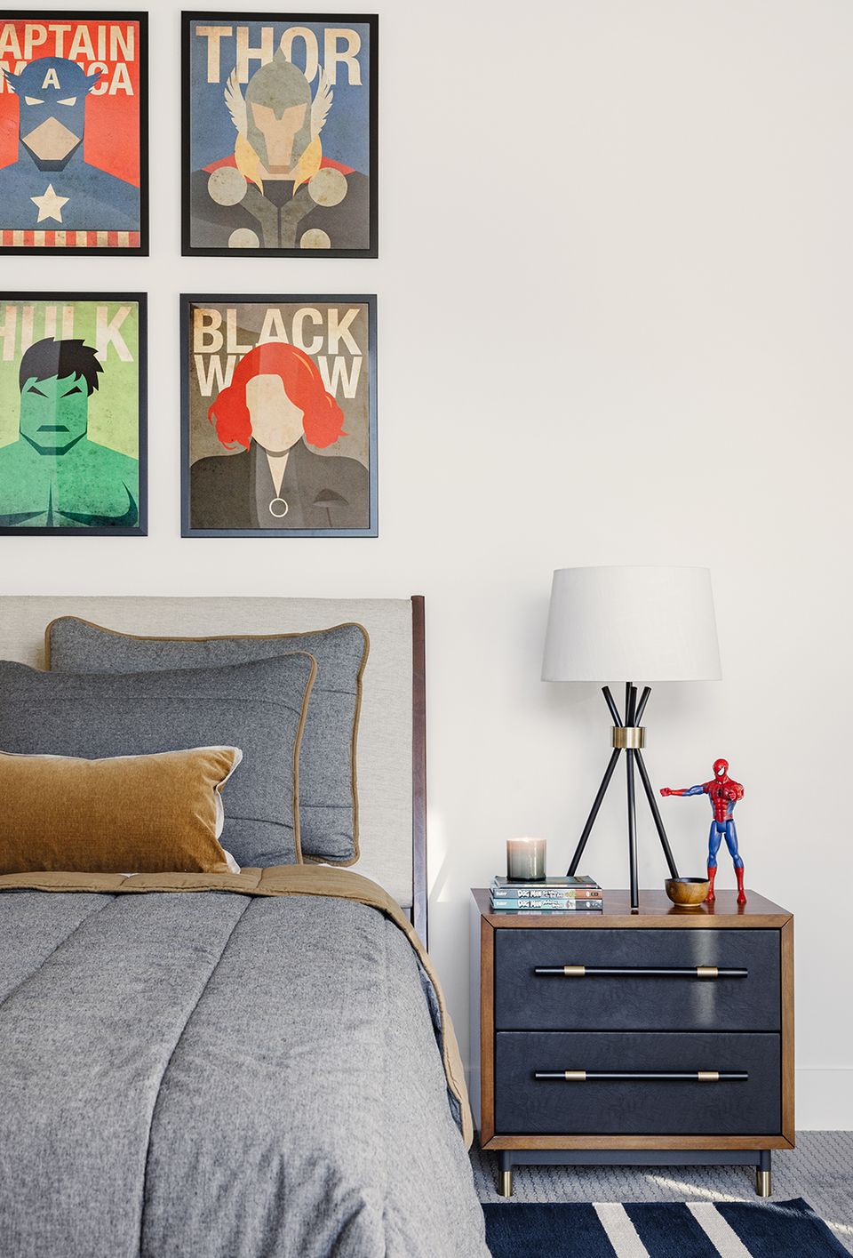
Benjamin Moore Alabaster with deep blue

Alabaster makes this calming bedroom even more serene by pairing well both with a deep ocean blue built-in headboard and warm beige throws. While the room’s bedspread leans a touch more warm than its walls, their colors complement one another.
Want expert advice on your own space, straight from an interior designer? Get started today with ourstyle quiz.
