17 Living Room Color Palettes Interior Designers Will Never Retire

In the design world, living room color palette selection is an incredibly important step in the design process. Per our opus on whole home color schemes, these chosen hues should ideally touch every room in your home, from half bathrooms to basements and beyond (no pressure or anything). What’s more, the colors in your home can have an affect on your mood — picture a bright, coca-cola red bedroom compared to a blue bedroom, for example.
Fortunately, thanks to the countless completed room designs, our design team can fashion elevated, timeless living room color schemes in a snap. Keep scrolling to browse a few tried-and-true color schemes they’re loving, from layered neutrals to all bold everything.
1. Living Room Color Palette: Moody Modern
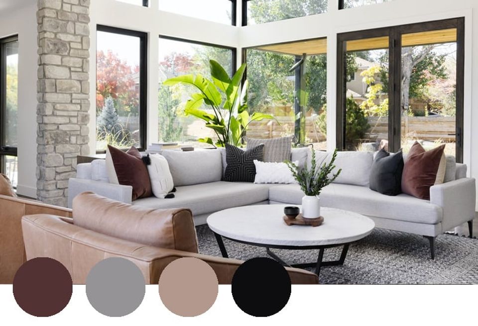
Bright, neutral spaces aren’t going anywhere, but we love layering bold accent colors to spice things up a bit. In the above living room, cool gray and bold black ground this modern color palette, while moody oxblood and cognac leather add depth and drama. Remember: just because a color is a part of the color palette, doesn’t mean it has to overtake the whole space.
2. Living Room Color Palette: Warm & Retro
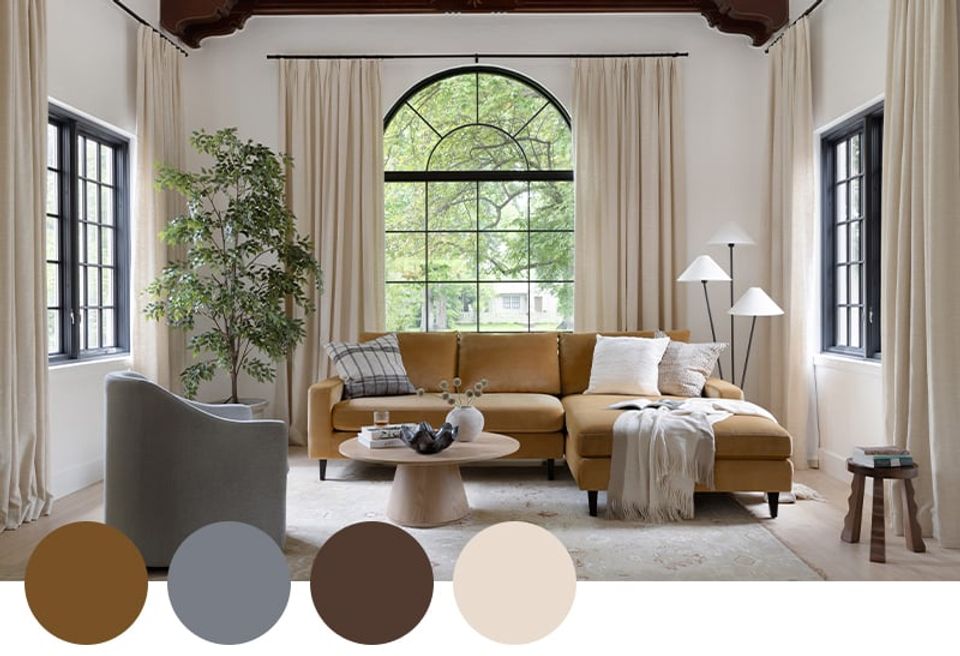
Image credit: Interior Define
With rich marigold and shades of brown taking center-stage, this on-point living room color palette leans a touch retro 1970s in the best way. Hints of gray-blue, green, and crisp ivory add some much-needed cool contrast for a perfectly balanced color scheme.
3. Living Room Color Palette: Subtle Jewel Tones
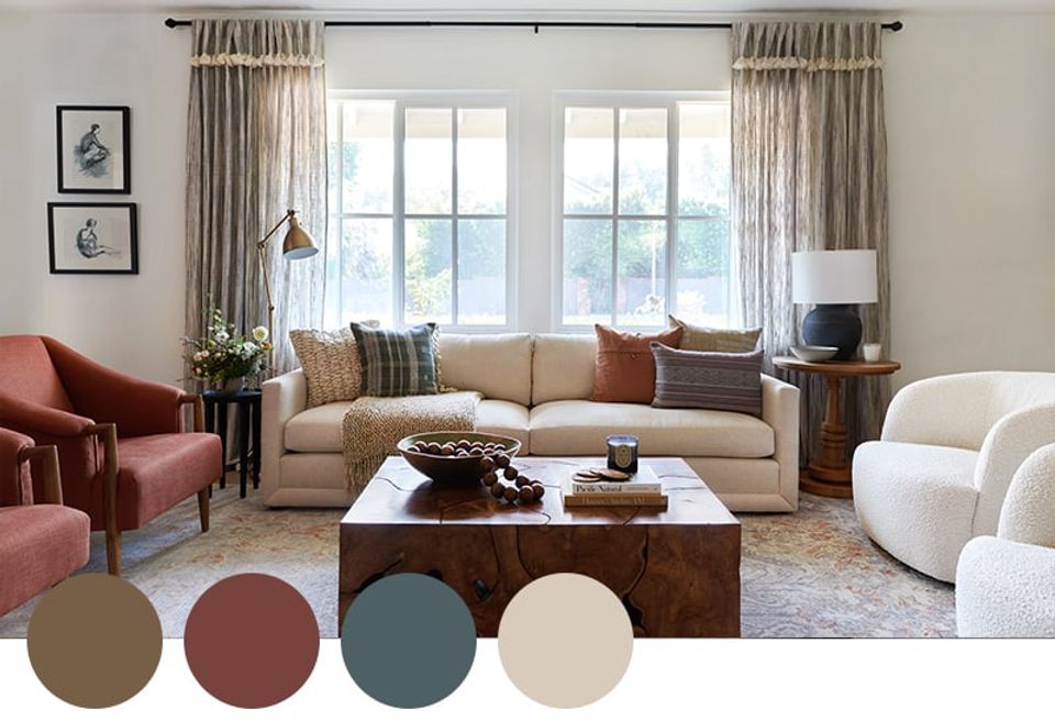
Barely-there ruby and subdued sapphire bring warmth and saturation to this otherwise neutral color palette. We love how the crisp white walls, brown wood tones, and hint of bouclé calm down the overall look and add a calming quality.
4. Living Room Color Palette: Warm High-Contrast
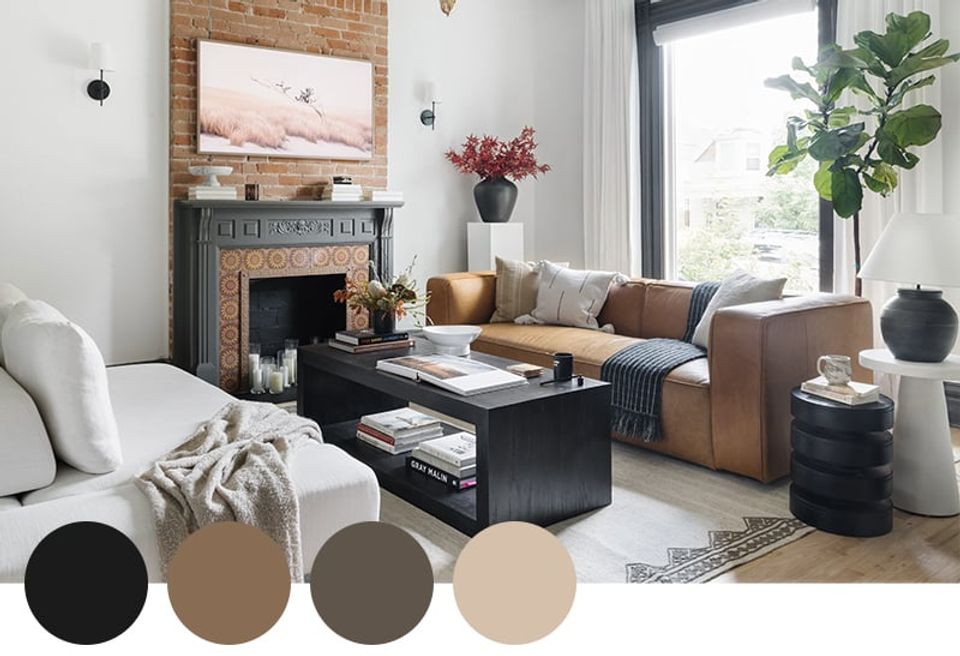
Thanks to the liberal use of black, charcoal gray, and crisp white, this color palette leans edgy and high-contrast in a cool, modern way. But the cognac leather sofa and exposed brick lend a warm, texture-rich touch of character to this classic Victorian. *Chef’s kiss*
5. Living Room Color Palette: Crisp Classic
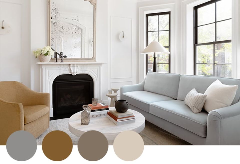
Image credit: Interior Define
Thanks to the colorful upholstery, this classic interior feels bright, playful, and modern in a beautifully unexpected way. The soft, marigold yellow and barely-there blue seating feel fresh and inviting, while the crisp white walls and dark gray and ivory accents check the “timeless” box.
6. Living Room Color Palette: Cozy Cottage

Image credit: The Inside
While warm camel and shades of blue reign supreme in this stunning living room, the dusty pink accents lend a sweet, cottagecore charm that makes the space stand out. Always lean into hints of pattern (particularly florals) when going for the cottage cozy look!
7. Living Room Color Palette: Desert Modern
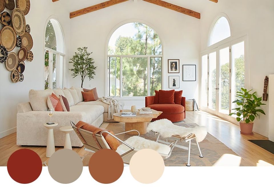
This classic warm minimalist color palette boasts subtle southwestern charm that we absolutely love. The crisp white creates a clean, modern backdrop, while the shades of siena, coral, burnt orange, and brick red add warmth, character, and personality. It’s simple, yet stunning.
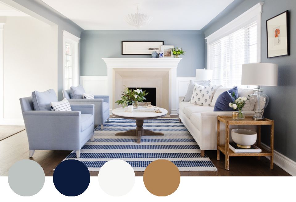
8. Living Room Color Palette: Coastal Neutrals
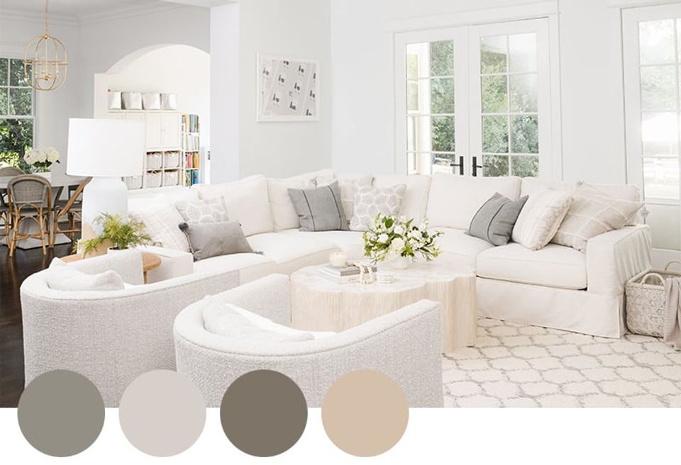
There’s something undeniably classic (and a touch preppy) about a white and blue-gray living room color scheme. Here, shades of white and ivory set the stage for a serene space, while blue-gray throw pillows and textured accents add subtle depth and visual interest. It’s a foolproof color scheme if you swear by neutrals.
9. Living Room Color Palette: Forest Floor
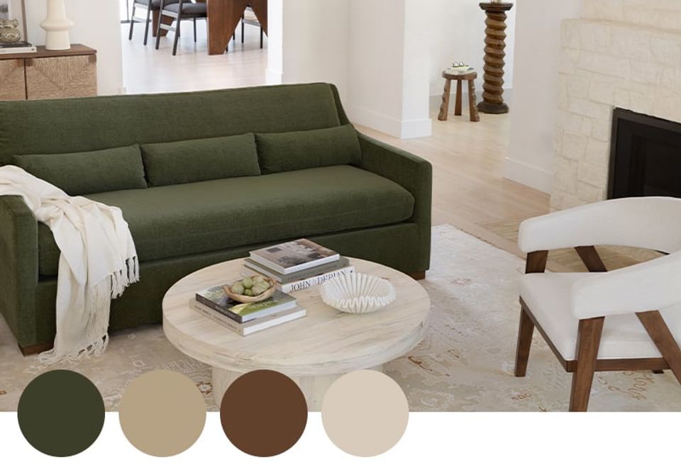
Image credit: Interior Define
We absolutely love this earthy color palette for fall 2023. The warm brown and soft yellow paired with cool olive green and crisp white ensure eye-catching dimension, while still standing firmly in the “earth tones” color palette camp. This is your sign to go all-out with a green upholstered sofa, like this beauty from Interior Define.
10. Living Room Color Palette: Cozy Cool
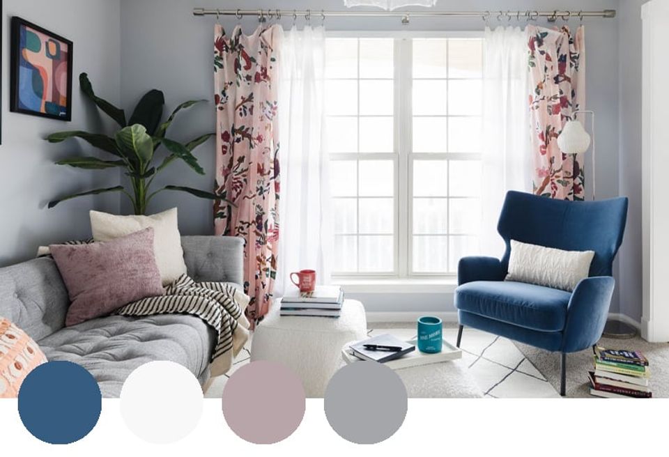
Bathed in soft blue-gray, crisp white, and rich Aegean blue, this living room leans cool and calming. But the mauve accent color adds a much-needed touch of warmth and brings the entire palette together. We particularly love the floral drapes — they unify the entire color while lending a whimsical touch to the room.
11. Living Room Color Palette: Warm Minimalist
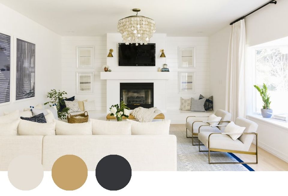
Coastal minimalists will love this living room palette! Thanks to the liberal use of white and cream, the space feels airy and bright, while the deep navy and brass accents add visual interest and contrast. This is a completely timeless choice in our book.
12. Living Room Color Palette: Contemporary Luxe
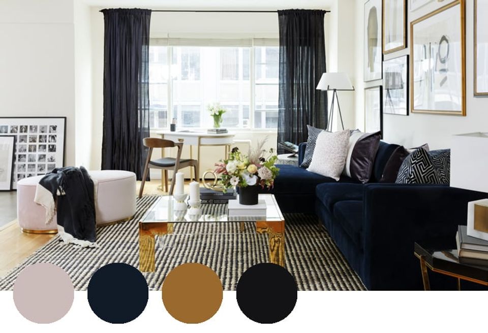
This glamorous living room color palette feels luxe, warm, and ultra-cool — it’s the perfect scheme for a high-rise New York apartment like this one. The chosen materials really add to the luxe, contemporary feel as well — we love the use of velvet, brass, and matte black.
13. Living Room Color Palette: Jewel Tones
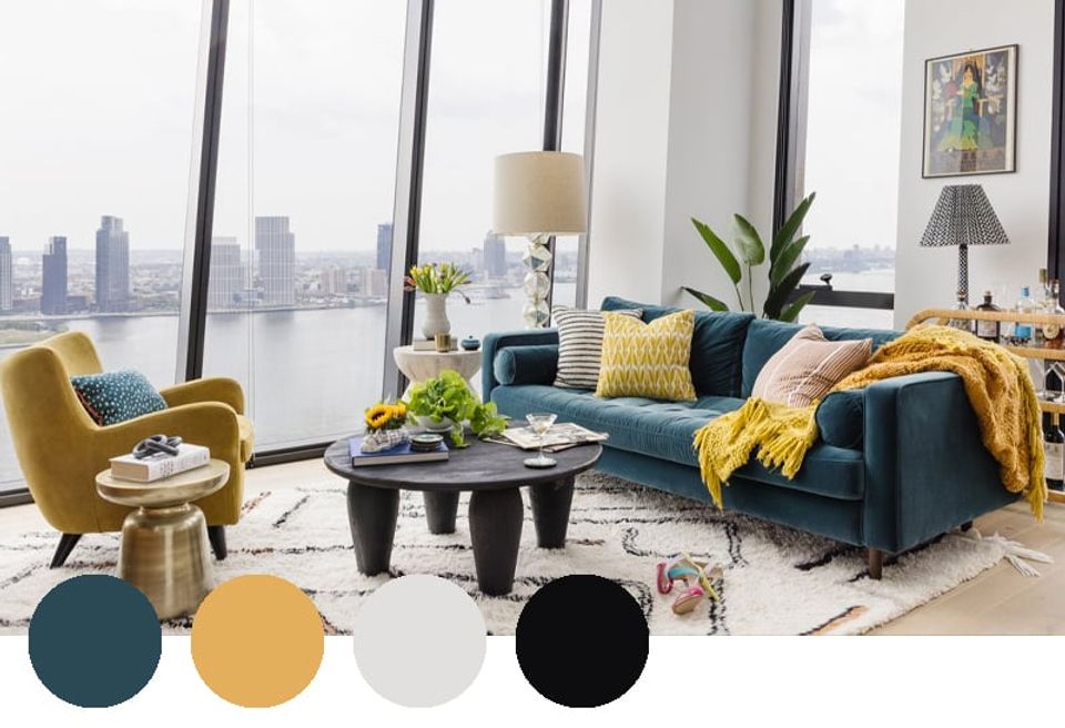
Modern and a touch retro, this bold jewel-toned color palette is made up of citrine, aquamarine, crisp white, and graphic black. While these two primary colors may not immediately feel like a match made in heaven, the off-white and bold black balance out the bold hues.
14. Living Room Color Palette: Coastal Grandmother
Layered blues will never go out of style in our book. The soft blue paint and accent chairs read calming and classic, while the bold denim in the rug and throw pillows punches it up just enough. And of course, the warm wood is key here — it adds the perfect hint of warm ochre for balance.
15. Living Room Color Palette: Neutral Earth Tones
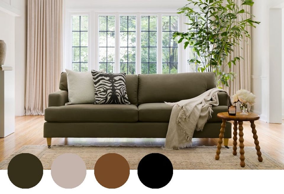
You can easily create a cozy, timeless living space with muddled olive, soft ivory, warm cognac, and a hint of bold black. This is the perfect living room color palette if you love organic modern, warm minimalist, or modern-traditional design.
16. Living Room Color Palette: High-Contrast Cool
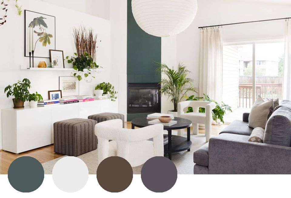
We love the cool, edgy, slightly post-modern vibe of this interesting living room color palette. The warm ivory and brown tones are classic, while the aquamarine and dusty purple function as neutrals while still adding personality and vibrancy. Just had plenty of house plants!
17. Living Room Color Palette: Scandi Boho
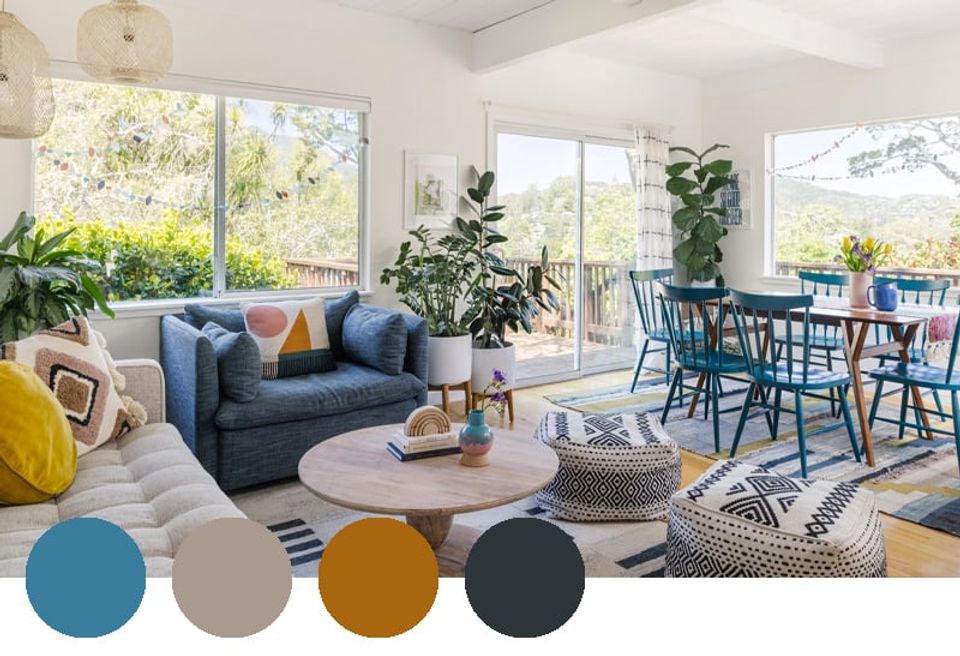
If you can’t get enough of modern-bohemian design, this punchy living room color palette has your name all over it. We love the daring use of warm ochre, bold aqua blue, and soft pink, particularly in the furniture. But of course, the white walls and dark charcoal accents make this bold palette possible.
Want expert advice on your actual space, straight from an interior designer? Check out our design packages to work with a design pro one-on-one.
Frequently Asked Questions
What is the most popular living room color palette right now?
Warm neutral and earth tone palettes are having a strong moment — think muddied olive, warm ivory, cognac, and soft black. The appeal is that they’re timeless enough to hold up over years while still feeling current. Moody, high-contrast schemes with oxblood or deep navy are also consistently popular with designers.
How many colors should a living room color palette have?
Three to four is the standard rule: a dominant color (walls, large upholstery), a secondary color (rugs, drapes, accent chairs), and one or two accent colors (pillows, art, small decor). Having a color in the palette doesn’t mean it has to dominate — it can appear in small, strategic moments.
What colors make a living room look bigger?
Light, neutral colors — crisp whites, soft ivories, pale gray — reflect more light and make walls recede visually. Keeping the walls, trim, and ceiling close in tone creates a seamless effect that reads as spacious. If you want color in a smaller room, concentrate it in accessories rather than walls.
What is a timeless living room color palette?
White or cream walls with warm wood tones and one accent color — navy, cognac, or deep green — have proven staying power across decades. The key is avoiding anything too trend-dependent in your large, hard-to-swap pieces (sofa, rug). Save bolder color choices for textiles and accessories that are easier to update.
