Pattern Is More Popular Than Ever — 12 Designer-Loved Ways to Layer Prints Like a Pro

Anyone who’s ever tried to mix and match multiple printed pillows with a statement rug knows that mixing patterns is more complicated than you think. It takes a shrewd eye and fundamental knowledge of both design and color theory to pull it off.
It’s not enough to simply buy a few patterned textiles with a unifying color palette and call it a day — it’s all about achieving visual balance and contrast via scale, repeat, and style. If you take a hard look at any pattern-heavy, maximalist spaces, you’ll notice that each print feels wildly different, yet somehow cohesive as a whole.
Fortunately, we’re not one to keep design secrets close to the chest. Our very own Toussaint Derby is an absolute pro and mixing patterns, and she’s eager to dish on her expert tips. Ahead, find the twelve pro tips designers consider when mixing patterns:
1. Modernize florals with geometric patterns
Busy, romantic floral patterns need a direct opposite to calm the overall look and achieve balance. Solid colors and graphic, geometric prints always fit the bill — we’re talking romantic blue florals with sleek velvet and classic stripes.
2. Always mix scale
Scale, or the size of the print, should vary between each textile. For example, you can mix a busy leopard print chair with a classic oversized check, or a small floral print with a wide cabana strip. This visual mix ensures balance, contrast, and interest.
3. When in doubt, start with a rug
While we love a jute area rug or a grounding neutral, a traditional pattern is a great way to set the palette and tone for the space. Find a fun patterned rug you absolutely love, and add in complementary patterns and hues from there, like subtle wallpaper or striped accent pillows.
4. Invert colors with a pared-back palette
This is one of the easiest, most helpful tricks in the book if you’re a color-averse minimalist: simply invert the colors when selecting your prints. Start with one pattern that’s mostly black with a little white or tan, and pair it with the opposite: mostly tan or white with a touch of black. To keep this look from feeling boring or one-dimensional, make sure to pepper in a subtle accent color, and vary print style, repeat, and size (like abstract burl wood against tight, geometric tile).
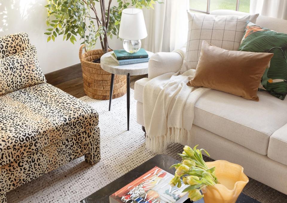
5. Balance animal prints with classic patterns
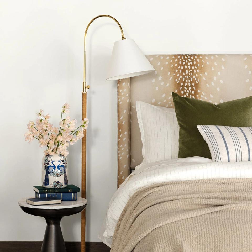
A classic stripe or pared-back polka dot with a consistent repeat is the perfect foil to a bold, free-flowing animal print like leopard, fawn, or tiger stripe. These more traditional prints add balance and formality, keeping the animal patterns from leaning to “safari theme room.”
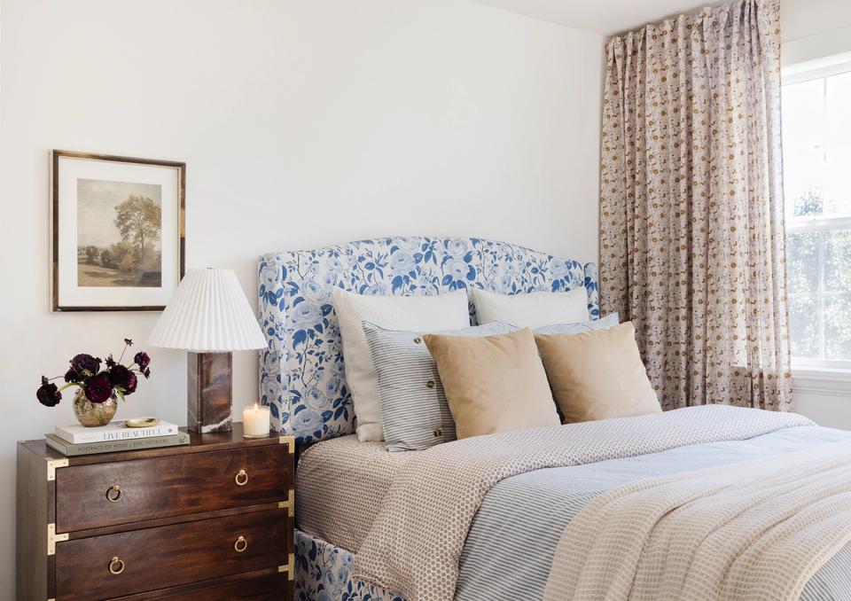
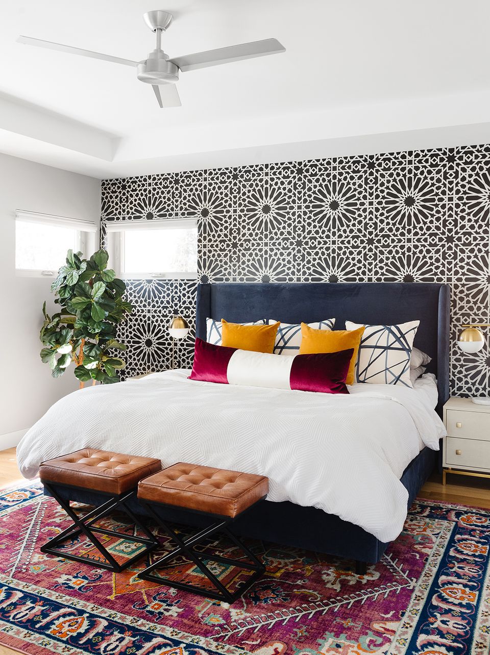
6. Hone your color palette
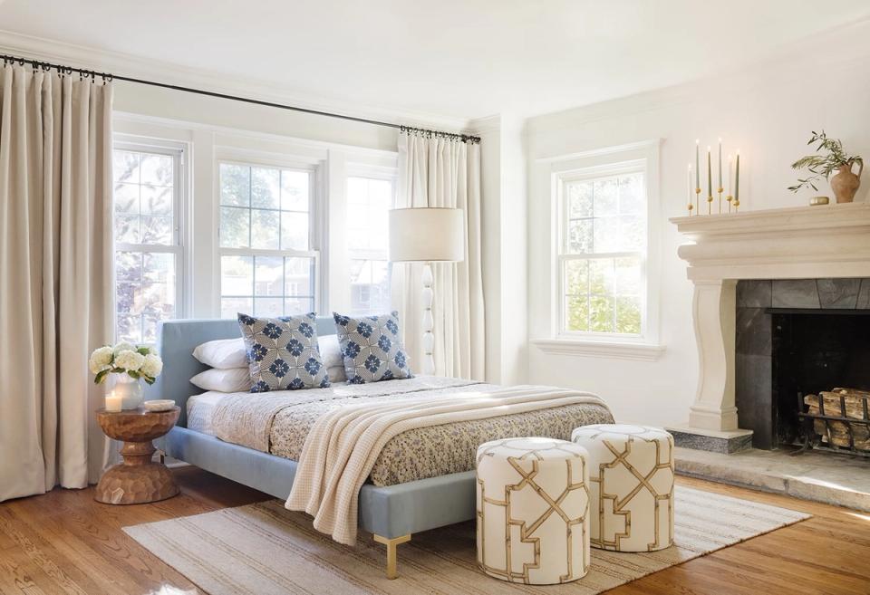
While you can 100% throw caution to the wind and power clash with the best of them, we recommend having at least one color that carries through all patterns — even if it’s not an exact match. In the above bedroom, for example, the bed frame, throw pillows, bed spread, and taper candles all have a shade of blue to tie the look together.
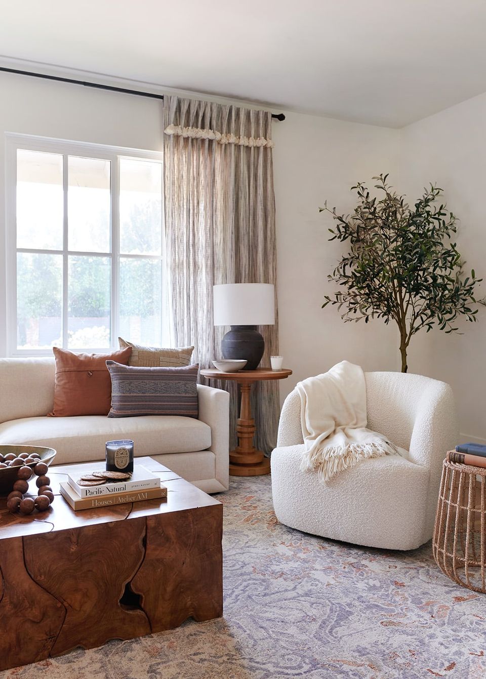
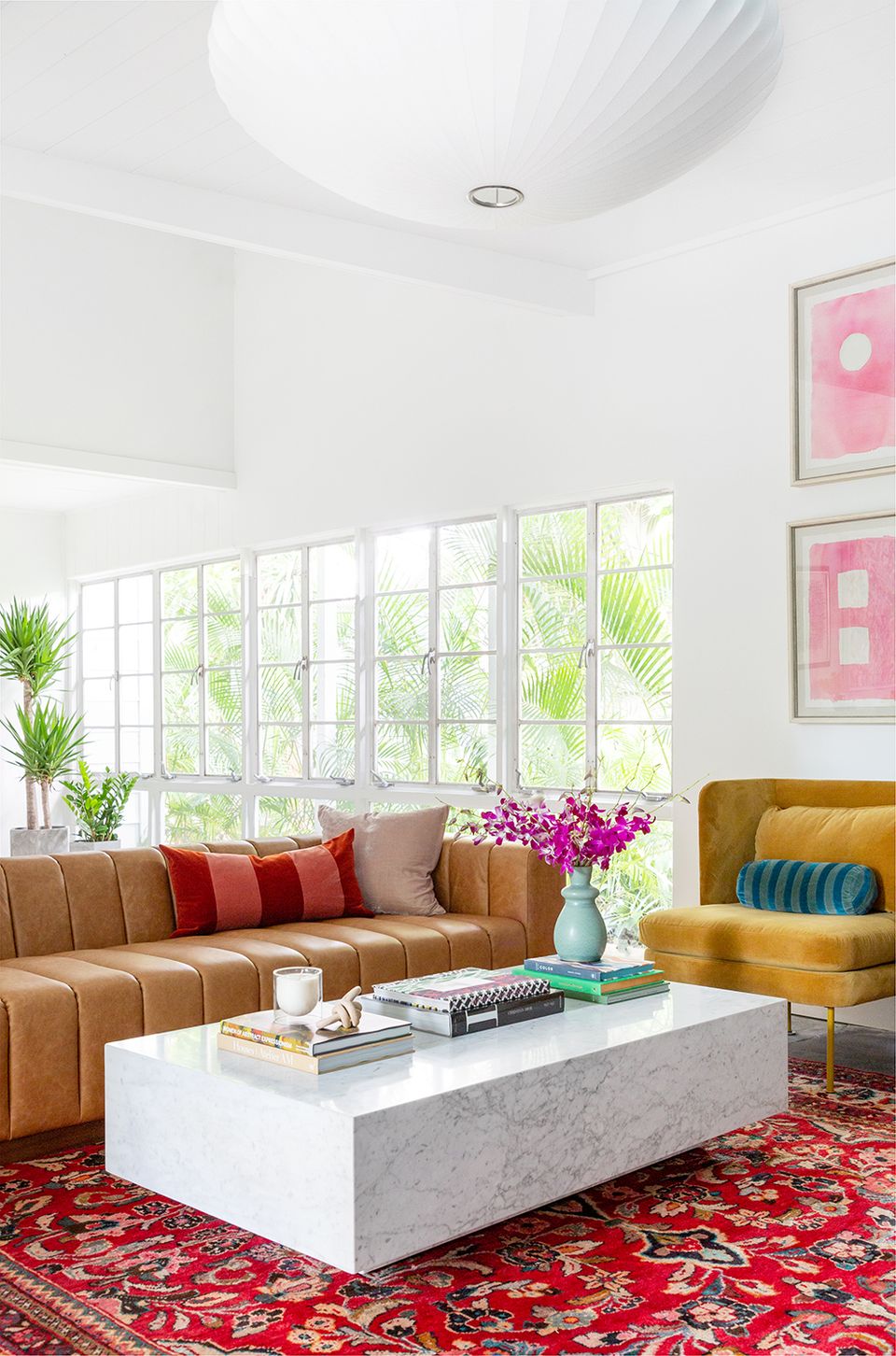
7. Remember negative space
Intentional negative space is absolutely essential when trying to pull off multiple patterns in a single space. It’s arguably just as important as the prints themselves. Always balance printed pieces with clean solids, whether it’s fresh white walls, a solid area rug, or solid throw pillows. For example, a bold patterned sofa might crave solid, textural pillows, and vice versa.
8. Go monochrome
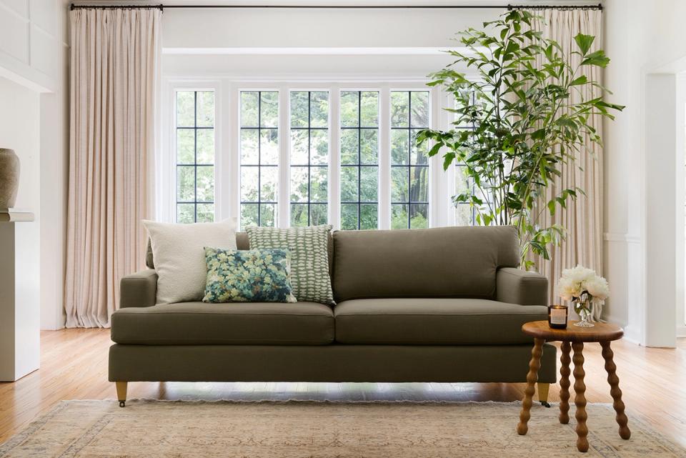
New to the world of pattern? Test the waters by playing with prints in variations of the same color, like olive, lime, and aquamarine. The overall look feels playful and layered, but still understated. This works equally well with shades of blue, or even shades of white, cream, and tan (for the minimalists out there).
9. Get playful
Pattern (and interior design, for that matter) is meant to be expressive and artful. If maximalism speaks to you, express your personal style with patterned wallpaper, textiles, and throw pillows. And remember: a tight color palette is key when going all-out with prints.
10. Bring in wallpaper
Wallpaper is coming back, and we’re so in love with the artful, slightly nostalgic look. Similar to a patterned rug, you can absolutely center an entire design around a favorite wallpaper — your selection will set the tone for the color palette and overall aesthetic. Just remember to balance out the look with solid upholstery or a toned-down rug.
11. Go all-out with upholstery

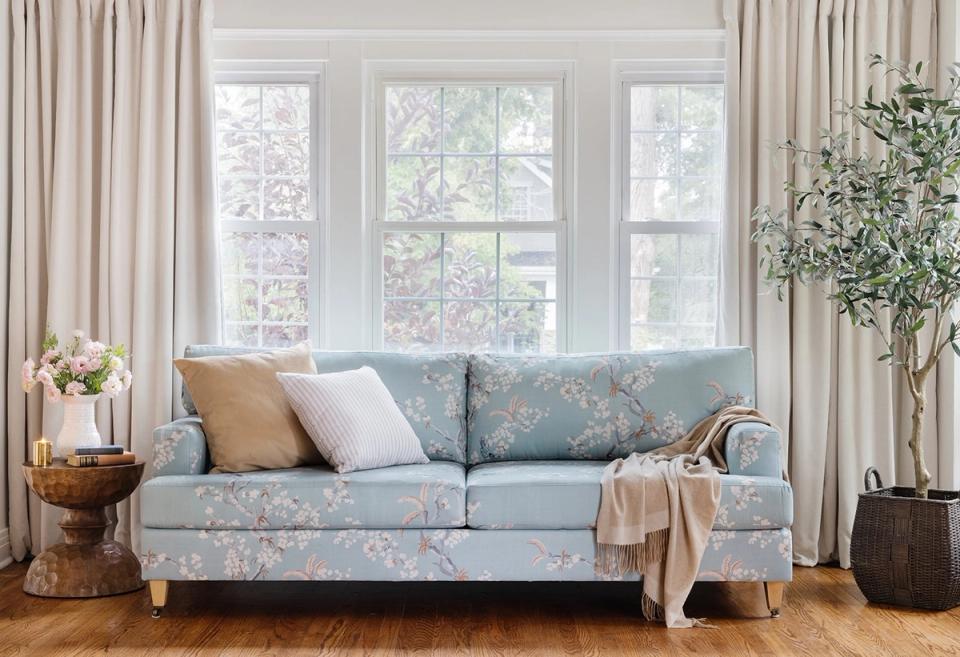
Speaking of wallpaper, traditional design is staging a comeback in 2023 — floral print upholstery included. Go all-out with a patterned sofa or accent chair, and take things one step further with an accent print, like a classic stripe. Paired with a solid rug or clean white walls, the look feels elevated and charming.
12. Remember: take your time!
Layering patterns is somewhat of an art form. Start with one you absolutely love, and add in contrasting prints from there. Always order fabric samples in advance to ensure a balanced, complementary combination, and when in doubt, take your time! Wait until the rug arrives before considering your second print. Creating an artful, balanced, and layered interior takes weeks to months, not days!
Want expert advice on your actual space, straight from an interior designer? Get started today with ourstyle quiz.
