Design 101: How to Use Negative Space to Create a Balanced, Chic Interior

Have you ever stepped into a room that felt justright? Chances are, it made good use of negative space.
While a room’s furnishings, decor, and architecture play a big role in how it looks and feels, negative space is just as important in creating a cohesive and harmonious end result. The idea is also pretty simple! Negative space, a term used in both art and design, is intentionally “blank” space. On a piece of paper, that’s any part that’s not drawn on or colored in. In a room, negative space can look like a number of things: Unadorned walls, unstyled surfaces, simple bedding, and an absence of furniture.
Negative space is important in design because it strikes a balance in a space and prevents visual clutter. It allows you to focus on all the significant design elements in a space, without feeling overwhelmed.
To be clear: Negative space isn’t just for the minimalists among us. It’s an important — essential, even! — facet of any room, in any style. Well-designed homes always master the art of negative space, but there’s no one way to get it right. Here are eight designer secrets for nailing it.
Arrange art strategically
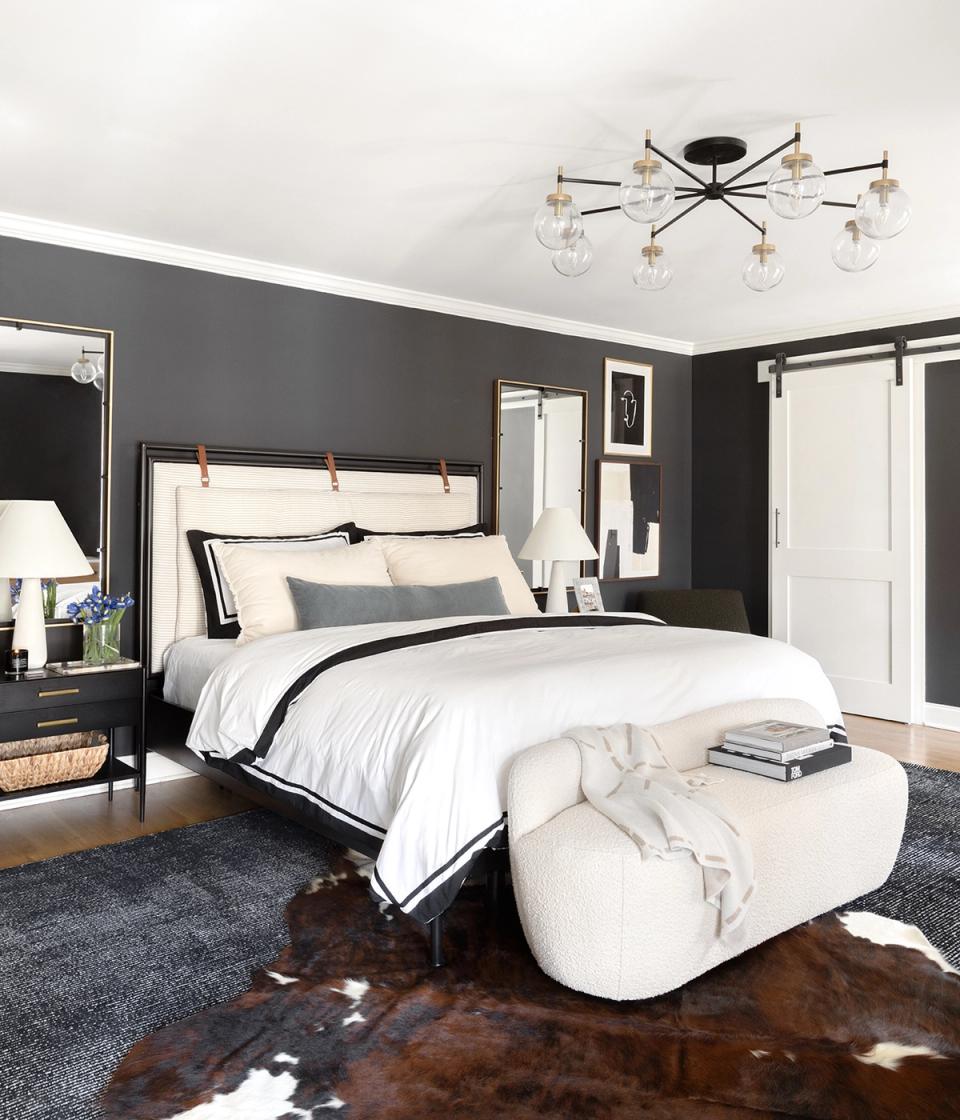
When decorating your walls, it’s important to work with the space and furnishings you have. In this bedroom, art would look too cramped above a large headboard — especially because the room’s ceilings aren’t particularly high. Arranged on either side of the bed, instead, a few pieces of art look intentionally styled.
Let your architecture shine
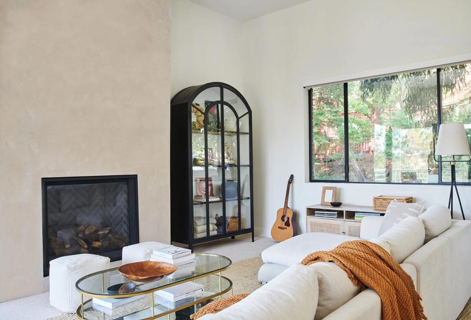
It might feel like second nature to hang a piece of art or a shelf on any blank wall. But interesting architectural features can often benefit from more minimal styling. The perfectly patinaed wall around the modern fireplace in this room is striking in its simplicity — plus, it makes a great pared-back contrast to the standalone cabinet next to it.
Embrace asymmetry
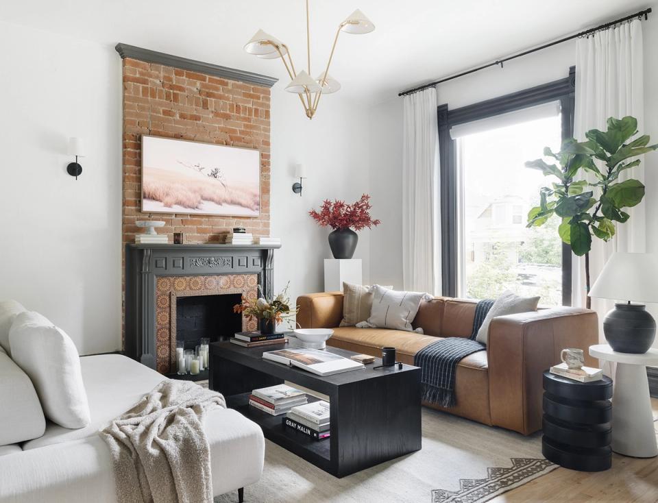
Instead of designing your space by mirroring one half of the room onto the other, lean into asymmetry to create a calmer, more relaxed set-up. Note the use of negative space: One corner of the room features a pedestal and floral arrangement, while the opposite wall is left bare. This prevents the room from feeling too crowded. Instead, it looks purposeful and calm.
Let your furniture create negative space
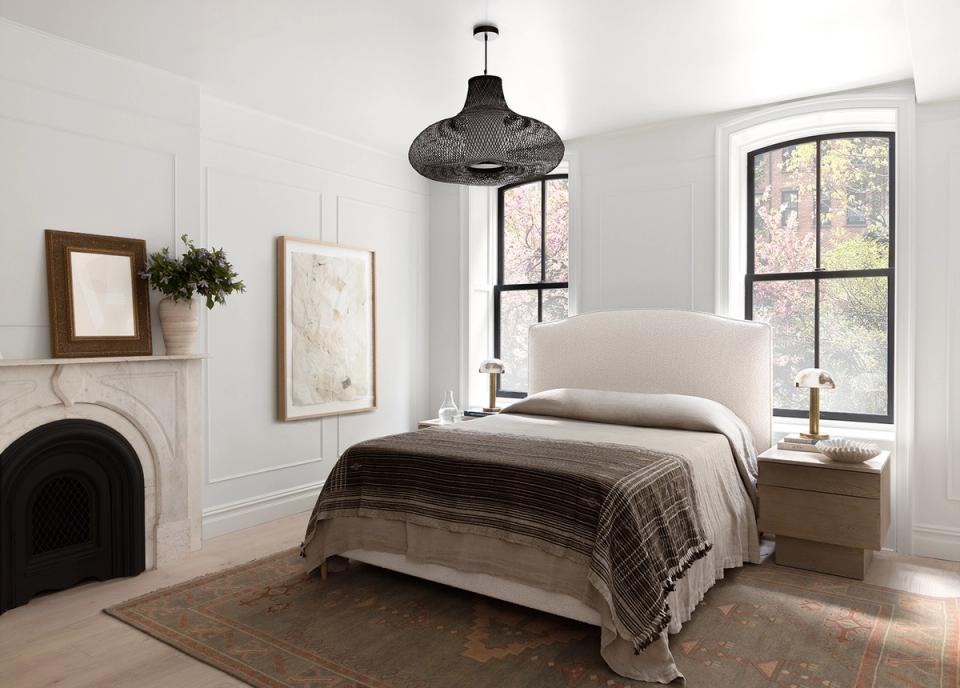
There are instances in which your furniture can — perhaps ironically — function as negative space. Consider the Interior Define bed in this room: The mostly cream piece overlaps with windows, creating a “breather” from a busy, albeit gorgeous, view.
Let lighting shine
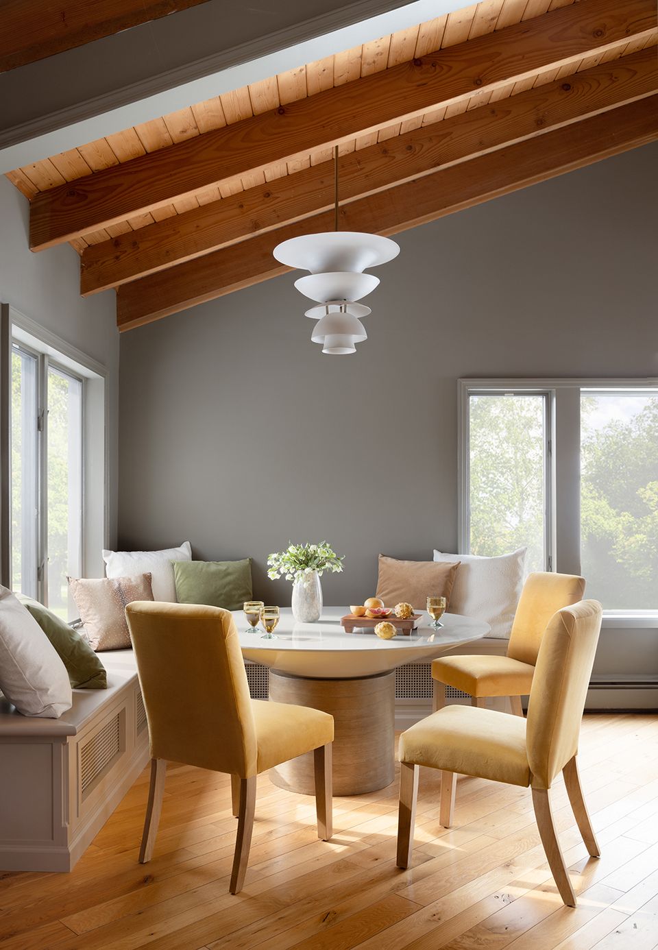
If you’re afraid that negative space will make your interior feel barren, consider the power of a good statement lamp or chandelier. The right light fixture can act as a work of art in your space, especially when you leave the walls around it unadorned to not distract from it. This strategy works particularly well in this space — wall art would also compete with the room’s expansive windows.
Find small moments of calm
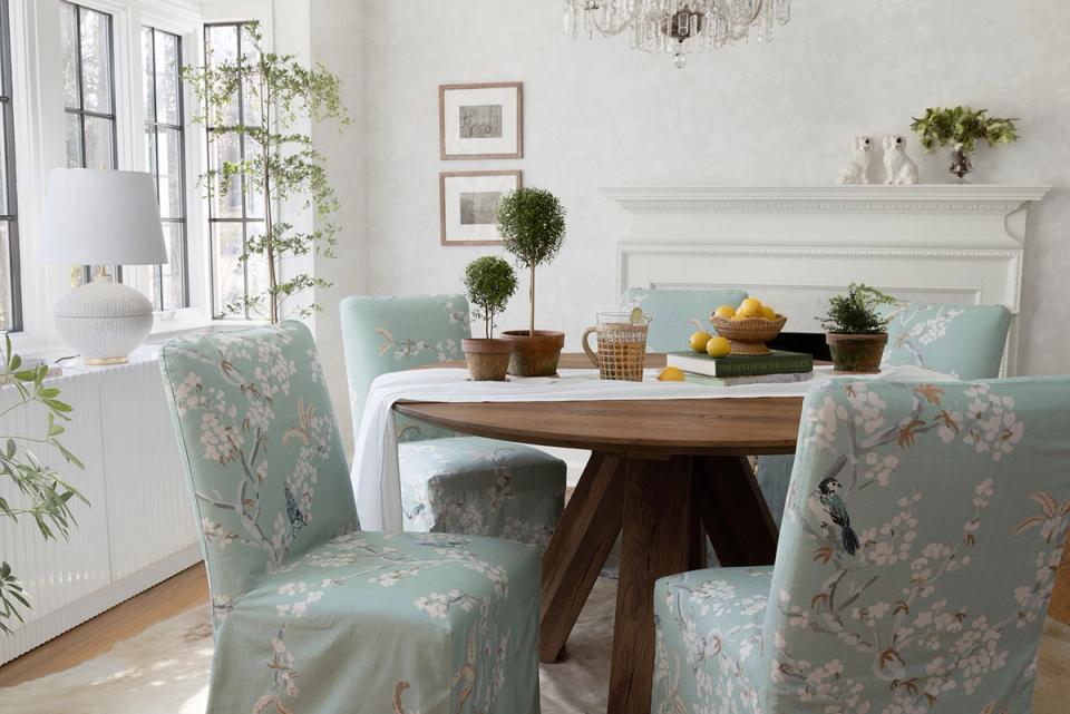
Negative space can even improve maximalist style. Take this dining room, for instance. It’s full of detail, with beautiful patterned dining chairs from The Inside, subtle wallpaper, lush plants, a vintage-inspired chandelier, and more. But notice the mantel: With just a few decorative objects constrained to one side, it’s a bit more restrained. That leaves much more visual space for all the other styling decisions in the room.
Choose less, more important furniture
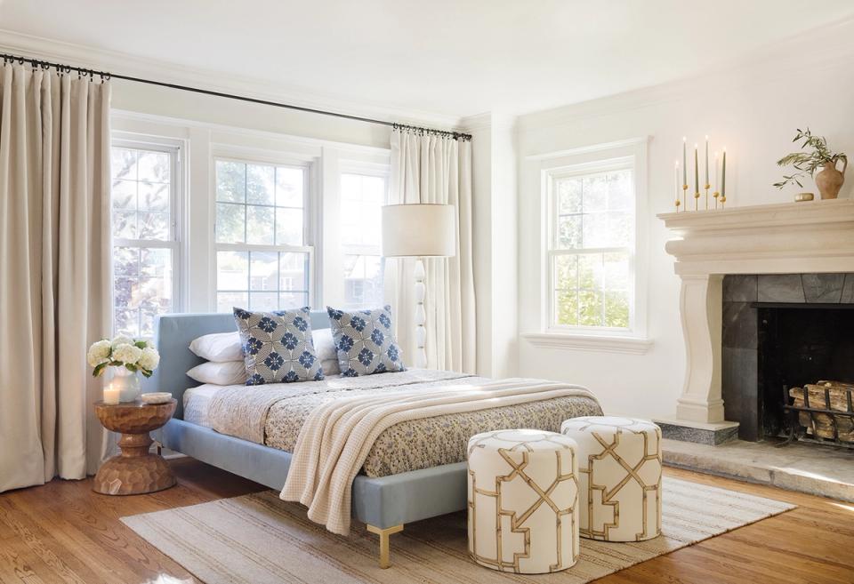
Just because you can fill a room, doesn’t mean you have to! Think about what’s most important to a room: In a bedroom, that’ll be the bed scene itself. While you could fit a chair in the corner of this space, that would take away from the gorgeous pattern and texture mixing of the bed, nightstand, and ottomans.
Highlight a significant work of art
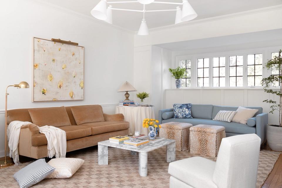
One big statement piece can make a world of difference in a room — especially when you give it space to breathe. Additional art would distract from this stunning, oversized piece. Plus, blank walls allow other details to stand out, like a corner table vignette and an artfully styled coffee table.
Want expert advice on your own space, straight from an interior designer? Get started today with ourstyle quiz.