10 Timeless Neutral Color Palettes That Interior Designers Call “Perfect”

When most people hear the word “neutral,” they picture a sea of whites, beiges and grays that feels decidedly minimalist. And while the Scandinavian-inspired aesthetic is definitely neutral to its core, there’s a lot more room for exploration when creating a dimensional neutral color palette for your home. In fact, we’d argue that successful neutral color palettes require just as much thoughtful curation and design expertise as colorful, wall-to-wall maximalism.
Considering that neutral color palettes will never go out of style, we decided to dedicate a full feature to the nuanced art of layered, visually engaging neutral schemes. After all, there’s a stark difference between a neutral home that leans cold and unfinished, and one that feels cozy, welcoming, and warm.
Ahead, find nine of our favorite neutral color palettes and pro tips for creating your own, as outlined by Havenly lead designer Toussaint Derby.
1. Classic High-Contrast
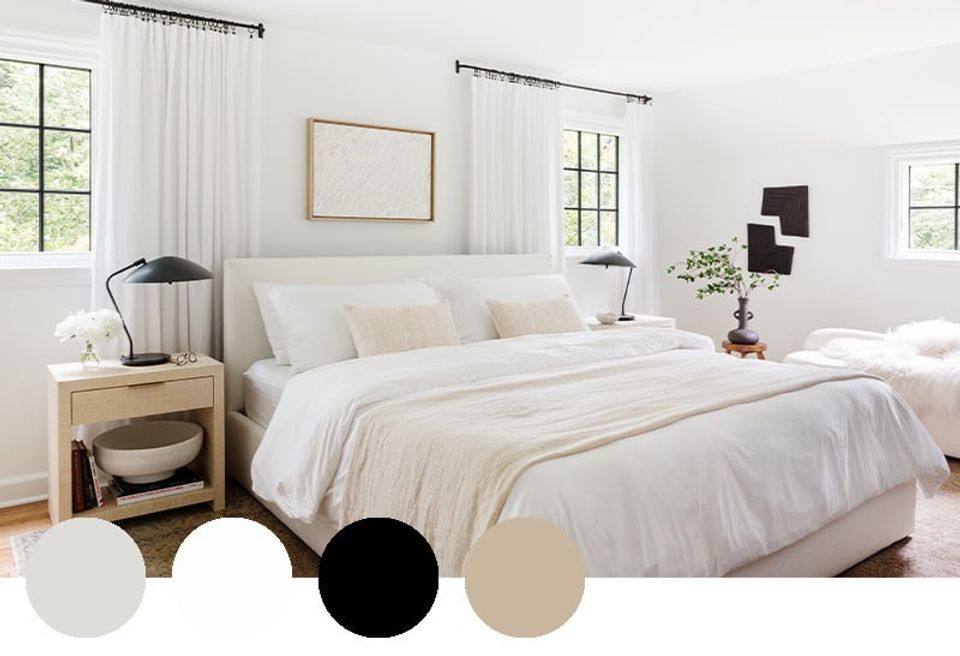
Bold black definitely has a place in a successful neutral color palette, especially if you love a high-contrast moment. Embrace a base of layered neutrals with white, tan, and ivory, and add pops of black in artwork, decor, and hardware for a touch of much-needed gravity.
2. Warm-Toned Traditional
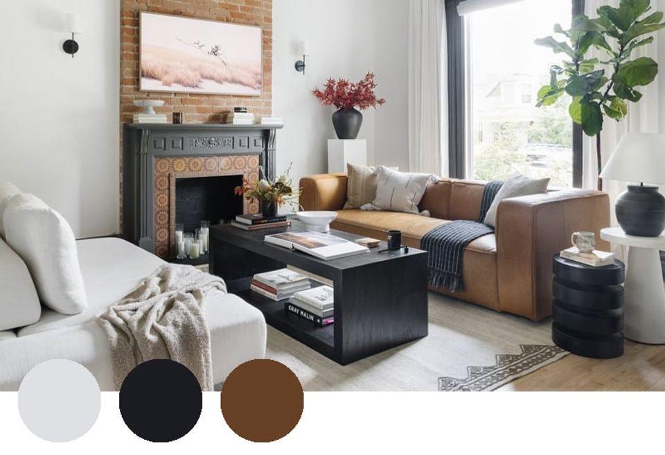
If your space features classic exposed brick details like the above Victorian home, incorporate that rusty brown hue into your neutral color palette. Complement it with cognac leather, add levity with crisp off-white, and finish with edgy black accessories for a modern touch.
3. Scandi Minimalist
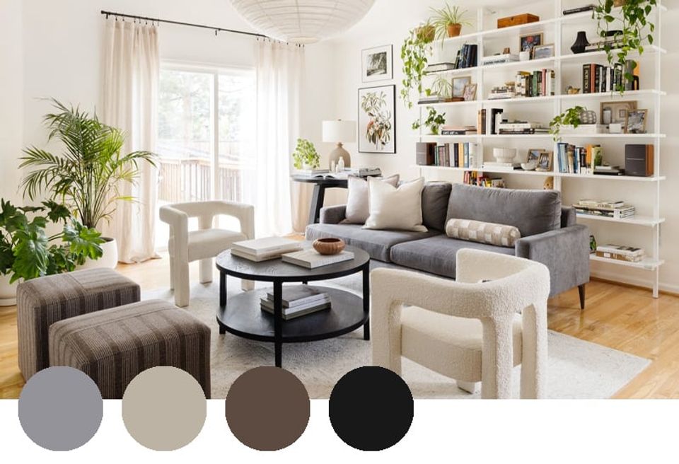
From the cool-toned neutral color palette to the trailing houseplants (64 total, to be exact), the above space boasts a beautiful Scandinavian minimalist aesthetic. The designer started out with classic white and black, plus pops of purple-tinged gray and deep chocolate brown to round out the palette. The end result is cool, modern perfection.
4. Down to Earth
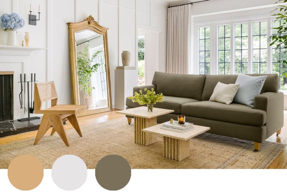
Muted earth tones will forever be a go-to neutral color palette in our book. Warm white, honeyed oak, and ornate brass create a warm neutral backdrop, while the cool olive sofa adds a subtle pop of color that functions as a neutral. With a hint of bold black in the fireplace mantel, this neutral color palette is layered, cozy, and a touch unexpected.
5. Ultra Cool
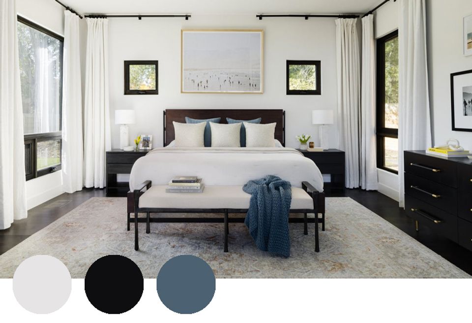
If your minimalist heart can’t stray from classic black and white, consider adding subtle visual interest with a soft, lovely blue accent color. It adds just the right touch of dimension and personality, while doubling down on the serene, relaxing atmosphere. A throw blanket and matching pillows can go a long way!
6. Softer Side
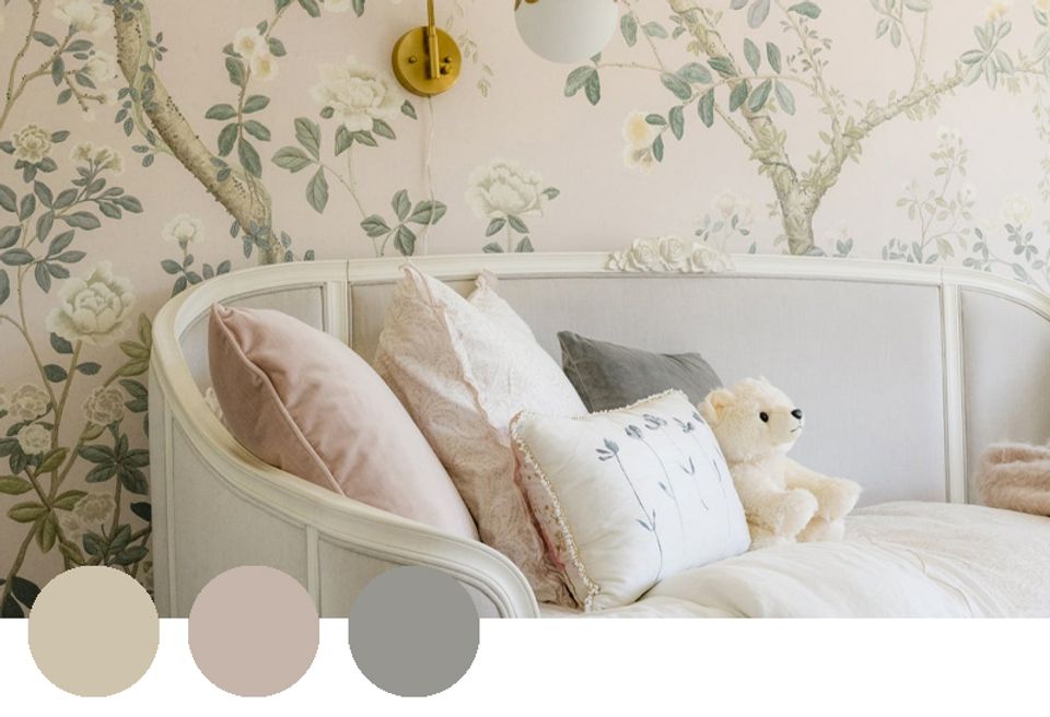
For a colorful palette that still reads neutral, look no further than soft, barely-there shades, from dusty pink to muddy gray-green. These soft, feminine hues add personality and storybook character, while still reading understated. Pro tip: add a touch of glam brass to double down on the romance.
7. Neutral Navy
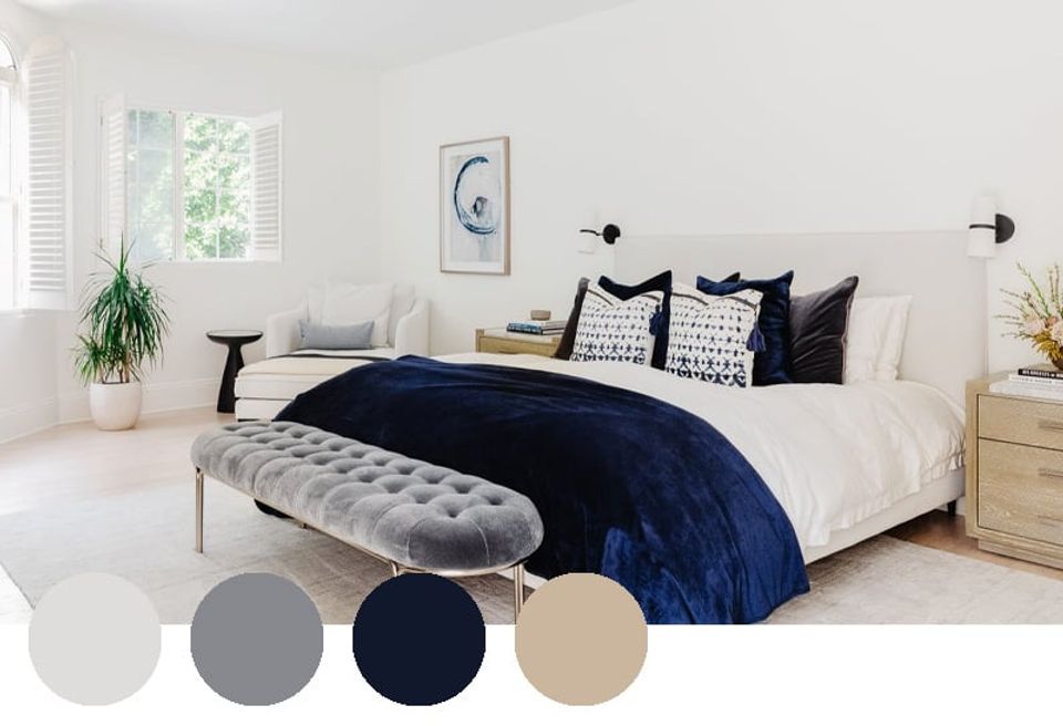
Navy is an incredibly popular color in the design world for obvious reasons. It’s bold and saturated, yet so easy to incorporate into a neutral color palette. Start with a base of whites and grays, and layer in rich navy via artwork, throw pillows, and blankets. Finish the look with honeyed wood tones for a pop of warmth.
8. Natural Warmth

If you prefer the warmer side of the color spectrum, we’d like you to meet warm minimalist color palette perfection: warm white, deep walnut, classic brass, and shades of tan (preferably via natural materials). Paired with fresh greenery and florals for a cool touch, the end result is cozy, texture-rich heaven.
9. Plum Pops
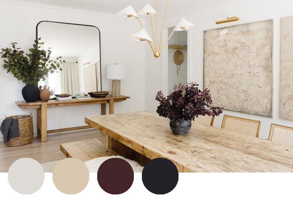
If you’re dead set on a white, black, and tan neutral color palette but find yourself craving a soft pop of color, explore slightly bolder hues found in nature, like burgundy, plum, wine, dusty rose, and beyond. These accent colors fall in line with the neutral directive, but add a much-needed touch of personality and saturation. Pro tip: bring in your chosen color via dried florals, fresh blooms, or greenery that you can easily swap out as your heart desires.
10. Subtle Saturation
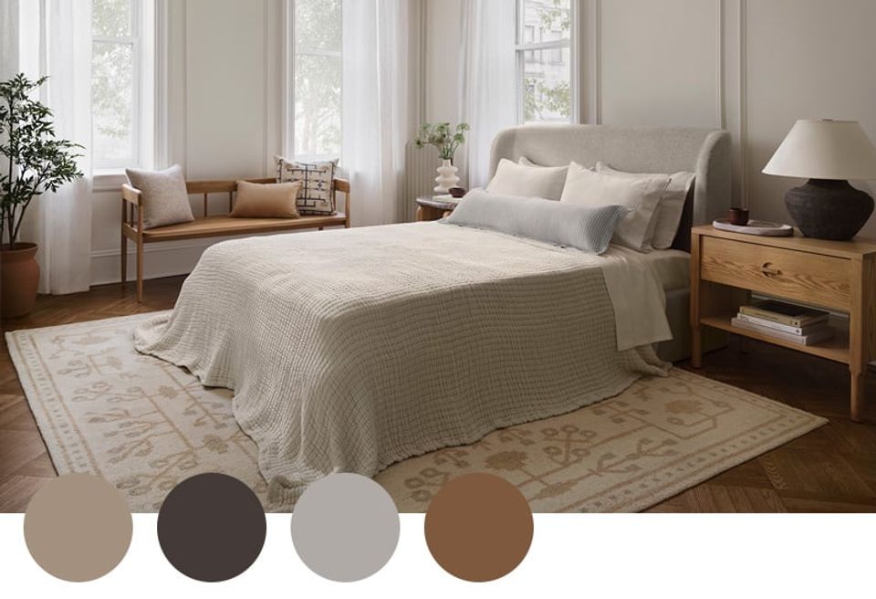
Reminder: a neutral color palette and can still include color! In this soft, serene bedroom, soft shades of tan, cognac, gray, and baby blue add subtle saturation and visual interest to the white-walled space. Coupled with understated patterns and layered textures, this neutral bedroom is far from boring.
Want expert advice on your actual space, straight from an interior designer? Start with our style quiz to work with a design pro one-on-one.
Frequently Asked Questions
What is the best neutral color palette for a home?
The most versatile palettes combine warm whites with natural wood tones, warm grays or taupes, and one deeper anchor color—like navy, forest green, or terracotta.
What is the most popular neutral paint color?
Benjamin Moore White Dove, Simply White, and Sherwin-Williams Agreeable Gray are consistently among the most designer-recommended. Warm beiges and greiges have surpassed cool grays in recent years.
How do I layer neutrals without the room looking flat?
Vary the texture. Linen, wool, wood, stone, and ceramic all read differently even in the same tonal range, which creates depth without adding color.
