Designer Picks: The 10 Best Neutral Paint Colors We’ll Never Retire
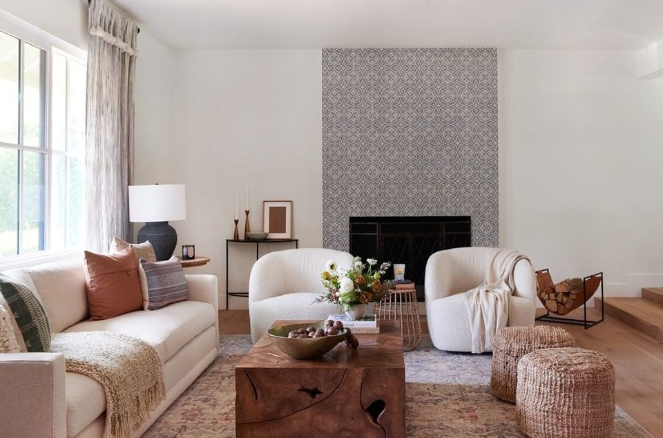
When it comes to updating your space, nothing pulls weight quite like a fresh coat of paint. Of course, we’ve waxed poetic about the power of paint many times over, but this is our official opus on the best neutral paint colors. From a beautiful warm white to a modern beige, neutrals lend a clean, refreshing feel to any space that’s as beautiful as it is timeless. Paint trends may come and go, but neutral paint colors are forever.
But of course, we know firsthand how stressful it can be to select the perfect neutral paint color. Even whittling it down to a single paint brand leaves you with thousands of options. So, we tapped our design team for the best neutral paint colors they always come back to, regardless of space or project. From hundreds of thousands of client projects, find the top 10 neutral shades that we always come back to.
1. Benjamin Moore Simply White
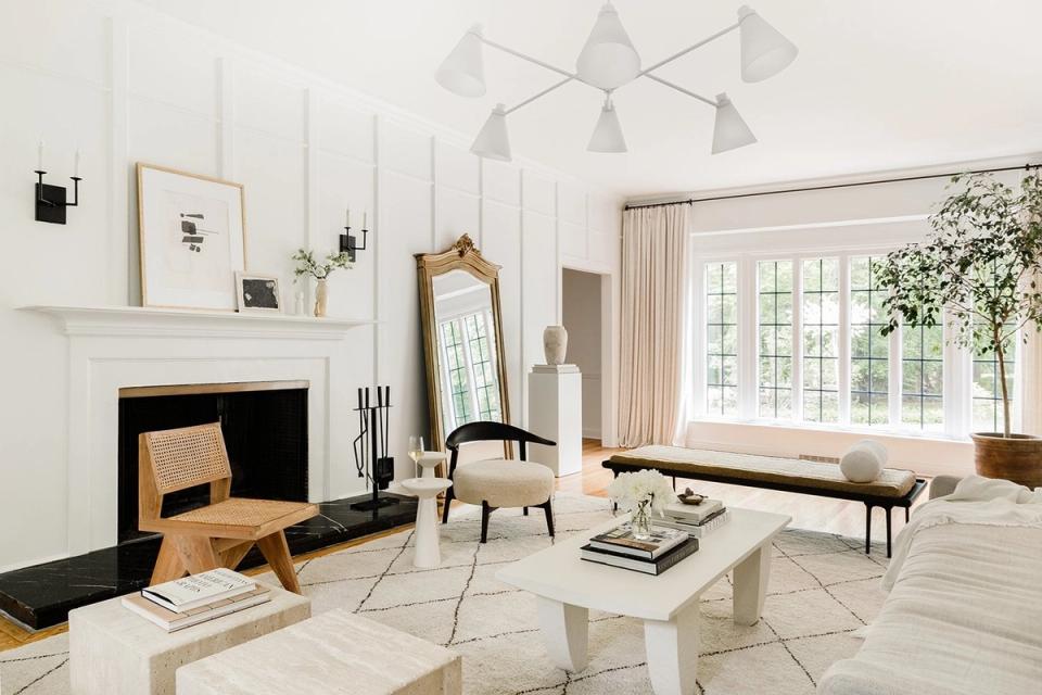
Looking for a clean, modern paint color? Your search ends with Benjamin Moore’s Simply White. Our designers always turn to this neutral paint color when searching for a crisp, true white that doesn’t lean cold or stark, which is somewhat of a diamond in the rough. It has a beautifully subtle cream undertone that adds the perfect touch of warmth to any space, whether you’re using it on kitchen cabinets or a monochrome wall-ceiling-trim combo.
2. Benjamin Moore Chantilly Lace
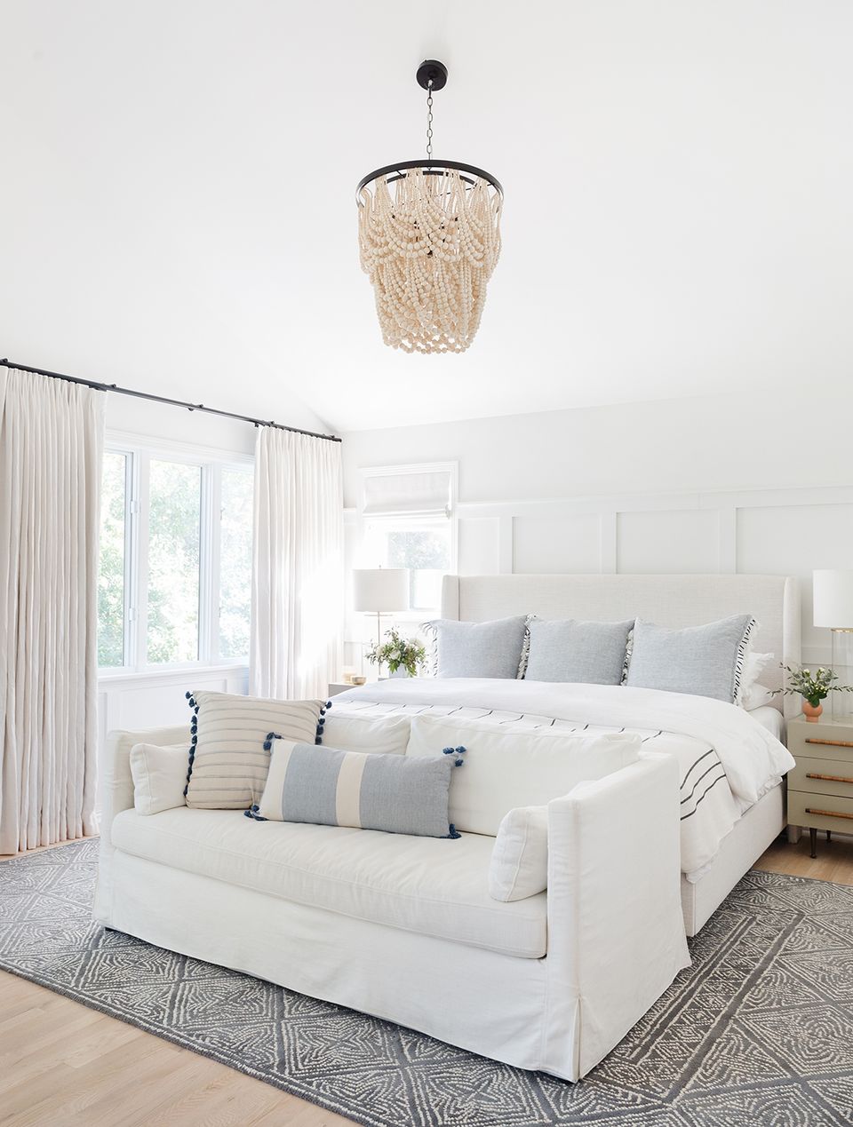
Aptly named Chantilly Lace is a beautiful, delicate white inspired by its namesake fabric. Per the Benjamin Moore site, it evokes images of pure silk, soft linen, and simpler times, and we have to say we agree—it’s not too cool, not too warm, and looks beautiful when paired with slightly traditional decor (like the above bedroom).
3. Benjamin Moore White Dove
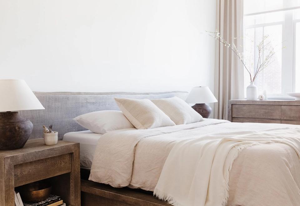
If you’re looking for a true creamy white that doesn’t feel dated, meet White Dove. This soft white paint color is, in a word, beautiful—it lends just the right touch of softness and warmth to any space, whether you’re a modern cottage devotee or a classic warm minimalist.
4. Benjamin Moore Swiss Coffee
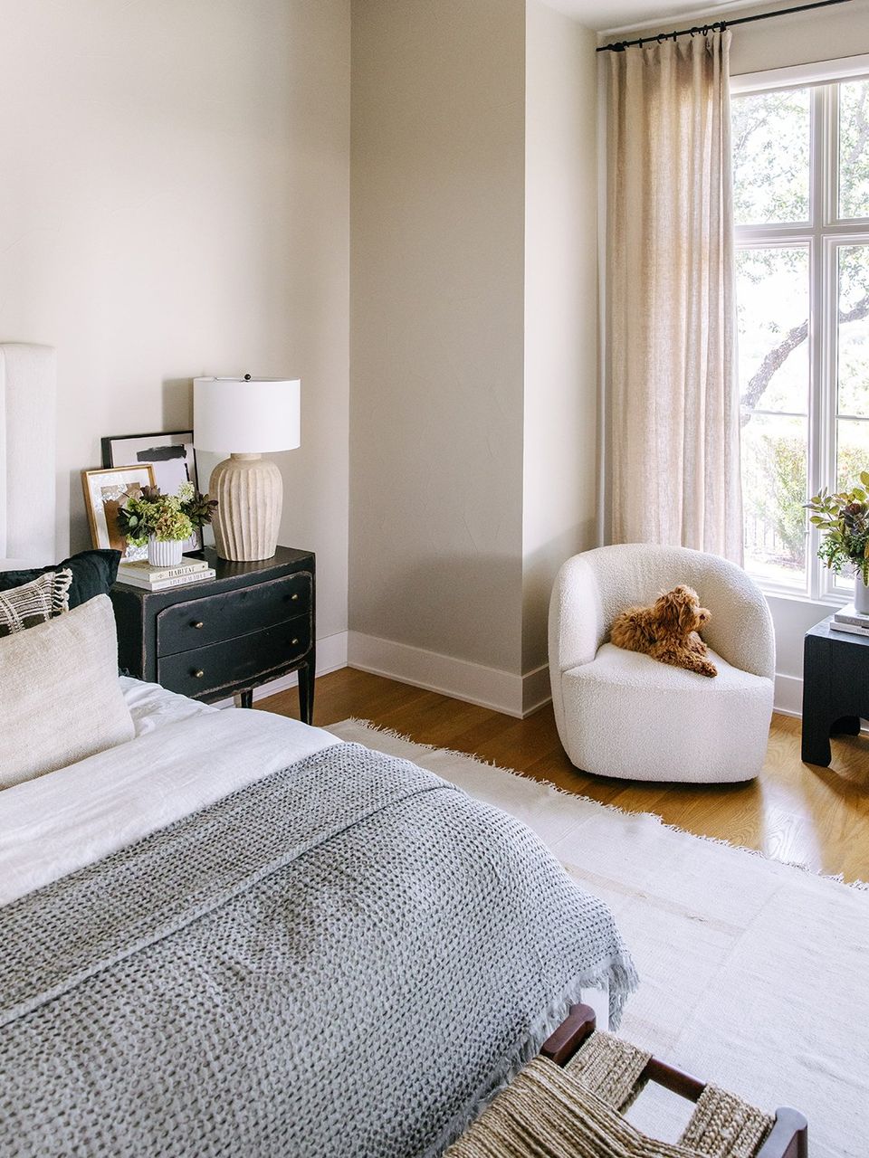
True off-white Swiss Coffee is a designer favorite for a reason—this shade is endlessly versatile and lends a touch of warmth and dimension to any space without veering into the “vibrant” territory. If you’re a classic minimalist who wants to test the waters with color, Swiss Coffee is a perfect, warm, and subtly decadent neutral.
5. Benjamin Moore Balboa Mist
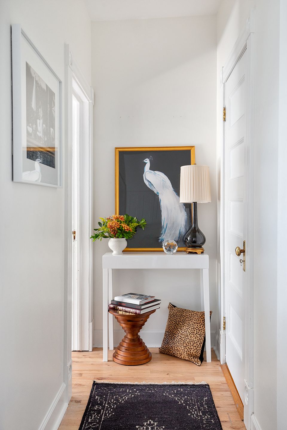
True off-white Balboa Mist has a subtle beige undertone, which gives it a slightly more traditional feel. We love how versatile this shade is—it leans slightly warm and sandy in natural lighting, and a touch greige in interior spaces like bathrooms and hallways. Either way, it lends subtle, rich color to a space while staying firmly in the “neutral” lane.
6. Benjamin Moore White Heron
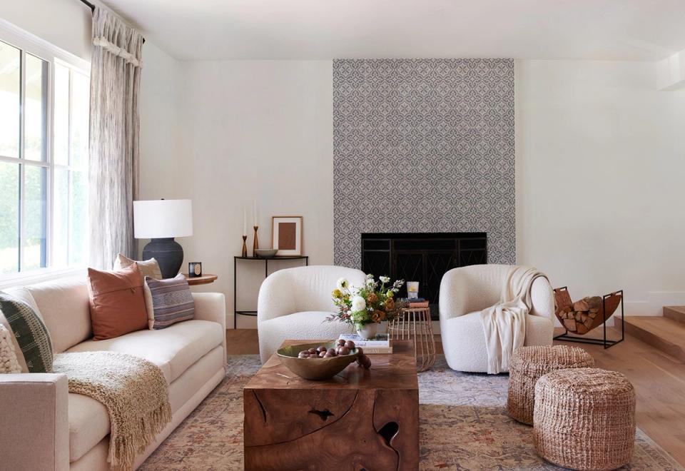
White Heron is the perfect gray-tinged white that lends an ever-so-slightly cool feel to any room. Because of its subtle, almost undetectable undertone, it’s an incredibly versatile paint color suited to variety of styles and spaces. It’s a great choice for those looking for a subtle hint of gray.
7. Benjamin Moore Pale Oak
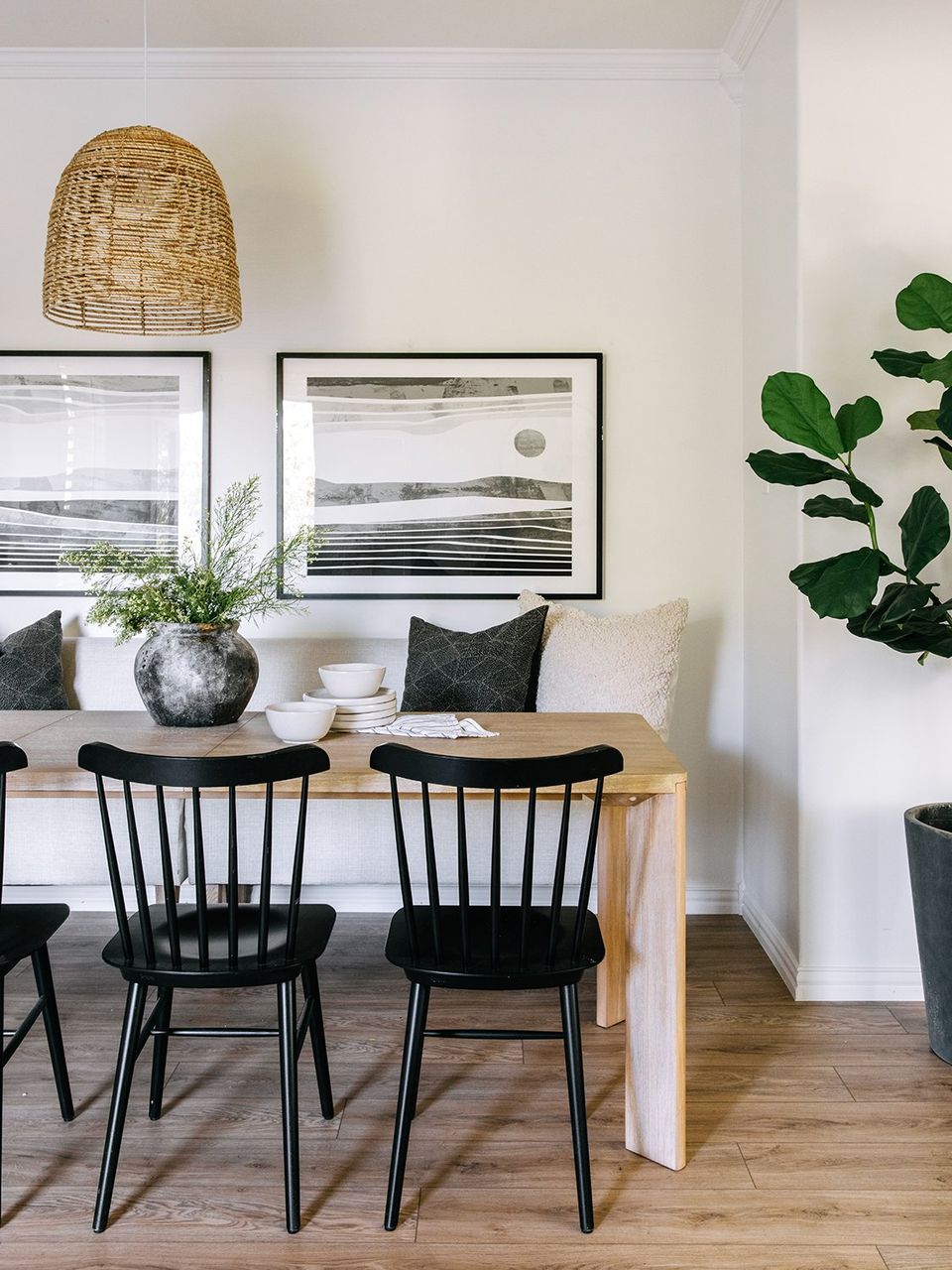
Another time-honored designer favorite, Pale Oak is classic greige that will stand the test of time. It’s a perfectly balanced warm-cool neutral that adds a touch of color and warmth to any space. It’s similar to White Dove in terms of subtle warmth, but is decidedly more beige.
8. Benjamin Moore Alabaster
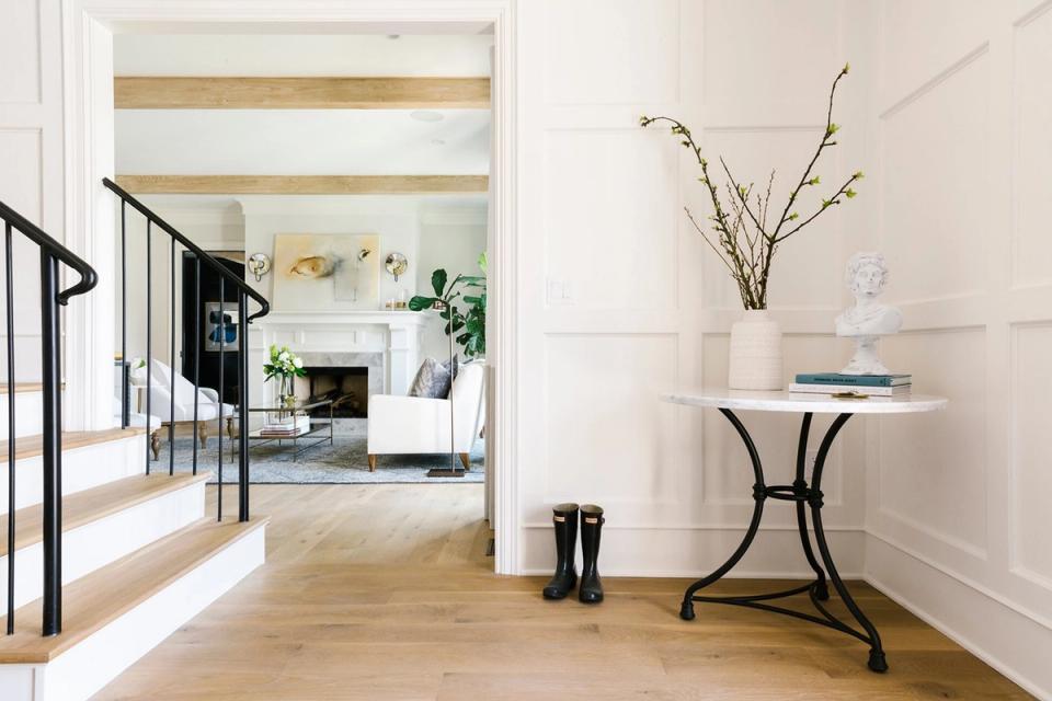
Benjamin Moore’s Alabaster is another beautiful, bright white that leans every so slightly cool. With a subtle pink undertone, this hue is a bit more crisp than the ever-popular Sherwin Williams version and looks beautiful in larger spaces with plenty of natural light.
9. Benjamin Moore Gray Owl
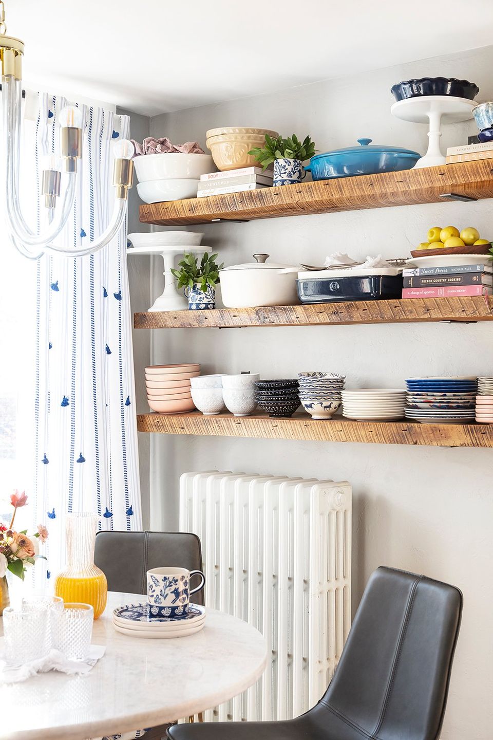
With a subtle yellow undertone, Gray Owl is a soft grey hue that leans ever so slightly warm when applied in large swaths. It gives you a touch of color and depth beyond white, without veering too bold or dramatic. Given its warm undertone, it pairs well with warm wood tones and rustic finishes.
10. Benjamin Moore Hale Navy
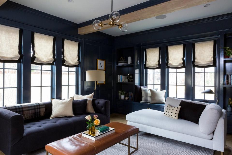
Navy is a dramatic neutral in our book (hear us out), and nothing beats Benjamin Moore’s Hale Navy. Because it’s not overwhelmingly blue, this hue easily functions as a classic backdrop—especially when paired with neutral furniture and decor. It lends a cozy, dramatic feel to any space and is the perfect choice for a moody home office, calming bedroom, or classic library.
Ready to find your perfect neutral?
A Havenly designer can match a paint color to your space and the way your light behaves.
Take the Havenly style quiz—in 10 minutes, you'll be matched with a designer who gets your style.
Not ready to commit? Try Havenly AI—snap a photo of your room and see it reimagined.
Neutral Paint Color FAQs
What is the best neutral paint color?
It depends on your light and undertones, but designer go-tos include Benjamin Moore Simply White, White Dove, and Pale Oak for their timeless, flexible warmth.
What's the difference between a warm and cool neutral?
Warm neutrals have beige, cream, or greige undertones that feel cozy, while cool neutrals lean gray and read crisp. The right pick depends on your lighting and decor.
Is greige still popular?
Yes. Warm greiges like Pale Oak remain designer favorites because they add subtle color and warmth without competing with the rest of the room.
How do I choose a neutral paint color?
Test large swatches on multiple walls and view them at different times of day. Undertones shift with light, so what looks warm at noon can read cool at night.
