The 10 “Ugly” Color Palette Mistakes Interior Designers Always Notice

Personality. Style. Energy. Individuality. Ambiance. Creating a home with all five characteristics (and more) all comes down to mastering one important design element: color. From a moody, color-drenched library you saw on Pinterest that’s forever burned into your brain to a warm, neutral living room that feels like drifting on a cloud, memorable spaces use color in a way that’s impactful, thoughtful, and perfectly restrained.
Since we’ve already discussed color palette “do’s” at length, naturally, it’s time to delve into the opposite: common color palette mistakes. From color clashing to one-dimensional palettes, our design team is dishing on the most common color catastrophes they spot in peoples’ homes. Keep scrolling for the tea.
1. Zero warmth in a neutral space

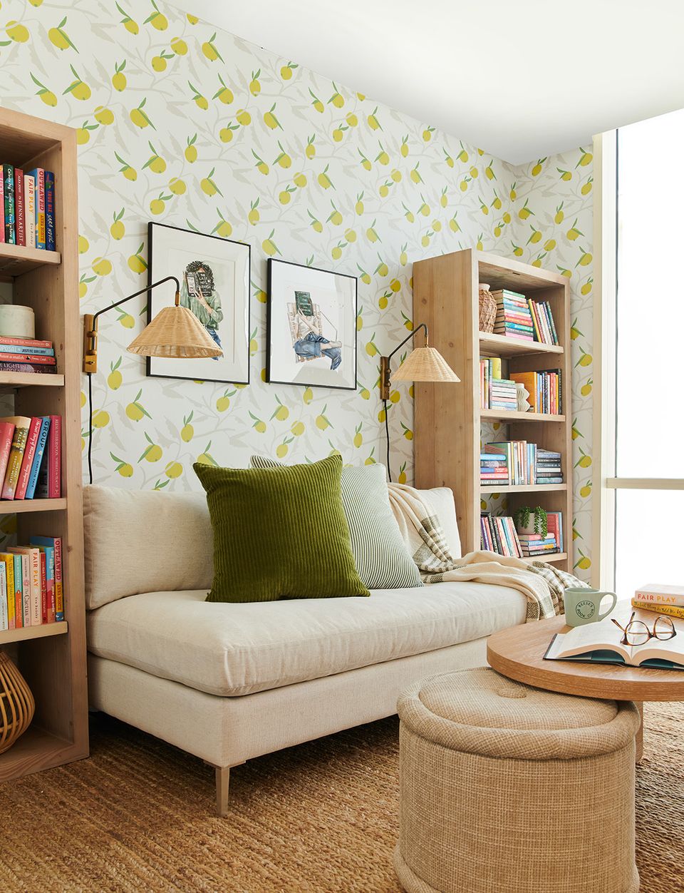
While the neutral look may appear simple, it takes an expert eye to really pull off. What a minimal space lacks in color, it should make up for in warmth and texture — materials like cane, jute, rattan, linen, shearling, and wood add that much-needed touch of life to a white-on-white room. Always add in these unique, warm elements to balance out the cool tones in a neutral space.
2. Passing on contrast

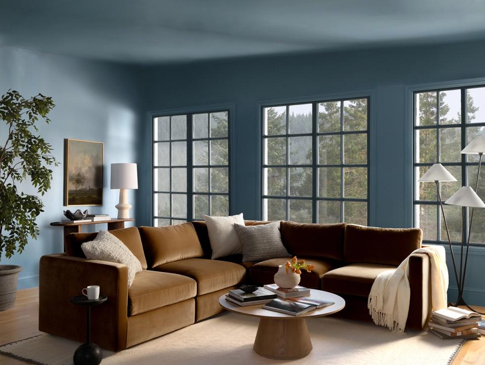
Contrast is crucial when creating a successful color scheme — even in a monochrome, color-drenched space (we love the moody trend!). Whether it’s a dark, bold rug set against a crisp white sofa or a rattan lamp that pops against dark green paint (like in the above living room), that touch of eye-catching contrast makes a space feel dynamic and full of life.
3. Using one accent color

We’re all for simplicity, but only bringing in one accent color will almost always result in a one-dimensional, matchy-matchy space. Instead, follow the 60-30-10 rule when curating your color scheme: fill 60% of the room with your dominant color, 30% with your primary accent color, and 10% with your secondary accent color. This will help create a space that feels balanced, interesting, and unique.
4. Ignoring the architecture

The existing elements in your home — the walls, floors, ceilings, and even the natural lighting — all contribute to the color palette, too. Before buying a rug or ordering a sofa, always consider the color of your flooring and surrounding elements. For example, if you have orange-toned oak flooring, opt for black or dark walnut pieces instead for contrast. Always consider how and where you can add cool tones where there is too much warmth, and vice versa. (For interested parties, here’s our handy guide to mixing wood tones like a pro.)
5. Disregarding atmosphere

At the end of the day, your chosen color palette will create a certain atmosphere in each room. It’s essential to consider what kind of vibe you’re looking to create before swathing your walls in coats of wet paint. In a bedroom, for example, you may want to forgo shades of red or even stark white and aim for a more calming, tranquil color palette. Always consider how you want to feelin the space when you start curating your colors — you won’t regret it.
6. Too much pattern

From color palette to scale and repeat, mixing patterns is a true art form. When playing with multiple patterns in a single room, you always want to vary the size and repeat of patterns, and stick to a tight color palette to ensure cohesion and harmony. Again, opposites attract here! Pair a whimsical floral with a graphic stripe or bold animal print. And remember: materials like marble, burl wood, and wicker offer their own touch of “pattern,” too — every design element plays a role in the overarching color scheme.
7. Competing statement hues

We get it — you love olive green and navy blue in equal measure, but when it comes to selecting a statement color, you have to pick one. Creating a striking, well-balanced space is all about letting one bold color shine, and bringing in thoughtful accent hues with smaller elements, like window treatments, rugs, side tables, throw pillows, and the like.
8. Clashing vibrant colors

Maximalism doesn’t mean clashing. If anything, this style requires a far more thoughtful, skillful curation of colors than a minimal, neutral-on-neutral space, and benefits from an expert eye. If you’re eager to use bold, vibrant colors, go all out! But make sure to balance those colors out with grounding neutrals, even in small amounts. Power clashing is an art form!
9. Failure to swatch

You may think you have a crystal-clear idea of the colors in your space, but unless you actually swatch paint on your walls and hold fabric samples in your hands, it’s a gamble. Sure, moodboarding tools or even Pinterest can help you get a visual understanding of your look, but nothing beats the real deal. Always swatch your paint colors (even 15 different shades of white!) and when you can, order samples.
10. Ignoring undertones

An aesthetically-pleasing home color palette hinges on even a basic understanding of undertones. Knowing which colors have a warm undertone and which have a cool undertone will ensure that you have a thoughtful balance of both warm and cool colors in your space, rather than a room that feels flat or one-dimensional. Again, contrast is king!
Want expert advice on your own space, straight from an interior designer? Get started today with ourstyle quiz.