How LA Actress Odette Annable Brought Texas Modern Style To Life

During the pandemic, actress Odette Annable and her husband Dave made the bold decision to relocate their family from Los Angeles to Austin, Texas. But finding the perfect home proved to be a bigger challenge than expected. The couple put offers on five different houses in the area before snagging their current 1990s stucco abode.
“This house checked so many boxes for us,” says the House star. “It has the space to host all of our friends, which was important to me after leaving my native California. I wanted to create a fun, welcoming home that people would be excited to visit.”
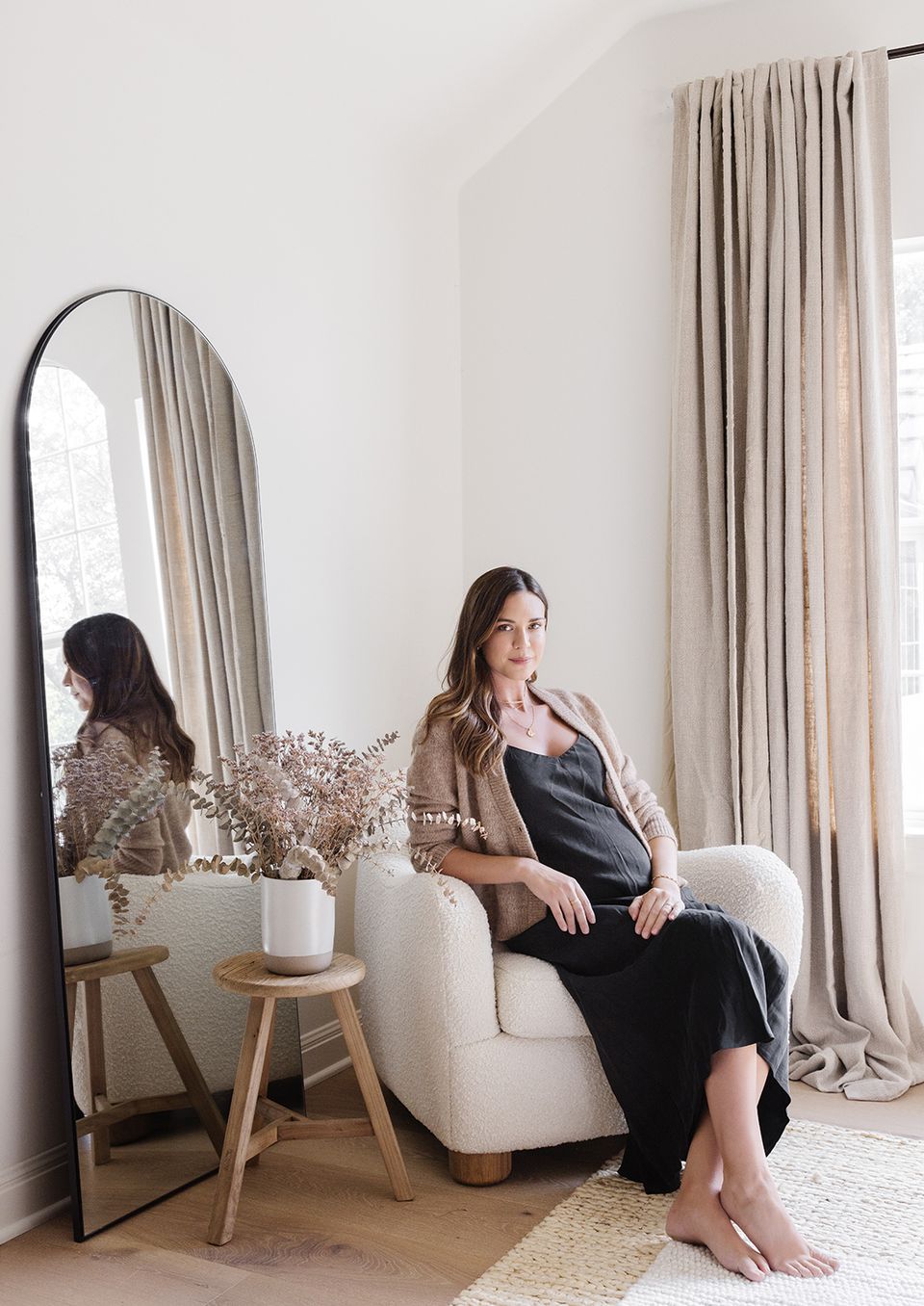
Odette and Dave tackled a few low-lift renovations themselves, but decided to call in the experts when it came to the design. With the help of Havenly’s Kelsey Fischer, the two tackled the dining room, guest bedroom, and home office upstairs, plus the family lounge area and dining nook in the basement.
“She really wanted to bring her laid-back, California style to Austin,” notes Kelsey. “We channeled that look throughout the home with layered neutrals, natural materials, and a few edgy accents, while still remaining family-friendly.”
Ahead, find out exactly how Kelsey managed to bring the actor’s signature California-cool aesthetic down south. In fact, we’re dubbing the chic aesthetic “Texas Modern,” a blend of laid-back coastal influences with rustic soul and warmth. Find the full Odette Annable house tour below.
Feeling Neutral
Kelsey expertly curated and executed a neutral whole home color palette for the Annable abode. From the formal dining room (pictured above) to the basement lounge area, the home is replete with warm whites, natural tan, crisp ivory, and pops of edgy black. “This palette feels very laid back, but also polished and cool, which is the vibe we were going for,” adds Kelsey.
The main design influence was Annable’s native Golden State, where a relaxed-yet-refined aesthetic reigns supreme. “I focused on bringing in texture and mixed materials to add the feel of California,” Fischer describes. “We kept the wood light and paired it with more high contrast accents.”
Texture on Texture
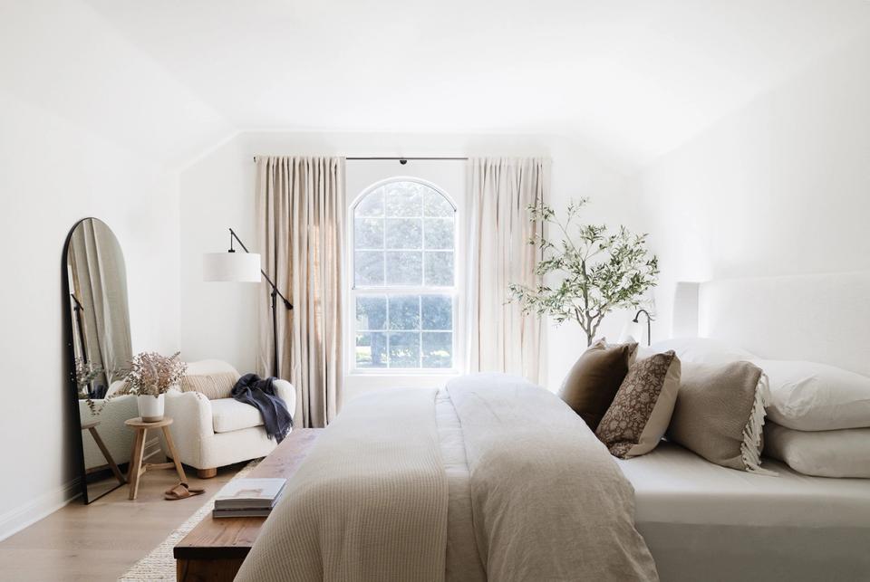
To warm up the neutral color palette and give the space a homey, guest-ready feel, Kelsey went all-in on rich, textural elements. “Texture is such an important design element in this home,” she notes. “Everything you touch or interact with was carefully chosen, from the jute rugs, rustic wood, and linen upholstery to the sheepskin, iron, and brass accents.”
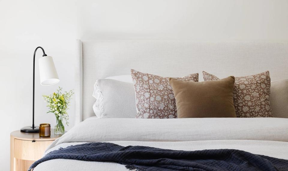
This design approach is best exemplified in the guest bedroom. Here, a neutral linen bed (the Modern Wingback Bed from The Inside) anchors the space, while tonal drapes, patterned throw pillows, light wood furniture, and hints of edgy black add warmth and visual interest. These unifying details really make the whole home feel approachable and welcoming.
Going Family-Friendly
The biggest challenge for Kelsey was adhering to the family-friendly requirement while maintaining the elevated, neutral aesthetic. “We usually have a ton of kiddos running around,” Odette says. “I wanted to create a space for them to be kids, but also a space for adults to unwind in a beautiful aesthetic. Elevated and serene, but not stuffy.”
Kelsey struck an ideal balance with the help of performance fabrics, particularly in high-traffic areas like the basement. In the dining nook, for example, the two agreed on a long, rectangular dining table, four black wooden chairs, and a plush banquette upholstered in an oatmeal-hued performance fabric. “Nothing feels too precious, but it all feels very elevated,” adds Odette.
Cozy Details
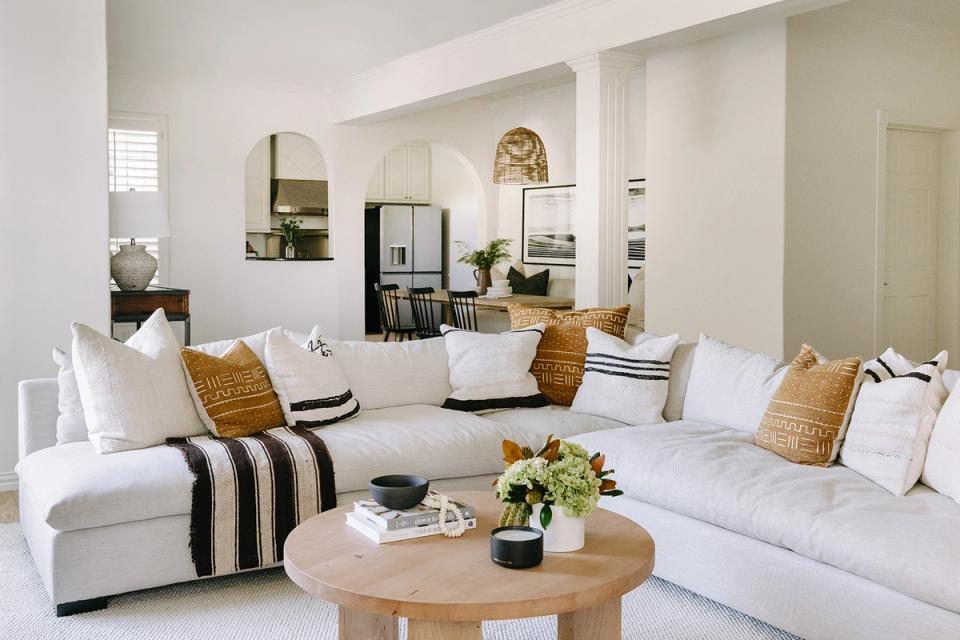
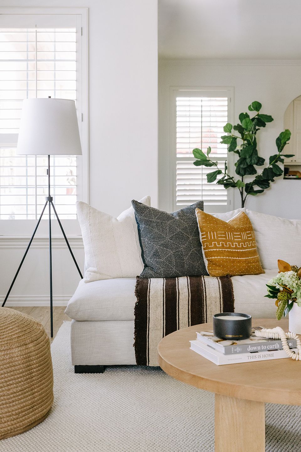
Steps away in the basement lounge area, Odette already had a sink-right-in sectional perfect for family movie nights. Kelsey went with a circular coffee table, some oversized jute poufs, and plenty of patterned throw pillows to pull the look together. “This is the space where all of my family gathers for football games or movie nights,” Odette raves. “We end up lounging and hanging here more than anywhere else in our home.”
Hints of Contrast
While the Annable home is like a warm, neutral hug, the edgy hints of high-contrast black really make the look sing. “The bolder pieces are some of my favorites in the entire home,” says Kelsey, referencing the painted spiral staircase in the foyer and the matte black sculptural lighting peppered throughout. Almost every space has at least one high-contrast touch, from the curtain hardware and pendant light in the home office, to the black art frames and throw pillows in the basement. “These small details add just enough edge to keep things interesting,” she adds.
Looking for a way to overcome your unique home dilemmas? Work one-on-one with our expert interior designers for just $129 per room. Get started today with ourstyle quiz.