The Classic Gallery Wall Is Out — 8 Fresh Takes Our Designers Love Instead

When you hear the term “gallery wall,” a familiar display likely comes to mind: clustered photographs in mismatched frames; a sculptural element (or two); small mirrors interspersed throughout; maybe a stray vintage flag or poster; a balanced, mostly symmetrical layout.
While fun, eclectic, and personalized, we can’t help but wonder: is the gallery wall of 2010s Pinterest fame past its prime? We say yes — this look has been upgraded and modernized over the years. “There will always be a place for the mixed-media gallery wall,” says Havenly designer Brady Burke. “But this look has naturally undergone some revisions, updates, and tweaks over the years.”
Designers Toussaint Derby, Kelsey Fischer, and Kasee Smith echo this sentiment, noting that there are countless ways to tweak the gallery wall concept to your exact tastes, from minimalist vignettes to asymmetrical layouts. “When done right, gallery walls can 100% feel fresh, unexpected, and timeless,” adds Toussaint.
Ahead, find Havenly designers’ eight inspired takes on the classic gallery wall fit for every home, design style, and wall space.
Tip 1: Keep it Simple
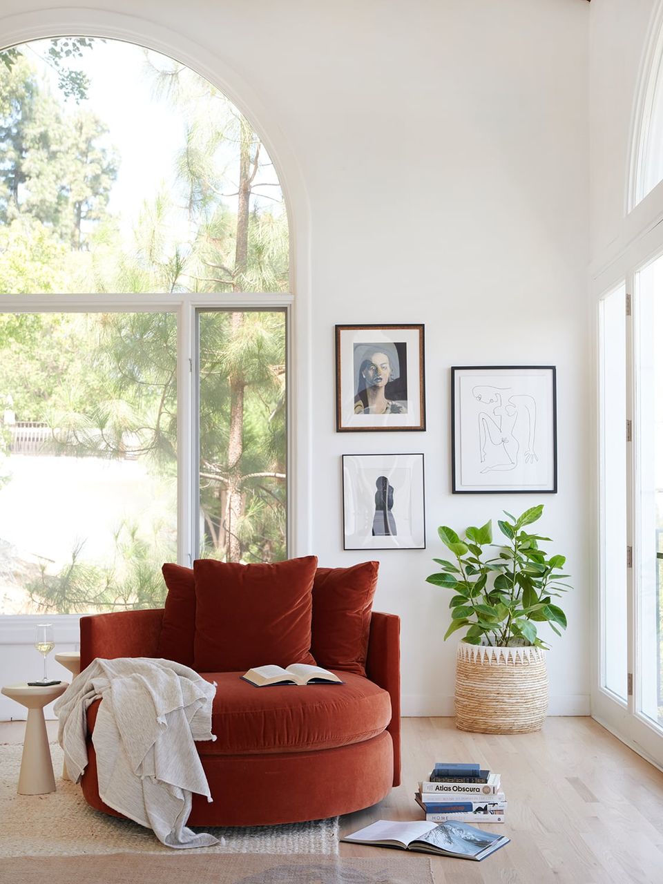
Generally speaking, we’ve seen the traditional gallery wall concept evolve in a more simplified direction. While there will always be a time and a place for the large, collected gallery wall, sometimes three curated pieces can be just as effective. Pick a loose color palette, and vary the frames, mat, and artwork style.
Tip 2: Go Beyond Artwork

Speaking of sculptural elements and mirrors, the idea of adding mixed media to a gallery wall is nothing new. But now, we’re seeing a more varied, unexpected use of materials, objects, and even shelving to create more captivating displays. Above, Havenly designer Melissa Wagner used a floating shelf to split her artwork display and incorporate objects that don’t require a drill, like vases, plants, and candlesticks.
Tip 3: Add Personal Mementos
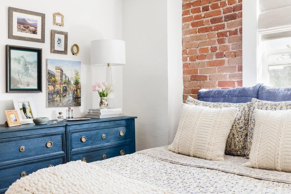
As always, carve out space for personal mementos, thrifted pieces, and family hand-me-downs when planning your gallery wall. For example, a few small, ornate frames passed down from your grandmother can add a one-of-a-kind touch. Even if you start with a gallery wall set (we get it — they’re incredibly convenient), pad it out with sentimental elements to make it feel like you.
Tip 4: Vary The Scale
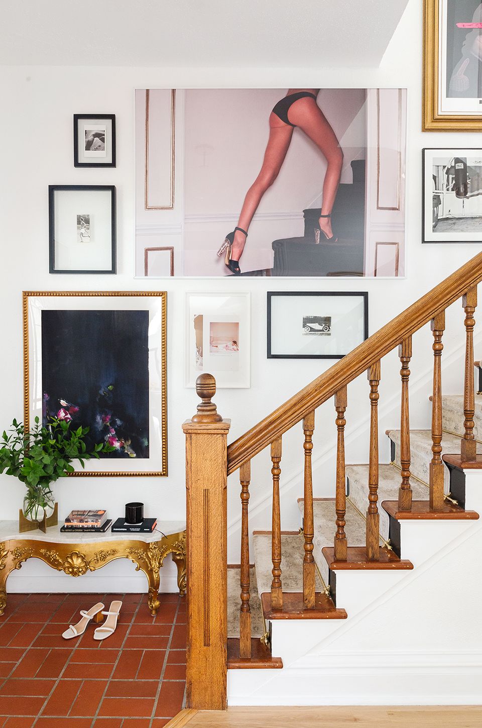
Rather than clustering small to medium-sized art prints and photographs, vary your scale from extra-small to extra-large for a fresh twist. Select a few oversized pieces as your “hero” prints, and build the gallery around them. Don’t be afraid to bring the drama here — the more striking the size difference, the better!
Tip 5: Simple & Oversized
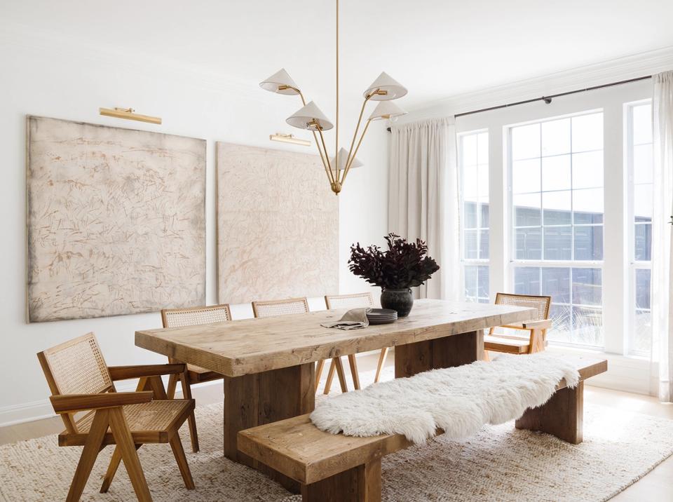
This ultra-modern, streamlined looking is becoming more and more popular in the design world. Skip the tedium of gallery wall planning in general and opt for two large, striking prints hung side by side. The look is very museum-inspired (especially with picture lights hung above each canvas) and feels just as striking and effective as a collected gallery wall.
Tip 6: Incorporate Lighting

We love the idea of incorporating statement lighting into a gallery wall. From shaded wall sconces to two-armed swivel fixtures and even oversized pendant lights hanging in the foreground, don’t forget to consider how light fixtures can play a role in your vignette. Plus, this is a great way to add mixed materials like jute, rattan, linen, marble, iron, and brass for a layered look.
Tip 7: Lean With It
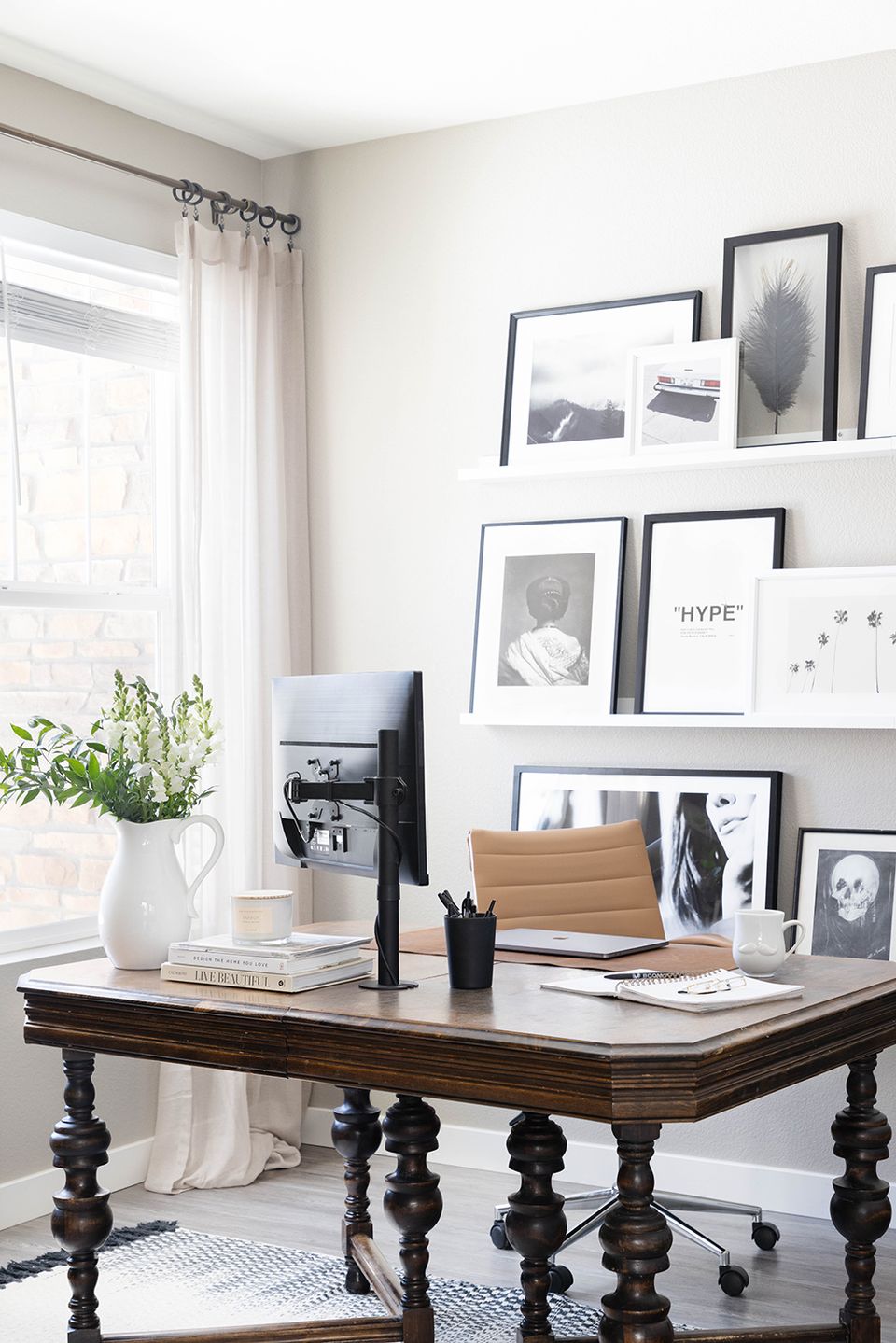
Another foolproof way to avoid the tedium of gallery wall planning? Picture shelves with leaned art prints. Take notes from Kelsey Fischer and opt for sleek floating shelves topped with monochrome, layered artwork behind your WFH desk for the perfect Zoom backdrop.
Tip 8: Embrace Asymmetry
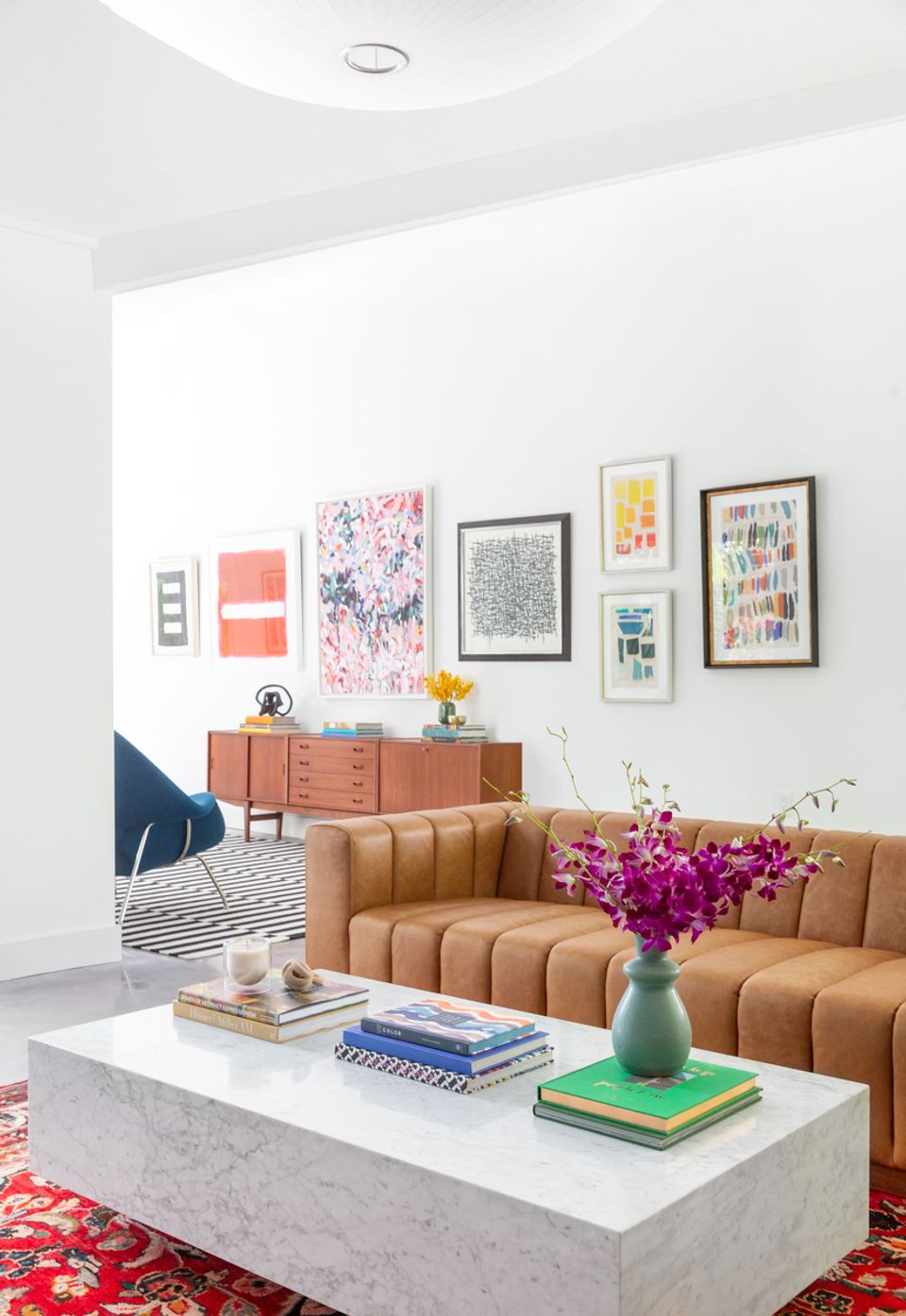
Asymmetric design is trending in general, and we’ve seen the look play out in gallery walls. While it may feel counterintuitive, resist the urge to create perfectly symmetrical, balanced vignettes (especially if you already have symmetry elsewhere, like a centered bed frame plus matching nightstands and table lamps). Instead, add a bit of visual intrigue by clustering a few art prints on one side of a centered focal point, or opting for different sized pieces instead of matching prints.
Looking for a way to overcome your unique home dilemmas? Work one-on-one with our expert interior designers for just $129 per room. Get started today with ourstyle quiz.