Every winter, Pantone announces the “Color of the Year”, a shade they predict will make a big impact in homes and on runways in the coming months. While sometimes we totally agree with their color expertise, this year’s color Ultra Violet was a little controversial. There are just so many better colors out there. So, we turned to our favorite design experts, the Havenly design team, to pick their very own colors they hope to see all over the place in 2018. Read on for their predictions!
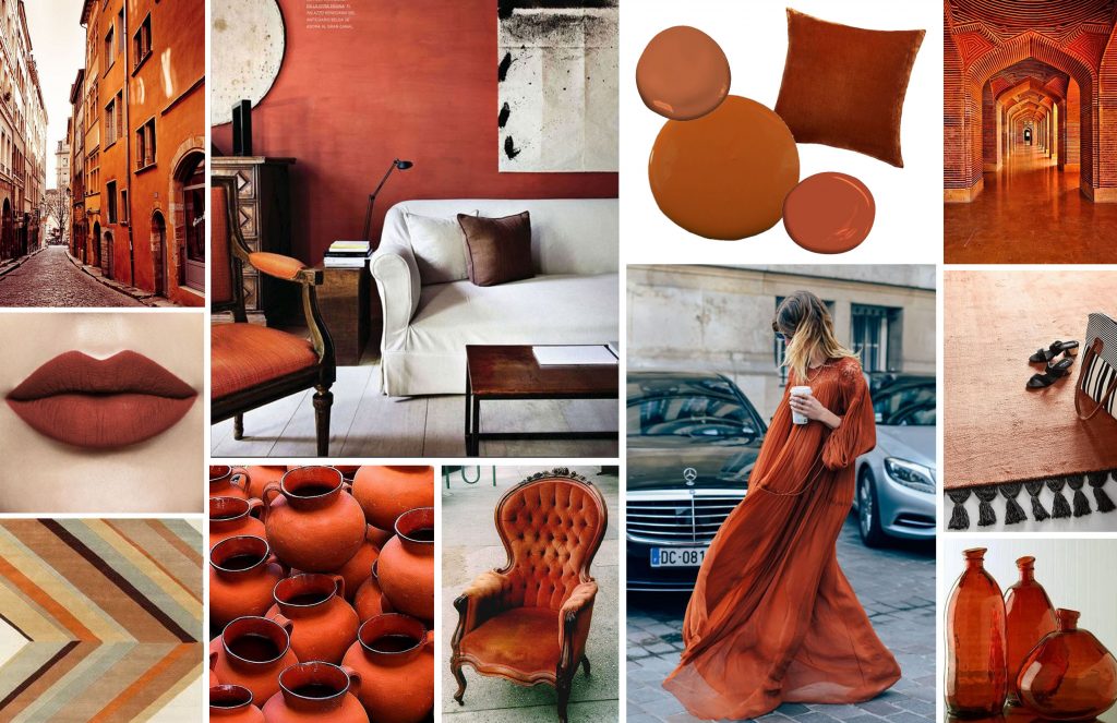
Kylee Trunck, Senior Staff Designer: Sienna Copper
Kylee picked this bold, warm shade that’s perfect both for bringing a cozy feel indoors in the cold, or keeping the late-summer heat going all year round. We love this deep, slightly rustic shade. It brings to mind Spanish style, and feels just a little bit seventies. Even though this orange is certainly bold, it can be used almost as a neutral– check out those gorgeous walls! All in all, Sienna copper feels fresh, a little bit retro, and the perfect boho compliment to any look.
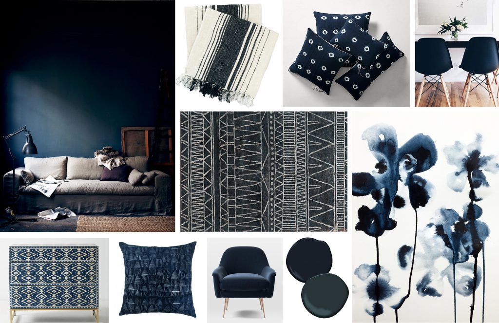
Elyza Brillantes, Design Program Manager: Ink
Elyza’s pick is the deep, dark, and mysterious Ink. Ink is a dark blue, but not a navy. It has black tones, and a little bit of a green cast that makes it feel fresh and a little bit exotic. We love this shade in patternwork like mudcloth textiles or inlaid furniture, but it makes a bold statement as a wall color. As paint, it brings a cozy, warm vibe despite it’s dark color. As an interesting alternative to black, we love Ink for its versatility in any setting.
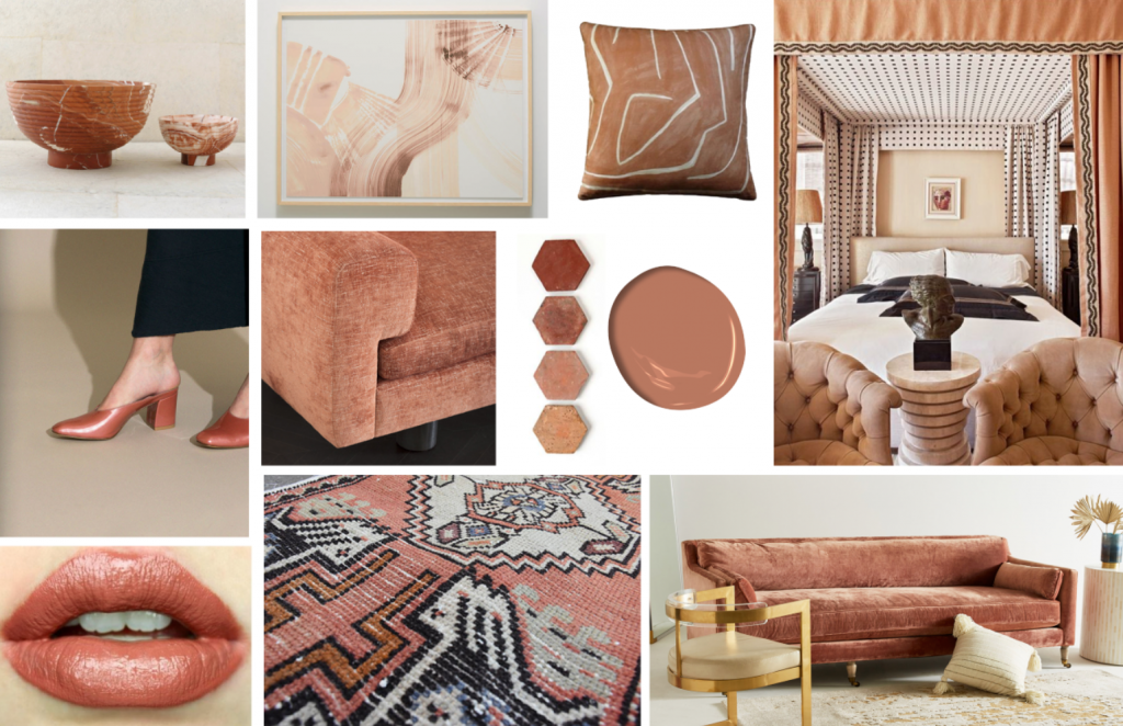
Shelby Girard, Head of Design: Vintage Terra Cotta
Shelby and Kylee must be feeling similar desert vibes for 2018, because we love that they both picked warm and dusty shades. Shelby’s pick, though, is on the paler end of the spectrum, and we love how it can look pink or neutral depending on its surroundings. This vintage inspired color pairs beautifully with deeper shades and looks totally luxe in velvet, but feels more natural than the ubiquitous millennial pink. Vintage Terra Cotta can be a great accent color, or can anchor even wilder shades if you prefer a bolder look. 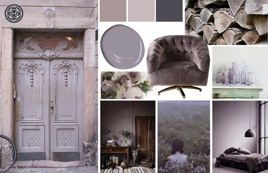
Lauren Cox, Design Program Manager: Smoky Lavendar
Lauren was inspired by Pantone’s purple color, but wanted a better version. So, she’s loving Smoky Lavendar for 2018. It’s a color that feels antique and european, but not overpowering. Almost grey but not, this shade is elegant and timeless. It feels inspired by nature without being too bright to look at. It’s a subtle purple, but infinitely useable in any space, as it can pick up cooler blue tones or warmer pinks effortlessly.
They’re all so beautiful, we’re having trouble picking just one! Luckily, our designers have such a great eye for emerging trends, we’re sure all of these colors will be all over the place before 2018 ends. Which shade is your favorite?

