10 “Cringe” Mistakes People Make When Decorating With Print & Pattern

ICYMI: Minimalism’s years-long reign is officially over, and we’re pleased to report that pattern is back. Thanks to the rise of traditional and maximalist design in the last five-plus years, patterned everything (yes, even floral print sofas) are taking center-stage in stylish homes once again.
Of course, this presents a whole new slew of decorating challenges, and we’ll be the first to admit that pattern-mixing is somewhat of an expert-level design task. We’ve already shared our designer guide to effective print-mixing, and now we’re addressing the polar opposite: what not to do. From too much color to too few solid prints, find the most common print-mixing mistakes our designers can’t help but notice in other peoples’ homes, and remember: less is more!
1. Using too many colors

If there’s one golden rule to remember when mixing patterns, it’s to stick to a curated color palette — pattern on pattern and color clashing is just too much. To offset the visual business of multiple pattern, a tight color palette keeps things harmonized — stick to 3 or so main hues!
2. Bringing in too many print “themes”

Animal print. Florals. Botanicals. Classics. Global-influenced. There are many pattern “themes” to choose from, and we highly recommend sticking to two or three favorites for contrast and calling it a day. Mixing in every pattern you’ve ever loved — from animal print to florals to Moroccan-influenced — can get busy fast. In a traditional home, for example, classic stripes mixed with soft florals perfectly complements the aesthetic.
3. Using more than one “hero” pattern

We know it can be difficult to only choose one bold pattern to take center stage, but using two loud prints in equal measure will create visual chaos. Instead, allow your single favorite to make the splash it deserves, and use contrasting prints in smaller doses, whether it’s an animal print or a classic stripe.
4. Overdoing it

Speaking of pattern-on-pattern, it’s all too easy to overdo it when decorating with multiple patterns in a single space. Sometimes, less is more when expressing your love of print — both in terms of color and theme. In the above space, for example, the geometric pattern is subtle, high-contrast, and highly effective — it’s perfect in its simplicity.
5. Forgetting to vary scale
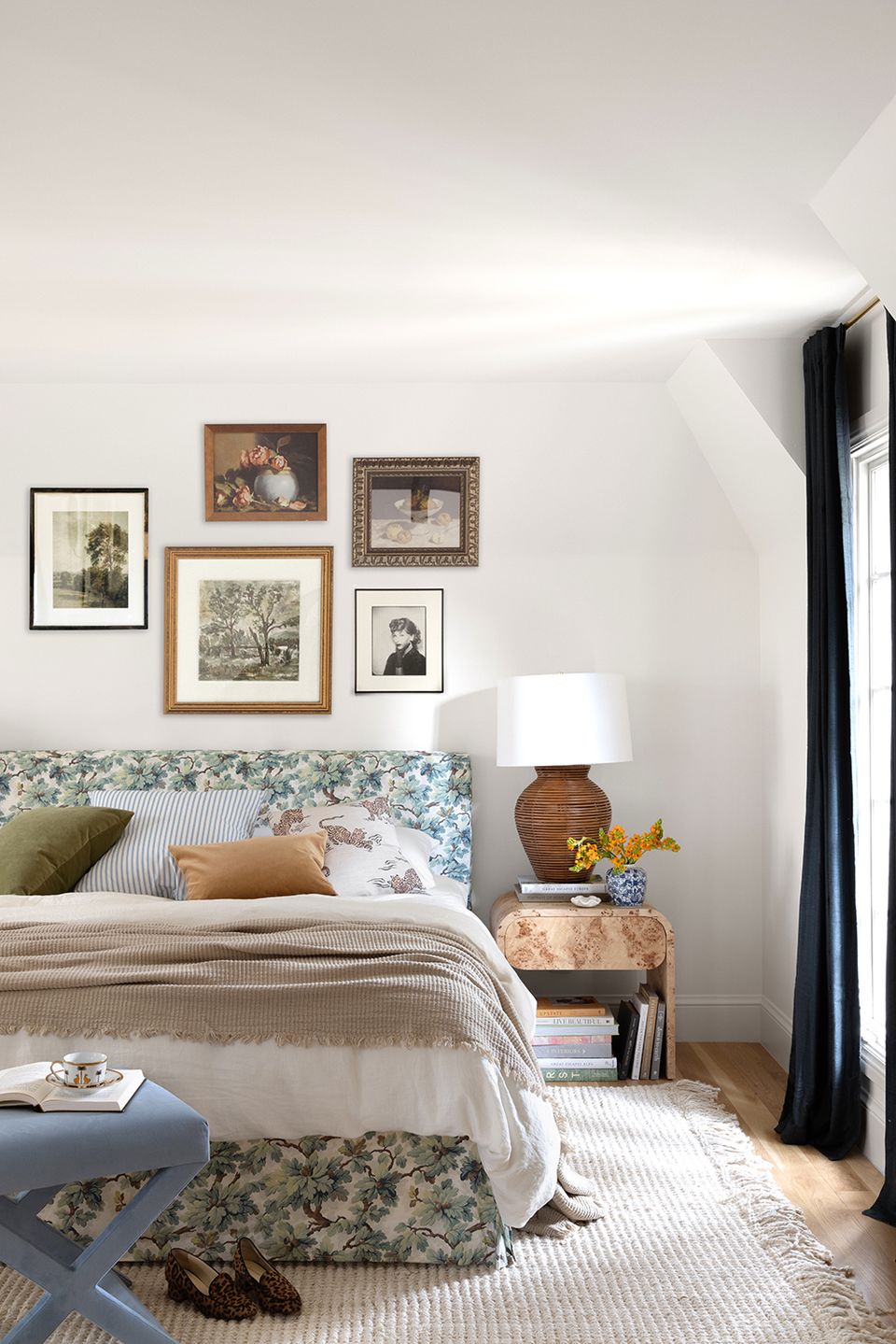
Scale refers to the size of the pattern motif — picture large, oversized stripes that repeat a handful of times, versus a tight floral print. When mixing patterns effectively, always switch up the scale so that your space doesn’t feel too busy — a small floral print mixed with a high-repeat animal print anda busy geometric pattern quickly creates visual chaos. In the above bedroom, for example, the large-scale tiger print throw pillows are a nice visual antidote to the busy floral bed frame.
6. Not factoring in materials

The architectural materials in your space — from the flooring to wall texture to the fireplace stone — all function as “patterns,” too. When planning your decor, always factor in these elements! Even a wicker lamp adds a certain textural, patterned element. If your space already has a lot going on architecturally, understated pattern mixing can feel more appropriate.
7. Rushing the process

Successfully mixing patterns and creating a layered, lived-in space is an art form! As such, your final look will be much more effective if you take your time. Rather than ordering a leopard print ottoman and floral wallpaper at the same time, wait until you can see your “hero” print in person and build your design from there. Always order fabric samples when you can!
8. Zero solids
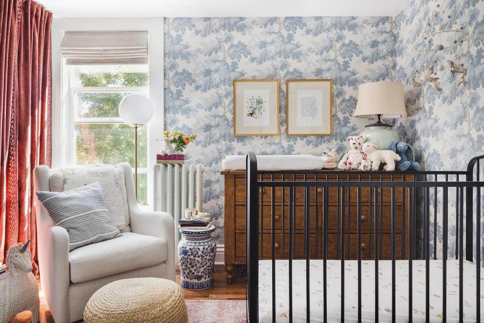
If you’re embracing a busy, wall-to-wall print (particularly in wallpaper form), solid fabrics are absolutely essential to pull it off with flying colors. In the above nursery, for example, the woodland print really works because of the solid pink curtains and solid accent chair — these two understated elements allow the print to sing and steal the spotlight.
9. No negative space
Intentional negative space, or curated “blank” space, is absolutely essential when trying to pull off multiple patterns in a single space. It’s arguably just as important as the prints themselves. Always balance printed pieces with minimal moments and clean solids, whether it’s fresh white walls, a solid area rug, or solid curtains. For example, a bold patterned bed spread might crave a solid bed frame, and vice versa.
10. Skimping on contrast

Contrast is often what makes pattern mixing sing, especially when you’re going with two bold prints. Instead of overdoing it on animal print or floral print, mix the two for eye-catching contrast. The combination is unique, dynamic, and the perfect example of opposites attract.
Want expert advice on your own space, straight from an interior designer? Get started today with ourstyle quiz.
