Design Project
Bachelor Star Katie Thurston’s NYC Apartment Is Just As Warm & Down-To-Earth As She Is
See how Bachelor star Katie Thurston transformed her NYC apartment with designer Neha Kaimal, blending mid-century modern with playful touches.
See how Bachelor star Katie Thurston transformed her NYC apartment with designer Neha Kaimal, blending mid-century modern with playful touches.


Expert guides on styles, layouts, and color

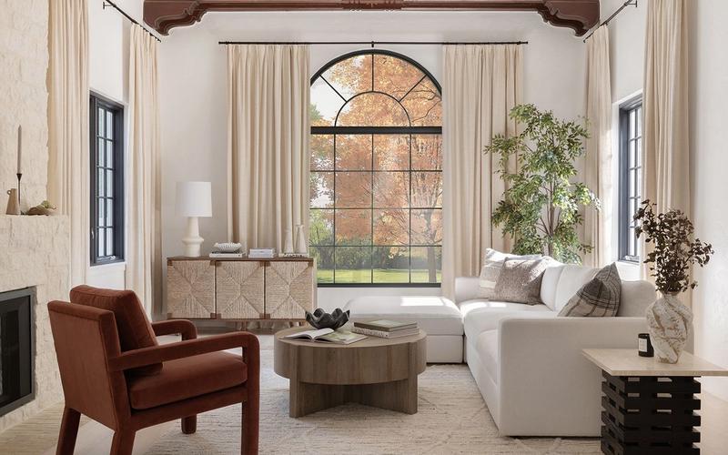
Learn how to hang curtains like a pro with 5 simple steps from Havenly designer Brady Burke. Master measurements, fabrics, styles & hardware.

Few things can throw off the overall look of a space like an errant cord or cable. We get it—no one wants to sacrifice their electronics for a pretty aesthetic, and more often than not, the placement of outlets in your home is outside of your control. But lucky for you, our expert interior designers…

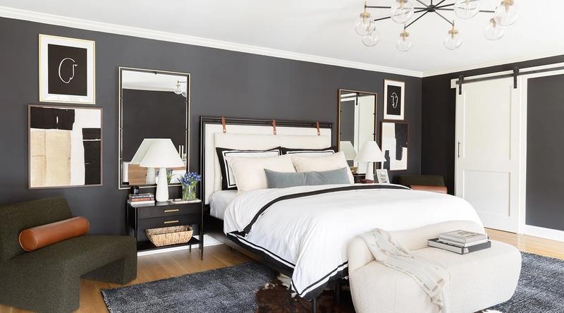
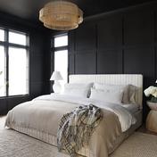
Learn how to arrange pillows on your bed with 20 stylish ideas from Havenly interior designers. Create the perfect bedroom look.
The people behind our design advice and inspiration
Work one-on-one with a Havenly designer to bring your dream room to life.
Get Started