Painting Walls and Trim the Same Color: A Designer's Guide to the Monochrome Look

As designers, we appreciate a good paint trend more than the average person. From our annual paint predictions to trendy DIY projects like painting tile, we pay attention to what's new and worth a brush crush.
But repainting takes time and money, so we have a soft spot for looks with staying power (there's a reason we keep these neutral paint colors on standby). The monochrome paint look is exactly that kind of timeless move. It's been building for a few years now, and it shows no signs of fading.
Meet the "monochrome paint" trend
Enter monochrome paint. A catchall term for painting the walls, trim, and ceilings the same color, this tonal look is equal parts cool and timeless — we don’t see it fading away into obscurity in a few months. On the contrary, it’s been slowly gaining steam for a few years now and shows no signs of stopping into 2024 and beyond.
Plus, the all-over paint look has a way of making your space feel both serene and seamless — it’s basically like being hugged by a room. Given our post-pandemic obsession with all things cozy, this look feels particularly topical. We think it works especially well in traditionally calming, serene spaces like bedrooms, bathrooms, and Reading Rooms.
Ahead, Havenly interior designers shares her pro tips for pulling off the immersive and cozy monochrome paint look, alongside all the inspo you need for painting walls and trim the same color.
What is the monochrome paint look?
When you paint the walls, trim, and ceiling the same color, that’s monochrome. The all-over effect is equal parts cool and timeless, making a room feel both serene and seamless, basically like being in a cocoon. Given how much we've all leaned into cozy spaces lately, the look feels especially right. It works beautifully in naturally calming rooms like bedrooms, bathrooms, and reading rooms.
Below, find the designer rules for getting it right.
Choose a bold but calming color
This look leans dramatic by nature—all-over color always does. So when you're choosing a hue, think about the mood you want and try to lean grounded. Whether you embrace a saturated shade like navy (Benjamin Moore Hale Navy is a favorite) for an intense calm or a soft sage green for an ethereal tranquility, make sure to keep color psychology in mind as you swatch.
Show off eye-catching woodwork
Monochrome paint can sing in a modern, trim-free space, but ornate moulding or texture-rich millwork keeps it from falling flat. If your space allows, add picture moulding, beadboard, paneled doors, or shiplap before you paint. (For ideas, see our guide to wall moulding.)
Mix your paint finishes
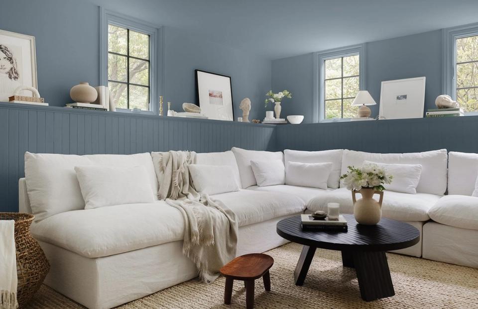
For subtle variation, vary your finishes. We recommend matte or eggshell on the walls and ceiling, and semi-gloss on the trim and doors. That understated shift in sheen adds dimension without breaking the seamless effect.
Paint the architectural features, too
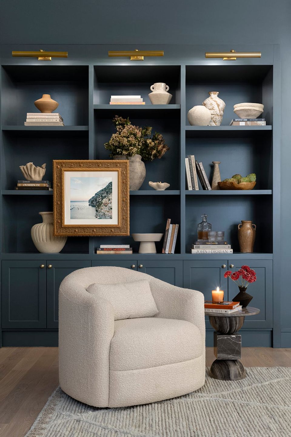
If you have a standout feature like built-in shelving, swathe it head-to-toe in your chosen color. Doing so deepens the cozy, cocooning atmosphere, and the minimal contrast is exactly what creates that calm.
Layer shades of the same color
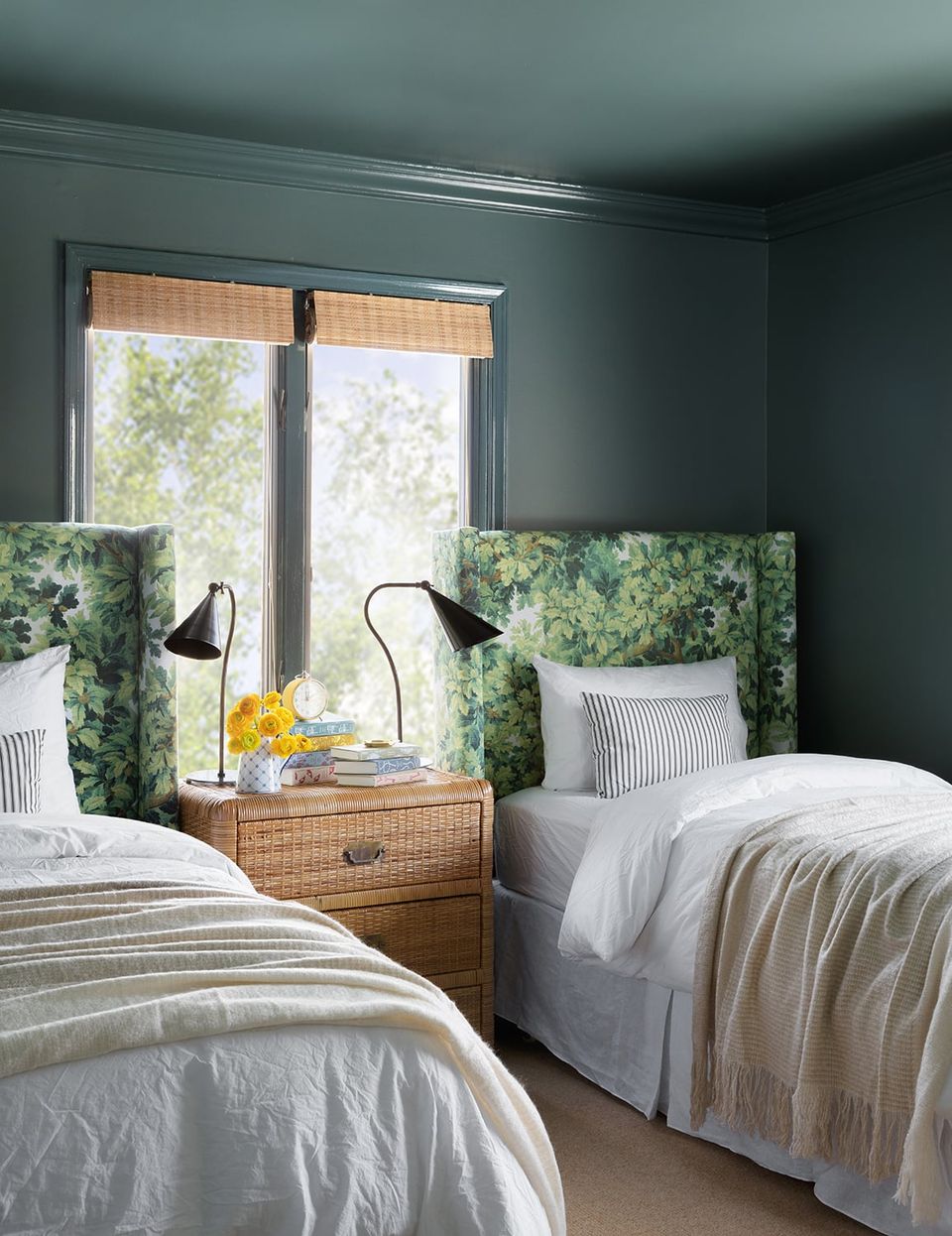
With such an all-encompassing color story on the walls and ceiling, furniture and decor selection matters more, not less. Lean into tonal patterns and varied textures like a patterned headboard, woven baskets, and layered textiles to keep the room from reading flat.
Lean into low ceilings
Painting walls, trim, and ceiling the same color is a smart move for a room with low ceilings. It sounds counterintuitive, but the monochrome look plays up the cozy, inviting feeling that small spaces already have. Just imagine how well this works in a finished attic or a snug guest room.
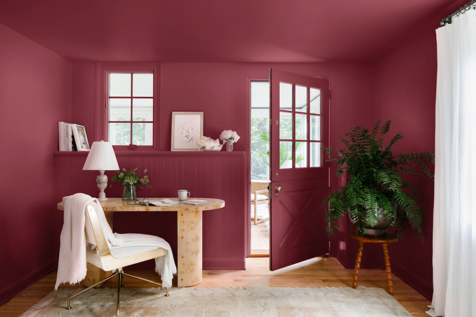
Add high-contrast furniture
To keep a saturated, all-over color from feeling heavy, add a little levity with contrasting furniture and decor. Crisp ivory upholstery and a light jute rug, for example, give the eye somewhere to rest in an all-oxblood room. Without those bright additions, a deep monochrome room can tip into gloomy.
Remember that neutrals count, too
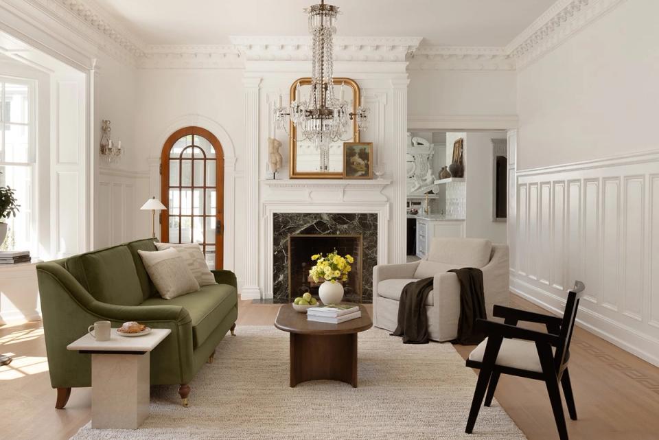
You can hop on the monochrome look with your favorite white, beige, or tan. Instead of a warm white on the walls, a true white on the trim, and a flat white on the ceiling, swathe the whole space in one neutral hue. That subtle switch makes a room feel noticeably warmer and more cohesive.
Frequently asked questions
What is color drenching?
Color drenching is the now-popular term for painting a room's walls, trim, ceiling, and sometimes built-ins and doors, the same color. It's the same idea as the monochrome paint look: one color, head to toe, for a seamless, enveloping effect.
Should you paint trim the same color as the walls?
For this look, yes. Painting the trim to match (rather than the usual contrasting white) is what creates the seamless, cocooning effect and makes the room feel calmer and often taller. Vary the sheen (semi-gloss trim against matte walls) so the trim still reads as a separate plane.
Does painting everything one color make a room look bigger or smaller?
Both, in the best way. Removing the contrast between walls and trim blurs the edges of the room, which makes the space feel larger and more open. At the same time, a saturated color makes it feel cozier and more enveloping. That's why the look is so flattering in small or low-ceilinged rooms.
What sheen should you use for walls versus trim?
A common designer approach is matte or eggshell on the walls and ceiling and semi-gloss on the trim and doors. The trim's higher sheen adds subtle dimension and stands up better to wear, while the matte walls keep the look soft.
What are the best colors for a monochrome room?
Grounded, calming hues work best: navy, sage, forest green, deep terracotta, charcoal, and warm neutrals like greige and tan. If you want help choosing, browse our guides to green paint colors and brown paint colors.
Want help committing to the color?
Going all-in on one color is a bold move, and it's a lot easier with a second opinion. A Havenly designer can help you choose the right hue, finishes, and accents so the look lands cozy instead of cave-like.
Take the Havenly style quiz—it takes about 10 minutes and matches you with a designer who'll build a complete, shoppable plan for your room.
Not ready to commit? Try Havenly AI—snap a photo of your room and see it color-drenched in your top picks before you open a single can.
Related reading
• 34 Best Green Paint Colors That Never Go Out of Style
• 10 Best Brown Paint Colors for a Warm Interior
• 7 Wall Moulding Ideas Interior Designers Love
• Havenly's Top 10 Neutral Paint Colors
